We're in the home stretch now as we talk through Generation VII, the last generation on the 3DS. And... there's a lot more to talk this time around as well, since just like Generation VI, the shinies have a fair bit more care put into them. Which... which is going to lead to a lot of my frustrations when we come to Generation VIII, but that's not until another article. Right now, we're going to talk about the shinies of Alola. I think I've gone on record that out of the more 'modern' generations, I love Generation VII's dex the most? And I am happy to know that they've got a lot of great shinies to go with them too.


We start off already with a winner. I think shiny Rowlet is the best-looking one out of this entire line, with the adorable pale light green and the teal bowtie leaf. Such a strikingly different colouration that arguably still retains most of the 'feel' of the original. Shiny Dartrix and shiny Decidueye swap the teal into being the main colour alongside an almost-black shade of dark green, which... I get. The original, non-shiny forms also swap the shades of green as they evolve. But I just so love shiny Rowlet's green, is all.
I do really like that the black underside-wings of Decidueye really ends up making him look a lot more sinister. It's like... regular Decidueye might be Robin Hood, but this shiny Decidueye is Batman or something. The blood-red 'arrowhead' feathers are also a lot more vividly picked up in this palette, which is very much appreciated. Shiny Hisuian Decidueye do that thing that a lot of regional variants do where it essentially lifts a variation of the original Decidueye's colours... but I appreciate that at least the greens and browns are a little more muted, giving a different definition of an 'autumnal' Decidueye.


Another winner! Shiny Litten and Torracat go from a black-and-red tiger cub into a shockingly loud white-and-orange colour scheme. Now actual white tigers are basically 'shinies' in real life, but the fact that the stripes are fiery make these two kitties look strikingly badass.
Interestingly, not all the black and gray stripes in Incineroar is changed into white for shiny Incineroar. His arms, legs, tail and head all get blindingly white, but his 'singlet' is still black. I don't know enough about wrestling to know if this is some kind of a reference or whatever, but I do find the end result looking pretty dang cool regardless.


Shiny Popplio is... it's okay. It's different enough that you know it's a shiny, but he feels like one of those older 'playing with shaders' shinies, y'know? Shiny Brionne being lavender instead of baby blue, and all of his little detailing on his ballet skirt and ear-bubbles being a bit more pastel-pink is nice.
Now I actually have a shiny Primarina in my copy of Ultra Moon, which I got from a wonder trade... meaning he's most certainly hacked or something. The fact that he's nicknamed a very unfortunate slur isn't nice either. But shiny Primarina is pretty cool! He follows the darker hues that the shiny unevolved forms have, and the pastel-pink frills work wonders here. But perhaps the most stark departure is swapping regular Primarina's light-blue hair for a shocking pale blonde... which... I think kind of works? I like it, anyway.


Okay, shiny Pikipek is just disappointing. I do really like shiny Trumbeak and Toucannon, though. It's like they discovered a different side of the colour pencil box, going for the red-purple-blue gradient instead of the red-orange one. Very nice. A subtle change, but I like it.


Mmm... I'm not feeling either of these. Granted, it might just be because I don't like the designs flat-out, but they just went to an obnoxious hair dye salon and called it a day. Shiny Gumshoos look terrible. Shiny Yungoos is... okay? The lavender isn't quite as jarring as the pink.


Shiny Grubbin is all right, but nowhere as drastic of a difference compared to its evolutions. Shiny Charjabug becomes bright red, and the blue and yellow highlights are pretty cute. But shiny Vikavolt is an amazing robo-bug of death, with a completely silver body, a glorious neon-green set of taser fangs, and a blood-red inner jaw. Regular Vikavolt is already pretty cool, but this shiny does ratchet it up to eleven.


I really like shiny Crabrawler! The purple and red makes for such a nice, tropical look to him. Shiny Crabominable is... serviceable. It's the same colour palette as Crabrawler, and I get that the white 'snow' is still there, but maybe I just really don't like Crabominable.


Almost all the shiny Oricorio forms look great. The pom-pom style is probably the only one that feels a bit lacking, though the pom-poms are at least contrastingly lighter? All the shiny Oricorios swap the primary and secondary colours, and pom-pom here is the least noticeable. Shiny Pa'u form Oricorio swaps the colours of the main bird and the skirt and headress, which... isn't as striking as Baile or Sensu, but it's all right.
But Baile Oricorio goes for a stunningly wonderful set of reversed colours, with the bird being primarily black with red highlights. Sensu form Oricorio also does a great colour swap, with the fans and ridges of the wings now coloured purple while the main body is light blue.


Very appropriate and very adorable! Cutiefly is one of my favourite lines from this generation, and shiny Cutiefly and Ribombee ditches the yellow for a straight-up obvious Fairy pink. Again, it's rather obvious for the cute little fairy-bee to be pink... but it's still a nice colour and an appropriate one for a shiny!


All very nice looking. While the original Rockruff and Lycanroc forms run the gamut of brown, red and orange, all the shiny forms are basically different shades of blue, bringing an interesting bit of consistency and making the colour palette range a bit more tighter. I feel like the baby shiny Lycanroc's pale blue is the nicest of the four, although I am a fan of the 'Dusk form' Lycanroc's blue.
...man, looking at them now, I really wished they made Dusk Form a bit more explicitly as a middle ground between Midday's full-on lupine wolf and Midnight's bipedal werewolf. He really is just Midday with some extra hair and spikes, yeh?

A little bit disappointing, if we're being honest. Shiny Wishiwashi's regular form swaps the whites for a... dull, yellowed colour, like white plastic that's been left in the sun too long. The eyeballs change from blue to orange, which is cute. Big daddy schooling-form Wishiwashi swaps the white glowing eyes into orange, which... I feel doesn't quite feel as 'shiny' or as 'special' enough.


Very nice. The most famous colouration of the real-life crown-of-thorns starfish is red. Shiny Mareanie and Toxapex are a shocking pink, but it's a very nice contrast to the original blues and purples of the regular colouration. I also like how well the central head-body polyps blend into the thorny hands, whereas the original colour scheme made them more distinct.


They're all right, I guess? Not my favourite. I do appreciate that their hair becomes a bit more bluish, but the main colour change is the fact that they go from brown to a lighter, almost orange-y brown. I get the creative design why Mudsdale's giant chonky mud-shoes aren't changed, but I wish that they were.


Ho-o-oly shit, that's badass. Black-suit Spider-Man is always cooler than the traditional red and blue. And shiny Dewpider and Araquanid looks amazing, with purple limbs and glowing red-orange eyeballs. The end result really looks like an evil sci-fi monster, and I'm a huge, huge fan! There's really not much to say here, but I really do like how menacing the end result looks. This could easily be the colour palette of a comic book villain or something.


Now shiny Fomantis and Lurantis look like the washed-out, two-toned shinies of the past... but I honestly kind of get it. Whereas the regular colours are representative at how they're a reverse flower orchid, these shinies seem to represent a regular, green praying mantis that camouflages itself against blades of grass. Or, in these two's case, living grass that camouflage themselves by looking like regular green praying mantises!


An amazing contrast from the original! I can't think at the moment if this is referencing any specific species of fungus, but they do look pretty great! Shiny Morelull is probably my favourite of the two, with all three mushrooms looking all wacky, like some kind of popsicles, actually. The browns are a much sharper contrast compared to the ghostly white body, as opposed to the regular colouration's pale purples, and that's much appreciated.
I like him a bit less, but Shiny Shiinotic still looks pretty great with the brown pants and cap ridges, while the main cap being yellow is an interesting look. I do like where regular Morelull or Shiinotic look whimsical and fanciful, these guys look more like dirty fungi in a forest floor or a damp cave.


Another simple ghostly-white shiny, but one that works very well. There's already a sinister undertone with Salazzle in general, and keeping parts of the original black colour scheme (Salandit's head and claws; Salazzle's underbelly) makes for a very nice paintscheme overall. A winner for sure.


I have some of these in Pokemon Go! I love the almost-gold orange shade of shiny Stufful and Bewear. It's just a colour that works well for a stuffed doll, and while it's not quite a boring brown, the golden orange does make for a very good contrast while also still being a good colour scheme on its own.


Aaaa! These guys are adorable. I honestly do think I would find the Bounsweet line much more memorable if they looked like this. I get that the regular line represents a proper mangosteen, but how many primarily-green humanoid plant ladies do we have? The lavender contrasts well against the purplish-pink fruit parts, and it looks particularly great as Tsareena. Honestly, it's the colour of royalty and the line is themed around a queenly line anyway, so!

On one hand, I get it. Just like Klefki's keys, Comfey's flowers aren't actually part of the actual Pokemon, and are 'accessories'. But I really don't think it's too much of a stretch for the Shiny Comfey to have a different arrangement of flowers. The blue-and-yellow colour scheme, and the white 'face', really does make for a nicely different shiny compared to the original one.

I'm not feeling this one. Shiny Oranguru swaps out the white fur for a light purple, and we've got some extra minor changes like the forehead star and the cloak stripes being turned into light blue. But otherwise shiny Oranguru just feels rather rushed.

Oh yeah. I think I would be much more appreciative of Passimian if he's coloured like the shiny Passimian here. The regular monkey is just so... so boring. Shiny Passimian keeps the main body as being white and gray, but the markings on shiny Passimian's shoulders and tail are bright blue, and he's gotten a bright-orange berry for his 'helmet'. The concept of Passimian is a monkey that's able to play rugby or American football or what-have-you, and this shiny palette really brings out the visual details a lot nicer than the original... which just looks like a regular monkey that ran into a bunch of leaves, and it takes you a bit longer to appreciate the design. Shiny Passimian fixes that very well.


Hmmm, serviceable, but not my favourite? I really like Golisopod normally, but just changing the accents doesn't quite do it for me. Shiny Wimpod gets a lot of red, while shiny Golisopod swaps the purples and dark greens for red and blue. But while it's still very blatant what they changed, the general silhouette is still dominantly white. I don't want to just suggest a black repaint for every Pokemon out there, but this would be one that looks badass in black, wouldn't it?


Speaking of being badass in black... yes. Actual black sand exists in the real world, including Hawaii -- in Punalu'u Beach, which even has a short area based on it in Alola. The glowing eyes look so much more threatening with the black sand, and I adore that even the little shovels change from red to yellow. This colour scheme is extra-badass for shiny Palossand, with the glowing 'eyes' around the mouth being picked out much more clearly against the black sand.

Real life sea cucumbers come in a variety of wacky colours. Perhaps not as much as sea slugs, but the most notable edible sea cucumbers are black or brown, which I assume is what was the inspiration for Pyukumuku's regular predominantly black colouration. Bright highlighter green with some yellow spikes makes for a very adorable little design!


Yeah, not all of these are winners. On one hand, I can kind of appreciate that they're homaging the original Arceus's shiny forms... but shiny Arceus looks like piss, and therefore all of these shiny Silvallys also look like piss. Shiny Type: Null has a bit more differences in the highlights and the shading of his helmet, but without a side-by-side comparison you could put a handgun onto my forehead and I probably would've guessed wrongly.
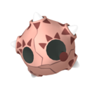

Oh! This one is creative, and honestly kind of mean! See, if you guys forget about Minior's little gimmick, from the outside, all the Miniors look identical. It's only when the 'shell' breaks apart that you can see which of the seven different colours of Minior you get. Shiny Minior, on the other hand, is always one colour... black, and it has all seven colours of the rainbow (the seven 'regular' Minior forms) as the little highlights.
I love this. I love the fact that they incorporate the 'colour reveal' into how the Shiny would play out, and I honestly wished that they incorporated these many, many different forms into how other shinies like Arecus, Silvally, Vivillon or Florges would look like.

I get the joke here, that shiny Komala's log-pillow goes from being coloured like a log into... well, a cute pillowcase, with pink frills to boot. The base Komala, I think, gets just a shade lighter. But I find it bizarre that Komala gets his accessories to turn shiny while some other Pokemon like Comfey above don't? Eh.

Mmm... I think they're going for a more naturalistic-looking turtle look with the yellows and browns. The colours still look 'flamey' enough for the concept to work, I guess? It's all right. I wasn't too keen on it, but after writing that sentence I'm a bit more sold.

It's not all winners, huh. Shiny Togedemaru somehow is barely different, swapping gray for... a pinkish, brownish gray? Could've done more.

Okay! Shiny Mimikyu's got a monochrome photograph thing going on for it, which I think is inspired partially by the fact that some of the creepier moments involving Mimikyu in the Sun/Moon games involved you trying to catch a Mimikyu with a camera. Creepy photographs are always a great and honestly always creepy part of horror, and you could just see shiny Mimikyu here as being part of an old, faded black-and-white photo... and then the picture of Mimikyu moves.

I feel like a lot of fishies could've gone for this kind of colours. I can't think on top of my head if shiny Bruxish is meant to represent a specific triggerfish species, but it's a damn cool-looking colour scheme that also looks very distinct from the original. It looks a bit like a highlighter accident, yes, but I also feel like there are definitely real-life tropical fishies that look like this!

Hmm, brown Drampa is... okay! He's pleasant looking. Very different from the original, and looks a bit more mundane, but it fits him. Honestly, Alola's been pretty much almost on-the-ball with all of these shinies, that even less-exciting ones like Drampa here (as compared to the two immediately before and after him) looks pretty great.

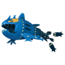
Holy shit, badass. Remember that the main body of Dhelmise is the seaweed, so the seaweed this time is coloured blood red, which... I think is meant to be based on the Sargassum algae and its famous red colouration. I love the bronze coloured anchor and the silver steering wheel. The regular Dhelmise always looks great with its choice of raggedly, drowned-wretch vibe, but shiny Dhelmise seems to really rock that 'vengeful spirit' vibe!


Okay, these are certainly different. The entire shiny Jangmo-o line gets a rather consistent shiny scheme of yellow and pink, with some dark-gray highlights and it's... it's certainly a bold colour choice? I'm not the biggest fan of their rather basic colour scheme, but I'm not sure if I prefer this either.


These guys all look cool! All four shiny Tapus go for a unified scheme where the main 'totem head' becomes black and white, and all of the highlights become a singular tone -- which is particularly noticeable for ol' Tapu Koko, where his giant saw-mohawk and tail is a nice shade of pale orange, which contrasts his original colouration.
But all the four Tapus look pretty great with the minimalist colouration. A+ from me.


Shiny Cosmog and Cosmoem are honestly quite whatever, and I can barely tell that they're different.
But shiny Solgaleo and Lunala go for a very simple colour change, swapping their primary colours for blood-red and keeping the yellow as their secondayr colours. I feel like the change is particularly stark for Solgaleo, though it's a bit too much for me? I do really like the shading on shiny Lunala.

Most of the Ultra Beasts get pretty great shinies! Shiny Nihilego... not so much, but it's an all right one. Changing the blue accents to a yellowish-gold is nice enough and looks good on its own.
...wait, is Shiny Nihilego mimicking Lillie's blonde hair?

I get the idea of what they're doing here. Only shiny Buzzwole's regular anatomy muscles get their colour changed, while the 'blood bag' inflatable muscles remain the same orange colour. Buzzwole has a fair bit of these blood bag muscles, however, and the chaotic mix of neon-green and orange doesn't make for a particularly cohesive shiny.

Huh, surprisingly cool! Shiny Pheromosa goes for an elegant lady in a black dress look... which also fits with the idea of an ugly black cockroach. Except it's only Pheromosa's body that gets turned into black, like she's wearing a tighly-fitting bodysuit.

Hmm, it's okay. He's blue instead of black, and that, I feel, is a colouration that a lot of cables sometimes use. I almost want them to go for the old-school stereo-audio-video colours -- those red, white and yellow ones... but those are cable heads instead of the actual cables themselves, right?

Oh, quite majestic, actually. Where regular Celesteela's colours are based primarily on the bamboo that contains Princess Kaguya, Shiny Celesteela seems to highlight the 'princess' parts of the anatomy with whites and teal border highlights, making it look a lot more majestic.

This is another one that I have to look up to see the difference. Basically all of the yellow 'wings' and inner-face details gets changed to gray or black, and... nope, sorry, Kartana. Your shiny's kind of unremarkable.

HOO HOO HA HA HA HA! Oh, this is badass. I unironically love this. Changing the black Guzzlord into white isn't rocket science, but I love that they kept the inner side of shiny Guzzlord's mouth blue, and he's even got a bunch of brown-orange lipstick! Pretty cool! I actually have one of these in Pokemon Go, and honestly, other than maybe the two bugs, this guy might be my favourite shiny Ultra Beast.


Hmmm. Shiny Necrozma goes for a dark blue, which hardly feels super-special. But both shiny versions of Dusk Mane and Dawn Wings bleaches the core Lunala/Solgaleo into a pinkish-white, as if the Necrozma's 'sucked' the colours from the base legendary. It's a bit less noticeable in Solgaleo, but the effect is particularly striking in Lunala. And, of course, shiny Ultra Necrozma goes ghostly-white, like it's truly epitomizing the meaning of a being created of otherworldly light.


Another favourite! Shiny Poipole being white and gold is a perfectly nice colouration for a weird alien baby to look like, very distinct from the original but works well on its own.
Shiny Naganadel, on the other hand, go full-on with the wasp colourations, and literally colours him as a dragon-wasp. Yellow and black! Now, I like their usual generic poison-monster purple paint scheme, but I do like the visual gag of the bee-looking monster being given a shiny that looks like a bee.

Mmmm, I'm not feeling it. The shade of yellow they picked for shiny Stakataka at least looks okay, and the neon-blue highlights are cute, but I kinda wished they went for brown instead? Or would that be too obvious?

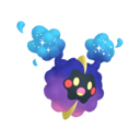
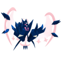
Glorious. Another obvious fan-favourite, shiny Blancephalon goes insane for the party, with a negative-colours disco light. The dark blue gloves and boots and that neck-frill thing works amazingly too, making Blancephalon look simultaneously more festive but badass at the same time.

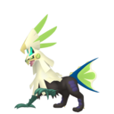
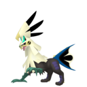
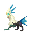
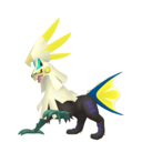
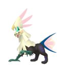
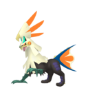
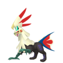
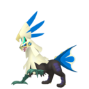
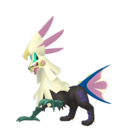
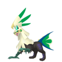
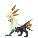
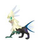
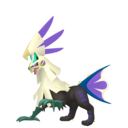
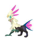
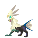
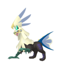
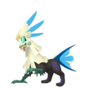
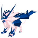
I admit, it's a pretty great colouration. White and teal looks great, and I honestly think I like it better than regular Zeraora's more generic 'lightning beast' look! I like this all around.


Shiny Meltan's got a blue wire instead of a red one. But otherwise the big difference is that shiny Meltan, Melmetal and Gigantamax Melmetal all just have a slightly more orange-hued gear instead of a yellow one. Disappointing, and kind of a sad end to what's otherwise been probably the best shiny generation so far.
No comments:
Post a Comment