And this is part two of my review of the first set of Magic the Gathering, known as either 'Unlimited', 'Alpha' or 'Beta' depending on which print run. This is an article I wrote a half-decade ago which I refurbished and rewrote huge chunks of. I've since played a lot of MTG and have a better understanding of the game and its history in general, and when I went back to reread my old work I realized that there's a lot to be redone.
And besides... one thing that influences why I'm doing this is that the last couple of years have been quite big for MTG in both good and bad ways. The state of the franchise isn't the best right now with so much crossover product being pushed by the designers, but I feel like several of the most recent sets have been a huge kick that revitalized the franchise.
And in the first part of my series covering the Alpha set, I covered the Black, Blue and Green colours and went through a lot of the basic concepts in MTG like the card types and colour identity. Since Alpha is a huge set, I split it into two articles! Depending on how much I have to talk about future expansions, some of them might also be split into two. The format of these articles has me talk about the cards that I find the most flavourful and the ones I can talk about the monster designs -- which would be quite a bit in these earlier sets; and then do a rapid-fire card dump at the end.
I am a bit better than I was in 2019 in talking about card effects, but these reviews are primarily flavour-first, and gameplay a distant second. I will try to acknowledge things that are relevant in MTG's long history (and not just dismiss the Moxes entirely as our good commentor in this article circa 2019 pointed out) but the scope of the review would still be primarily creature-based.
With that said, let's go through the Red and White colours, and cap it off with colourless artifacts!
[Originally published May 2019 as 'Unlimited Pt. 2'; revised November 2024.]
______________________________________________Red
Red is the colour of warfare, barbarism, and the 'Hulk smash' school of combat. It's heated emotions, and the super-manly clash of warrior against warrior, of martial warfare, of explosive battlefields -- to be contrasted with the more regimented order of White or the sneaky assassinations of Black. In gameplay, Red also ends up being the colour with the most aggressive cards -- early-game minions and direct-damage spells.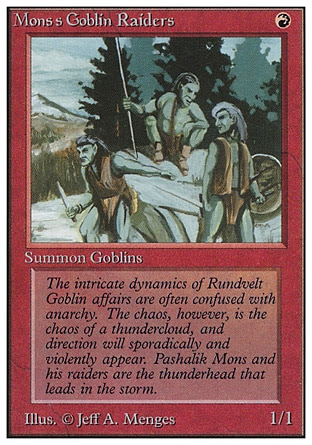
We have talked about 'iconic creatures' in each colour that was introduced in Alpha. But I think none are quite as enduring as elves in Green and goblins in Red. Red would experiment with a bunch of other creatures over the years -- minotaurs, dwarves, orcs -- but goblins would remain as one of the most consistently enduring races over the many, many different expansions. It would, like everything else in MTG, take some time for goblins to actually reach what the modern MTG audience would recognize as silly goblins. Take a look at the most basic goblin, the vanilla card Mons's Goblin Raiders, who, if not for the card text pointing it out, could just as well as be handwaved as orcs, trolls or even barbaric elves. We also have something that's quite consistent in older MTG sets -- the card name and card flavour text mention a 'Pashalik Mons', who wouldn't actually appear on a card until 2019, more than 25 years since the printing of his name on a card.
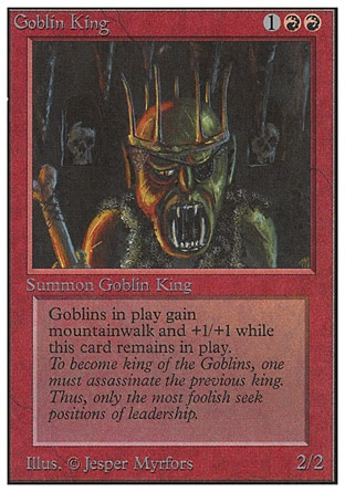
The local flavour of lord, the Goblin Lord, is a typical drawing of a 'savage goblin'. And goblins are supposed to be a bit more brutish and barbaric, but this was a fair bit before MTG really redefined the flavour of their goblins. Just like the other lords we've seen in the other three colours, the Goblin Lord is able to buff the aura of other goblins on the battlefield as long as he is screeching there. A nice little flavour text, too, describing the treacherous way that each subsequent goblin king assassinates his predecessor to get the position. Presumably those skulls on his throne are the previous kings!
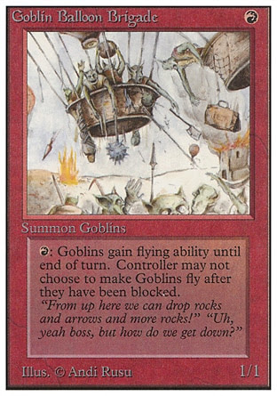
There we go with what I would associate more with a 'MTG goblin'. The Goblin Balloon Brigade is such a nice bit of whimsy. The inherent idea of attacking with a hot air balloon is already hilarious enough, moreso than if the goblins used a more po-faced flight spell or if they rode on wyverns or whatever. But hot-air balloons! And they're dropping weapons, which is fine. You see swords, spiky clubs and axes dropped down... and a suitcase. For some reason! I also love the goblins on the ground panicking and running away. They could be a rival goblin village, but knowing goblins, they're just as likely to be the unfortunate result of friendly fire.
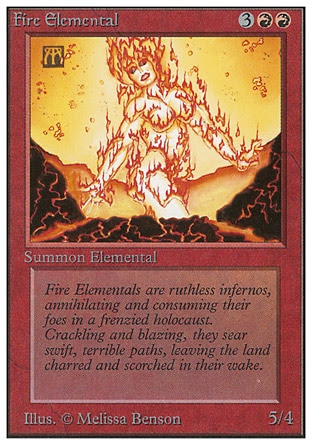

We've seen elementals in Blue (and thanks to creature-type retcon, in Green), but red also gets some elementals. Fire and Earth show up here, completing the quadfecta of classical elements. Unlike the Air and Water Elementals, however, the two Red-aligned elementals are completely vanilla creatures with no effects. I guess it's an attempt to make Red be a simpler deck to play, but that's not exactly the gameplay flavour of Red, is it?
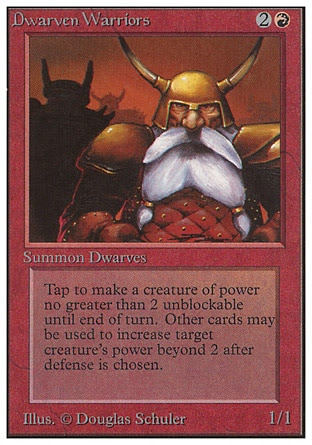
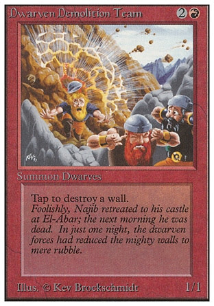
Dwarves also show up a fair amount in Red, and considering the original Magic was just the most basic medieval fantasy, Lord of the Rings demands that the dwarves show up. Dwarven Warriors is honestly kind of minimum-effort compared to the three elves we got in Green, though. It's just the most basic dwarf warrior you could think of.

I am genuinely surprised to find that in a fantasy set, we only get two dragons! One of them is a baby! Dragon Whelp looks gloriously goofy with that expression. I love the little bucktooth he has, the one crooked wing, and the fact that he's just sitting there like a fat baby. The best detail that the artist put in is the bellybutton -- which doesn't make sense since the artwork shows that he hatched from an egg. But it's still hilarious! Very children storybook-y. I like it.



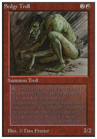
Yet another common 'savage brutish monster' is the troll -- and trolls are one of those fantasy tropes that has the widest interpretations. These guys are just misshapen brutes, though, and later expansions would migrate the trolls to Green.

More mythical creatures! Another creature that would later be more associated with the colour Green are hydras, but the very first hydra was in Red. The Rock Hydra has an... interesting artwork. It's kind of interesting that the way that the designers pick the flavour for the hydra's head regeneration is by having it made up of an elemental substance -- being rocks. The effects of the Rock Hydra is that it becomes stronger based on how much mana is spent to cast it, and the caster can pump even more heads to regrow the heads. Not the most mana-efficient, but nice in a flavour standpoint.


We have the two obligatory walls for Red. The Wall of Fire is literally just a wall of fire casted by a pyromancer or something. We haven't really seen it through the creatures above, but Red is very much associated with flames and fireball spells.
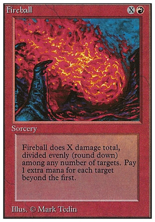
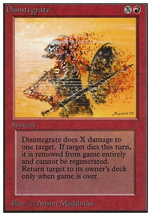
And there are a lot of Red spells that just deals damage to targets -- not just creatures, but also the players. We have a bunch after the break, but I think Fireball and Disintegrate are two of the most iconic ones, which can scale up a lot depending on the amount of mana you're spending.
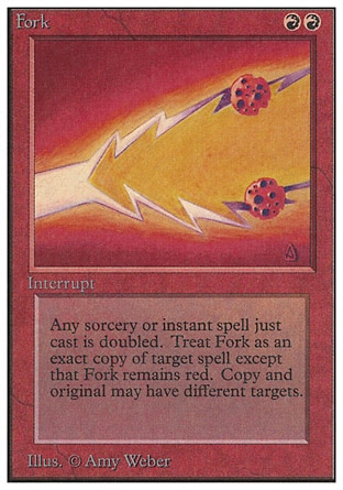
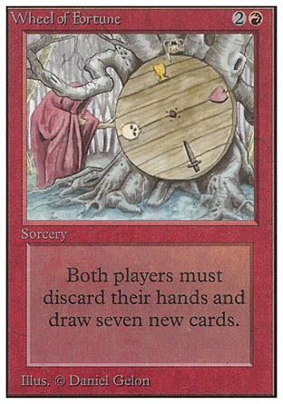
A lot of the Red spells have cool art but are ultimately very similar, and the original version of this article was quite repetitive thanks to me trying to equalize the amount of cards I speak in the main body of the article for each colour. That's a mistake, and my own frustration bled off the reviews. Love Fork, though. It's such a simple drawing of a lightning spell branching into two, but the ismple artwork of the Fork spell and the two targets -- probably meant to be meteors, but they end up looking like choco-chip cookies.
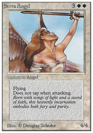
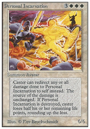
We'll start off with the two most interesting creatures in White... the first being one of the strongest creatures in this set, the Serra Angel. She is a 4/4 with Flying and an effect that would later become 'Vigilance' -- meaning that the Serra Angel doesn't untap when attacking. This allows her to be available to defend when the turn passes over. Design-wise, an angel is basically one of the most 'holy' creatures you can have as an equivalent to red's Shivan Dragon or black's Lord of the Pit. Neat!
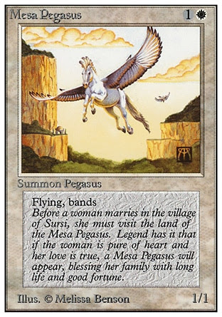
Variety is the spice of life for this original set, and in this fantasy soup setting, the Mesa Pegasus is basically an animal-angel thing, isn't it? The Mesa Pegasus has 'Flying' and 'Banding', with Banding being a mechanic I briefly described in Green but is way more prevalent in White -- the idea is that as the colour of the 'plucky hero', White is able to gather a bunch of weak but dedicated heroes to fight against a singular giant dragon or wurm. The Mesa Pegasus is apparently part of a ritual to check the purity of heart of women, something that's normally associated with unicorns.


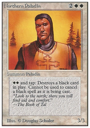
And we've got a bunch of humans. White has a dearth of creatures in Alpha, for a reason that you'll see after the break. Northern Paladin is just a guy in traditional crusading outfit. He has the ability to instantly destroy a Black permanent.
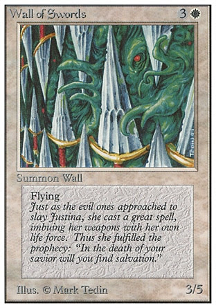
I love that for how muted White has been in terms of creature design, their obligatory wall, the Wall of Swords, is quite interesting. It's a bunch of broad swords, and that's honestly rather unexpected instead of having a wall of light or a castle wall or something. These magical flying swords are powerful enough to stop the 'evil ones', being these strange tentacle-ooze monster that's trying its best to squirm through the swords. Very neat artwork!


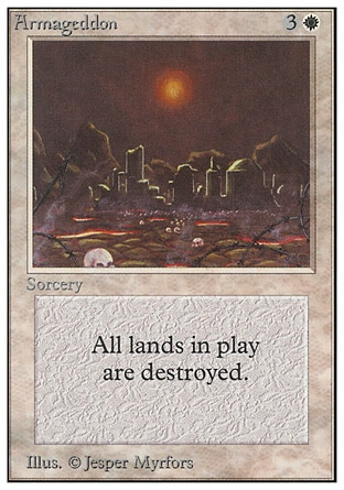
Of course, White isn't always nice and protective. They're also the colour of divine judgement, with Armageddon being perhaps one of the most devastating spells if you don't see it coming. All lands are destroyed, which just wipes out everyone's ability to cast spells -- and especially if you don't have any more lands in the field. Great artwork of an ominous sun above a war-blasted city with skulls all around it.
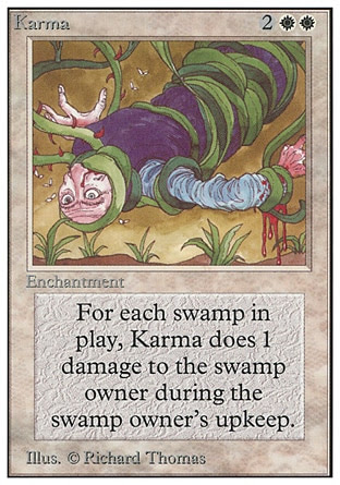

Karma is a pretty flavourful thing to give to the White class. I just really want to know what thing this poor sap did that the equivalent karma is having spiky rose vines wrap him up and slowly choke him to death. This one interacts with Swamps, which is another showcase of White having a lot of anti-Black-mana counterpays
This particular artwork of Swords to Plowshares isn't the most exciting thing (and this is one of those cards that gets reprinted over and over again), but I like the idea of White essentially forcing an enemy knight to repent and convert to pacifism, becoming a lowly, peaceful peasant tilling the fields.
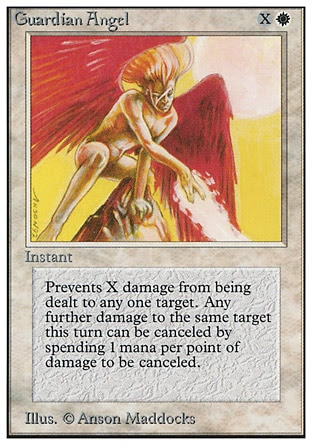
I'll close White off with two pretty neat artwork. Guardian Angel showcases a more interesting angel than Serra Angel, even though he's naked (albeit without genitalia). The red wings and flaming hair make the difference! The idea is that the Guardian Angel is intervening to block a certain amount of damage.

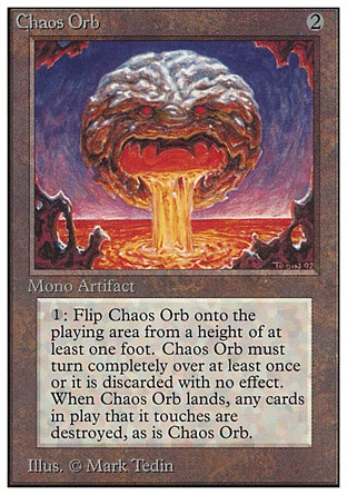

Chaos Orb here is famous for having a shitballs-crazy effect -- physically flip the Chaos Orb card into the air, and it will destroy whatever card it touches. Obviously, it's a horrible effect to actually do on a physical card game, and there are urban legends of people ripping up Chaos Orb to rain it down upon the gaming table. Nowadays these sort of 'dexterity cards' have been banned alongside the ante cards, only relegated to joke sets. The artwork is pretty psychedelic, isn't it? It's supposed to be an 'orb', but it also kind of resembles a moon, or a brain, or a meatball. It's got a creepy demon face engraved onto it, and it's vomiting out... lava? Okay!
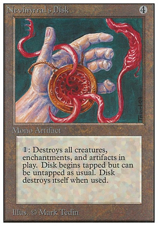
I don't know who Nevinyrral is! We do now, he's a zombie wizard! His card was printed after this article was initially published in 2019! But Nevinyrral's Disk is certainly a nasty looking disk with a demonic Sarlacc mouth within it, and nasty demonic elder-god tentacles pouring out of it. It sure destroys a lot of things in play -- those must be far-reaching tentacles!
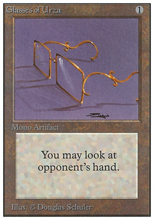
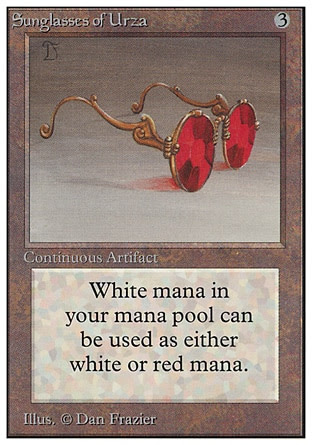
I'm obligated to include these two items, since they refer to one of MTG's main characters, Urza. One of the most prominent characters in MTG, and he will be a major main character in the novels that tied into a lot of the early expansions. And how did we first find out about him? His eyewear. The Glasses of Urza, and more gloriously, Sunglasses of Urza.
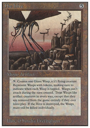

The Hive is just a gigantic hive that is... somehow counted as an 'artifact'. But it's a nest that spawns giant wasps? I'm not sure if this card was designed in a modern set would be anything but a Land or an Enchantment of sorts. Are these robotic giant wasps? Like, Insecticons from Transformers or something? There are some blue highlights on the very long-legged insect creature in the foreground, but it's really kind of ambiguous whether it's a robotic or clockwork creature, or if it's just the gloss from the insect exoskeleton.


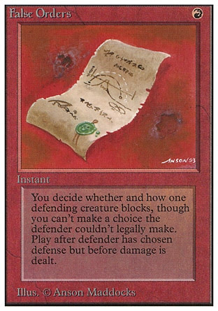
Burrowing has a giant mole-dinosaur monster that looks like it would be an enemy for an early Super Sentai series. I like it. It's goofy. False Orders being a Red card is a fun little flavour of military tactics. I like the crude drawings done on the parchment. Did an orc draw it?
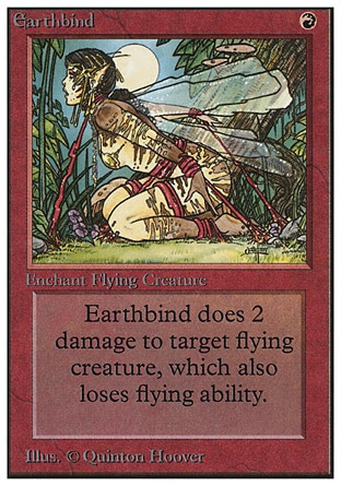
That artwork for Earthbind is really... uh... something. Not to be crass, but someone in the office had bondage on their mind that day, huh?
















Illusionary Mask is one of the cards that started a poorly-defined 'cards face-down' effect that wouldn't be properly integrated into MTG until Morph almost a decade later.








There we go with what I would associate more with a 'MTG goblin'. The Goblin Balloon Brigade is such a nice bit of whimsy. The inherent idea of attacking with a hot air balloon is already hilarious enough, moreso than if the goblins used a more po-faced flight spell or if they rode on wyverns or whatever. But hot-air balloons! And they're dropping weapons, which is fine. You see swords, spiky clubs and axes dropped down... and a suitcase. For some reason! I also love the goblins on the ground panicking and running away. They could be a rival goblin village, but knowing goblins, they're just as likely to be the unfortunate result of friendly fire.
Love the flavour text, too. "Yeah, boss, but how do we get down?"
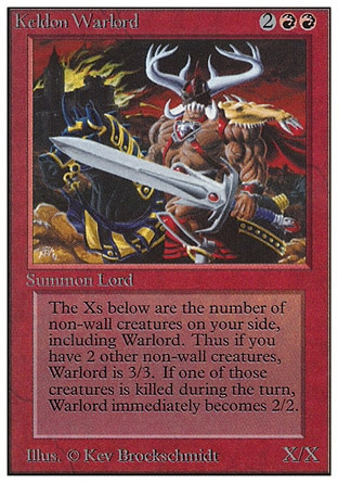
Keldon Lord is a bit weird in this early set since even his creature type identifies him as a 'Lord' (the Lord type itself being retired by modern magic) but his effects are completely different from the Goblin King or the Lord of Atlantis, where instead of buffing other creatures, he gains power by the amount of creatures on your side. Design-wise he's your archetypal representation of a badass, '90's XTREEM barbarian. Rippling muscles, over-the-top WoW shoulderpads, gigantic horns, big sword, black horse, and a burning castle in the background. What more do you need?
Also, one thing that I didn't have a chance to point out in the first article is how... inconsistently wordy a lot of the cards in the original first couple of sets are. As MTG standardizes its rules and how they were worded on the card, Keldon Warlord's little novella we got there, we would have it simplified as "This creature’s power and toughness are each equal to the number of non-Wall creatures you control."


We've seen elementals in Blue (and thanks to creature-type retcon, in Green), but red also gets some elementals. Fire and Earth show up here, completing the quadfecta of classical elements. Unlike the Air and Water Elementals, however, the two Red-aligned elementals are completely vanilla creatures with no effects. I guess it's an attempt to make Red be a simpler deck to play, but that's not exactly the gameplay flavour of Red, is it?
Fire Elemental is just a sexy lady made up of flames rising out of a volcano, which is... not the most interesting way to do an elemental. The more common 'genie made up of a substance' is played out in fantasy, and MTG would really stretch the definition of what an Elemental could be, but just making them look like humans is kind of boring.
Earth Elemental is also not super-interesting, though I really like his very uncomfortable-looking pose. He's almost doing a sumo pose right there, yeah?


Dwarves also show up a fair amount in Red, and considering the original Magic was just the most basic medieval fantasy, Lord of the Rings demands that the dwarves show up. Dwarven Warriors is honestly kind of minimum-effort compared to the three elves we got in Green, though. It's just the most basic dwarf warrior you could think of.
Dwarven Demolition Team is a lot more flavourful. I'm not sure which franchise grandfathered the idea that dwarves or goblins or gnomes are pyromaniac explosion enthusiasts, but the card art for the Demolition Team here is very fun! Well, not so fun for that poor blonde dwarf, but I like that this is a group of dwarves that's specifically attuned to fight against the many Wall creatures that run around in early-era MTG.


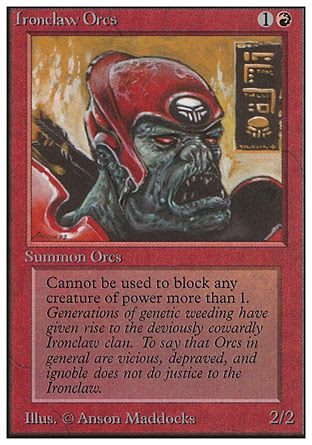
Orcs are another race that's associated with Red, who take the basic LOTR idea of them beeing green-skinned, ugly brutes. Ironclaw Orcs are noted to be 'deviously cowardly' due to generations of genetic weeding, and this is reflected with the fact that the Ironclaw Orcs refuse to block any creature that has power greater than 1... which, honestly, considering that anything more than 1 will kill the Ironclaw Orcs, seems to make it look smart more than anything.
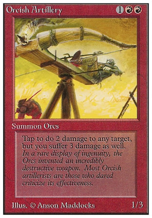
The Orcish Artillery also has some of the black comedy in Red that would later be shunted over to goblins, but I love the artwork here as the orc is operating this gigantic ballista in the most unsafe way ever. Love the flavour text describing that anyone who criticizes the artillery machines get forced to work on them, and while the Orcish Artillery can damage the enemy, they're so destructive that the Red player also get damaged by it.


I am genuinely surprised to find that in a fantasy set, we only get two dragons! One of them is a baby! Dragon Whelp looks gloriously goofy with that expression. I love the little bucktooth he has, the one crooked wing, and the fact that he's just sitting there like a fat baby. The best detail that the artist put in is the bellybutton -- which doesn't make sense since the artwork shows that he hatched from an egg. But it's still hilarious! Very children storybook-y. I like it.
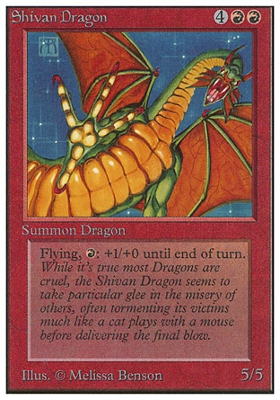
Shivan Dragon is one of the more iconic creatures from original Red, being a large green-and-gold monstrous dragon swooping down at you. The Shivan Dragon's flavour text describes it as a particularly sinister and cruel dragon that torments its prey. It's honestly something that's not super interesting other than the novelty of being the first dragon. Both Shivan Dragon and Dragon Whelp has a similar effect -- spend one red mana to give them more power, with the nice additional disadvantage that the Whelp dies if you pump too much power into it in one turn.


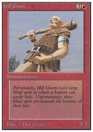
A bunch of giants, now, with... not very giant stats. I tend to find giants to be quite uninteresting to talk about since they're just big dudes. Hill Giant is just a big bald dude with leather armour and a big spiky club. Not a whole ton to say here!
The Stone Giant -- and presumably they're slightly inspired by original D&D's giant classifications -- is a muscular, half-naked bearded guy. His effect is actually hilarious, though. The Stone Giant can be tapped to make another creature have 'Flying'... for one turn, and then it's destroyed. This represents the Stone Giant chucking one of your other creatures into the sky to block or fight an attacking airborne foe, but then that poor creature dies when it crashes down to the ground! That's funny.


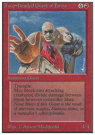
The Two-Headed Giant of Foriys is a two-headed giant with a slightly more elaborate tabard. He's basically a D&D 'Ettin', isn't he? The Two-Headed Giant can block two attacking creatures and has Trample, which highlights just what a big boy he is. Ignore the 4/4 statline, please. Love the flavour text: "None know if this Giant is the result of aberrant magics, Siamese twins, or a mentalist's schizophrenia".
The Gray Ogre not quite a giant, but he's an ogre. The lines between ogres and giants tend to be blurred, but ogres tend to be only slightly larger than humans and a lot more brutish. He sure is a guy with tusks and a spiky club. I like the flavour text, who describes, of all things, the 'ogre philosopher' called Gnerdel, who refuses to eat vegetarians and wants to eat those who eat meat because it's higher up on the food chain. Ogre logic!


Yet another common 'savage brutish monster' is the troll -- and trolls are one of those fantasy tropes that has the widest interpretations. These guys are just misshapen brutes, though, and later expansions would migrate the trolls to Green.
Uthden Troll is a really ugly, gray troll with oversized ears and nose, a snarling face and lumpy limbs. Just like Dragon Whelp above, there's a nice traditional children's storybook quality to him that's helped by the little poem of a flavour text. Both trolls have the 'Regenerate' ability, which allows them to regain health and prevent death by paying that cost. Many fantasy trolls tend to have high-speed regeneration of wounds to set them apart from other brutish enemies, so it's nice that these guys have a bit of an identity even early on.
The Sedge Troll is a more traditional take on fantasy trolls, being a hunchbacked, green-skinned, warty tall man with an ugly, fanged face. This one gets stronger if you control a Swamp, one of the few cards in this early expansion that rewards multiple colours in a single deck -- which is flavourful for a troll, too!
It's a minotaur! A vanilla 2/3 minotaur. It's a rather realistic cow-face that they're drawing, with a lot of fancy tribal tattoos. It's a relatively simple monster archetype, but I like the flavour text of Hurloon Minotaur establishing the minotaur race as a spiritual people. After so many descriptions of brutish dumb non-human muscleheads, it's nice to have this.
Granite Gargoyle! Later expansions would associate Gargoyles as being 'artifact creatures', or put them in White, but anything that's not an animal but is a savage monster gets lumped into Red, I suppose. It's a pretty cool artwork, a panther-bull sleek creature with wings. It's a bit different from the stone devils perched on the sides of buildings that are commonly depicted in media.
My favourite part of this card is the flavour text -- which is an advice on how it can be cooked, with credits to some dude with a gloriously long name called "Asmoranomardicadaistinaculdacar", who wrote the Underworld Cookbook... a brick joke that took until 2021 to pay off, when ol' Asmo was made into a card that interacted with food. This is why I love this franchise. The makers are such geeks.


More mythical creatures! Another creature that would later be more associated with the colour Green are hydras, but the very first hydra was in Red. The Rock Hydra has an... interesting artwork. It's kind of interesting that the way that the designers pick the flavour for the hydra's head regeneration is by having it made up of an elemental substance -- being rocks. The effects of the Rock Hydra is that it becomes stronger based on how much mana is spent to cast it, and the caster can pump even more heads to regrow the heads. Not the most mana-efficient, but nice in a flavour standpoint.
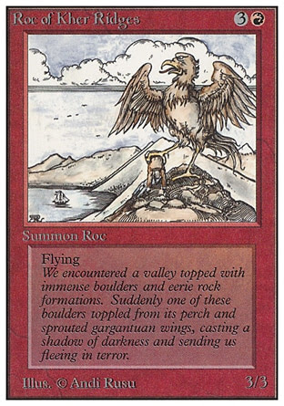
The Roc of Kher Ridges is a roc! It's a giant bird. That's neat! I really don't have a whole ton to say about it other than the neat artwork of it holding a dead person in its talons. The flavour text tries to make a rock/roc pun, which... eh, not the funniest pun.


We have the two obligatory walls for Red. The Wall of Fire is literally just a wall of fire casted by a pyromancer or something. We haven't really seen it through the creatures above, but Red is very much associated with flames and fireball spells.
The Wall of Stone, meanwhile, are just... the walls around some random city. That's kind of boring, Wall of Stone! You don't look magical! You're a literal wall! How are you a creature?


And there are a lot of Red spells that just deals damage to targets -- not just creatures, but also the players. We have a bunch after the break, but I think Fireball and Disintegrate are two of the most iconic ones, which can scale up a lot depending on the amount of mana you're spending.
Disintegrate has a very cool artwork of that guy being reduced to utter dust. Unless I missed a card, I think this is the card that first has the 'exile' effect. Exiling is basically the thing that happens in the game when you're killed so dead that your card doesn't go into the graveyard, it's straight up removed from the game. While later expansions would flavour exiling as being dimensionally displaced, in this card's case it just means that your corpse is so atomized that you can't be resurrected.


A lot of the Red spells have cool art but are ultimately very similar, and the original version of this article was quite repetitive thanks to me trying to equalize the amount of cards I speak in the main body of the article for each colour. That's a mistake, and my own frustration bled off the reviews. Love Fork, though. It's such a simple drawing of a lightning spell branching into two, but the ismple artwork of the Fork spell and the two targets -- probably meant to be meteors, but they end up looking like choco-chip cookies.
And in-between so many fireball spells, we've got the glorious Wheel of Fortune. It's a spinning spell! A cloaked figure spins around a wooden wheel that either lands on a chalice, a skull, a sword or a heart. It's a bit out of place to see so early on in a 'regular fantasy' set, and I find it quite hilarious. The effect is surprisingly powerful, too -- forcing both players to discard their hand and redraw a full hand. Done well, the Red player reloads his/her hand, but the main factor is that you can force your opponent to discard their hand!
That's it for Red, and I do think I left a huge chunk of spells for after the break. A lot of them really do the same thing of dealing damage, so there's not a whole ton for me to talk about.
_________________________________________________
White
We reach the final colour, White, which... again, I'm not just saying it to be 'edgy' about how the good guys are lame and the bad guys are cooler. Which is true, by the way, but a very common complaint that I'll have about early MTG is that the White cards tend to be so boring to talk about. They are about priests, paladins, knights and angels, and all that fantasy revolving around clerics and paladins. This being the first set means that I have a fair bit to say, but I also do really think that at least until we branch out of the Dominaria sets, White will probably be the singular colour that I will have the least to say about in any expansion.


We'll start off with the two most interesting creatures in White... the first being one of the strongest creatures in this set, the Serra Angel. She is a 4/4 with Flying and an effect that would later become 'Vigilance' -- meaning that the Serra Angel doesn't untap when attacking. This allows her to be available to defend when the turn passes over. Design-wise, an angel is basically one of the most 'holy' creatures you can have as an equivalent to red's Shivan Dragon or black's Lord of the Pit. Neat!
The Personal Incarnation is fun! As an 'avatar incarnation', the Personal Incarnation can absorb damage done to the caster, while itself also acting as a 6/6 creature with all that entails. And when the Incarnation is destroyed, the caster loses half of his/her life points. This thing is basically a JoJo's Bizarre Adventure Stand, isn't it? I like the art, too, and the fantasy of the frail wizard shadowed in the cliff in the background creating a giant musclebound avatar to wreak havoc against the band of warriors.


Variety is the spice of life for this original set, and in this fantasy soup setting, the Mesa Pegasus is basically an animal-angel thing, isn't it? The Mesa Pegasus has 'Flying' and 'Banding', with Banding being a mechanic I briefly described in Green but is way more prevalent in White -- the idea is that as the colour of the 'plucky hero', White is able to gather a bunch of weak but dedicated heroes to fight against a singular giant dragon or wurm. The Mesa Pegasus is apparently part of a ritual to check the purity of heart of women, something that's normally associated with unicorns.
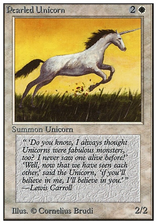
Speaking of unicorns... Pearled Unicorn! It sure is a unicorn, and it sure is a vanilla 2/2 creature. It's got a Lewis Carroll passage, though. That's cute.


Savannah Lions are one of the cheaper creatures in White, and they're stuck in White because lions are the animals representing nobility and knighthood. That's neat, even if this specific piece of art always does a little visual trick of me where the pouncing lion looks gigantic. It's not! It's just a regular lion! But the second lion in the background sometimes looks like he's in the foreground.
Also worth noting that while these guys had the creature type of 'lions', the Great Creature Type Update would turn all lions and large predatory cats into just 'Cat'. Which is really weird to me, since 'pegasus' and 'unicorn' didn't get folded into 'horse'. 'Wolf' didn't get folded into 'dog'. Rats, mice, squirrels and raccoons remain separate. What made 'cat' so important as a tribe?
The opposite twin of the Black Knight that we started this set talking about is the White Knight, who has First Strike and Protection from Black. This guy is a rather traditional medieval knight, with a tabard and a horse covered with one of those horse caparisons that look like bedsheets. We'll have a lot of knights in White, but this is the first.


And we've got a bunch of humans. White has a dearth of creatures in Alpha, for a reason that you'll see after the break. Northern Paladin is just a guy in traditional crusading outfit. He has the ability to instantly destroy a Black permanent.
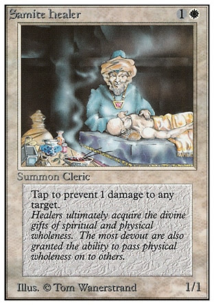
Samite Healer is an old man that heals the sick, and that fits with the cleric trope in a fantasy setting. Instead of just merely healing health, however, the Samite Healer prevents damage instead. It's pretty basic fantasy for the paladin/priest colour.


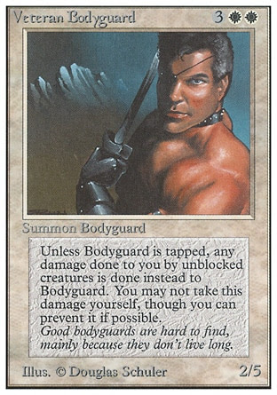
Veteran Bodyguard is a naked, muscular man with an eyepatch. He's just some dude, but I like the flavour that he's such a dedicated bodyguard that will jump in the way of any incoming damage dealt to the player. You can't prevent the bodyguard from doing so, because he is that dedicated. I like that flavour.
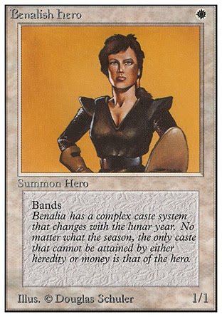
The Benalish Hero is soldier in armour. She... she exists. She bands. She doesn't get a background in her card art. More cards from the nation of Benalia would appear in White over the years, but that doesn't really make Benalish Hero herself particularly interesting. Neat little backstory, though.


I love that for how muted White has been in terms of creature design, their obligatory wall, the Wall of Swords, is quite interesting. It's a bunch of broad swords, and that's honestly rather unexpected instead of having a wall of light or a castle wall or something. These magical flying swords are powerful enough to stop the 'evil ones', being these strange tentacle-ooze monster that's trying its best to squirm through the swords. Very neat artwork!
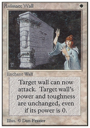
All walls normally can't attack -- something found in the rulebook in earlier versions, while the reprints would keyword it into 'Defender'. But Animate Wall allows the walls to attack! And... look at the sheer goofiness of this guy. It's a brick wall with a grumpy face, the stubbiest baby arms on the sides, and two feet that barely grow out of the lower corners. That's glorious. I think that's my favourite artwork in all of White's original set of cards.


I like the flavour of Island Sanctuary, where at any time, you can hide your forces in an island sanctuary safe from almost all creatures other than those that have Islandwalk. That's an interesting effect for sure.
A card that I'm sure is banned now is Balance, which in theory fits with White's themes of order and justice and balances out the scales to equalize the battlefield... but in reality is just utterly soul-crushing for certain deck types that want to go wide. I like the design of this guy's funky helmet, though, and that's a cool-looking pair of scales.


Of course, White isn't always nice and protective. They're also the colour of divine judgement, with Armageddon being perhaps one of the most devastating spells if you don't see it coming. All lands are destroyed, which just wipes out everyone's ability to cast spells -- and especially if you don't have any more lands in the field. Great artwork of an ominous sun above a war-blasted city with skulls all around it.
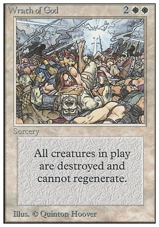
Wrath of God does something similar but to creatures, and you can see the deity's scowling face etched in the clouds as the orcs and humans all topple over and dead. White is the colour with the most removals in gameplay terms, and has the strongest board-wipes.


Karma is a pretty flavourful thing to give to the White class. I just really want to know what thing this poor sap did that the equivalent karma is having spiky rose vines wrap him up and slowly choke him to death. This one interacts with Swamps, which is another showcase of White having a lot of anti-Black-mana counterpays
This particular artwork of Swords to Plowshares isn't the most exciting thing (and this is one of those cards that gets reprinted over and over again), but I like the idea of White essentially forcing an enemy knight to repent and convert to pacifism, becoming a lowly, peaceful peasant tilling the fields.


I'll close White off with two pretty neat artwork. Guardian Angel showcases a more interesting angel than Serra Angel, even though he's naked (albeit without genitalia). The red wings and flaming hair make the difference! The idea is that the Guardian Angel is intervening to block a certain amount of damage.
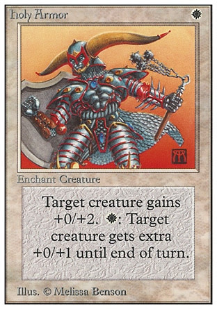
Holy Armour represents how White has a bunch of spells that buff creatures, but I'm mostly tickled by the utterly ridiculously gigantic horns on this guy's helmet, the disproportionately large shield, and the colour scheme of his armour. No wonder it's only increasing this fellow's toughness!
And we're done with White, but there's a lot of White spells that I'll discuss after the break. The thing with White is that it's the colour that tries to counter specific colours, meaning that a huge chunk of White's original set of cards are colour-specific Circles of Protection and stuff, which does take up a lot of card space.
_________________________________________________
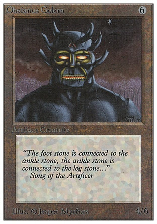
There are a couple of Artifact Creatures even in this first set, and they tend to be flavoured as artificial beings brought to life by magic or by other means. The Obsidianus Golem is a cool-looking golem, a jet-black obsidian statue with glowing eyes and mouth that looks alive. It's just a vanilla creature.
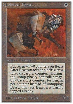

Clockwork Beast is a bit more interesting visually, thanks to the artwork which is a fair bit more stylized. It looks like a weird dog, but if you told me that it's a weird geometry dinosaur-beaver, I wouldn't blame you. It works with the idea that this is an artificial creature animated with fantasy clockpunk technology. The idea of its effect that it will constantly lose its +1/+0 counters and become weaker after every combat, representing either pieces falling off or simply the clockwork energy going off, but you can inject some mana to rejuvenate the power. A later interpretation makes the Clockwork Beast super-badass and nightmarish, reminding me of something from Phyrexia, but I like the goofiness of the original Clockwork Beast more.
_________________________________________________
Colourless (Artifacts)
In addition to the five main colours, the original set also has 'colourless' cards, with all of the original ones being 'Artifacts' -- which doesn't need any specific mana colour to cast. The idea is that these are generic magical items or objects that just need to be activated -- not a specific type of creature of spell that requires a certain type of thinking or specific version of magic to channel. It's neat, and you can see how this has influenced other games with factions -- Pokemon also having 'Colourless' to represent the video game's Normal-types; while Hearthstone and Elden Ring having 'Neutral' creatures that can go into any of their factions.
For the sake of these review, though, a lot of the Artifacts will go after the break. Artifacts are great from a mechanic standpoint, but this is a 'reviewing monsters' article first and foremost, and short of discussing each effect in painstaking detail, I'm not really going to have much to say until more Artifact Creatures come along, and that's not going to be for a while.


There are a couple of Artifact Creatures even in this first set, and they tend to be flavoured as artificial beings brought to life by magic or by other means. The Obsidianus Golem is a cool-looking golem, a jet-black obsidian statue with glowing eyes and mouth that looks alive. It's just a vanilla creature.
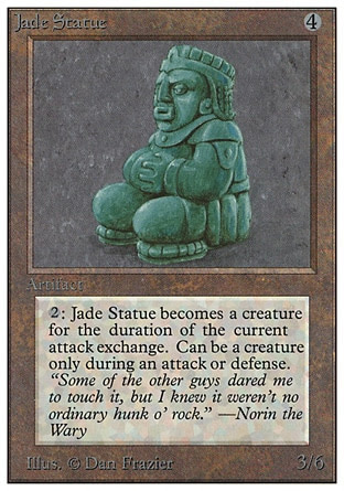
Looking very Asian, the Jade Statue is a praying statue that isn't always a creature -- it's only a creature if you pay some mana cost for it to pop out and fight for a single battle round. That's not the most efficient design. Early on, artifact creatures aren't super-duper useful and are meant to be a neutral but less-efficient alternative to the coloured creatures.


Clockwork Beast is a bit more interesting visually, thanks to the artwork which is a fair bit more stylized. It looks like a weird dog, but if you told me that it's a weird geometry dinosaur-beaver, I wouldn't blame you. It works with the idea that this is an artificial creature animated with fantasy clockpunk technology. The idea of its effect that it will constantly lose its +1/+0 counters and become weaker after every combat, representing either pieces falling off or simply the clockwork energy going off, but you can inject some mana to rejuvenate the power. A later interpretation makes the Clockwork Beast super-badass and nightmarish, reminding me of something from Phyrexia, but I like the goofiness of the original Clockwork Beast more.
The Juggernaut initially seems to just be some kind of a siege engine pushed by an ogre or something. But it's apparently not! It's an artifact creature still, and the flavour text notes its 'gigantic head', which gives the implication that the upper-body we see here is actually part of the artifact creature's anatomy. I find it a bit more disturbing than other interpretations of the Juggernaut, which tend to go with either just a siege engine or a giant Warhammer 40K metal-monster thing.


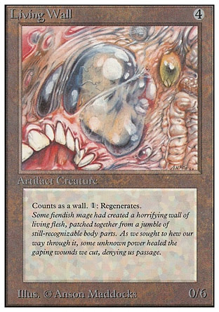
Easily the most horrifying piece of art in the entirety of Alpha is colorless's wall, the Living Wall. Wow, look at this thing. How is this an 'artifact' creature? It's a wall made entirely of flesh, and as its effect and flavour text notes, it constantly regenerates like a sick, nasty version of Wolverine's Healing Factor. Look at this thing. It's supposed to 'just' be a wall of flesh, but it looks more like a tumorous abomination that you see Elder Gods create. Look at this thing. Eyeballs, intestines and teeth all curled up here and there... and in the center of it all is something that isn't a giant malformed eyeball, but an embryo in an amniotic sac. WHY, evil wizards? That's fucked up!
Sheesh. We're going to go deep into the actual artifacts now, and let's go with me acknowledging Sol Ring. It's a ring made out of fire and/or soul energy, and it gives you two mana. It's simple, but it's also one of the most often-reprinted cards in a lot of pre-constructed decks, so there you go. One of the oldest but still most fair and relevant cads. It sure is a magic ring!


Chaos Orb here is famous for having a shitballs-crazy effect -- physically flip the Chaos Orb card into the air, and it will destroy whatever card it touches. Obviously, it's a horrible effect to actually do on a physical card game, and there are urban legends of people ripping up Chaos Orb to rain it down upon the gaming table. Nowadays these sort of 'dexterity cards' have been banned alongside the ante cards, only relegated to joke sets. The artwork is pretty psychedelic, isn't it? It's supposed to be an 'orb', but it also kind of resembles a moon, or a brain, or a meatball. It's got a creepy demon face engraved onto it, and it's vomiting out... lava? Okay!
I just really like the art in Mana Vault. It's this fleshy, Hellraiser-looking cube of maybe-flesh, suspended over a gaping void with a bunch of chains leading up to it. Around it are yawning caverns in wherever the heck the Mana Vault is suspended. It's creepy... but all we know is that it makes mana. One big problem that makes these artifacts so boring is that they don't have any real description about lore.


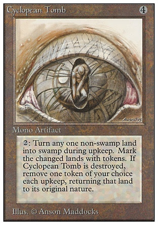
I really lie the surreal Cyclopean Tomb. Is it called that because the prison is shaped like a giant organic eye, or that it's a prison for cyclopses that just happen to be shaped like an eye? Or is it a cyclops being used as a tomb? A humanoid figure is stuck in the center of the pupil, and the texturing of the eyeball can go either-way on whether this is an inorganic structure or a particularly giant eyeball of some immensely large cyclops. Its effect has nothing to do with tombs, instead slowly infecting other lands and turning them into Swamps. Surreal!


I'm obligated to include these two items, since they refer to one of MTG's main characters, Urza. One of the most prominent characters in MTG, and he will be a major main character in the novels that tied into a lot of the early expansions. And how did we first find out about him? His eyewear. The Glasses of Urza, and more gloriously, Sunglasses of Urza.
I love how stupid the effect for the Sunglasses of Urza is, where you wear a red-tinted set of glasses that allow you to 'see' the White-mana lands Plains as Red mana. Also, see that they used to separate the artifacts as 'Mono' and 'Continuous' Artifacts, a terminology that would quickly be dropped by the designers .


The Hive is just a gigantic hive that is... somehow counted as an 'artifact'. But it's a nest that spawns giant wasps? I'm not sure if this card was designed in a modern set would be anything but a Land or an Enchantment of sorts. Are these robotic giant wasps? Like, Insecticons from Transformers or something? There are some blue highlights on the very long-legged insect creature in the foreground, but it's really kind of ambiguous whether it's a robotic or clockwork creature, or if it's just the gloss from the insect exoskeleton.
Also, I think this is the very first card to create 'token creatures' -- creatures that we normally represent with non-bordered cards that don't go into the deck (or, well, whatever you have in hand to represent a creature back in the day), and don't go into the graveyard once destroyed. It's pretty ubiquitous nowadays in MTG, but it would totally be a novelty back in the day, huh?
And I think we'll close off the main body of the article with the most infamous (and expensive) of the original card, the Black Lotus. Even when I first wrote this article, I was already aware of the sheer financial value of the lotus. Lore-wise it's just a black-coloured lotus flower, but its ability to be casted for essentially nothing and to tap for 3 mana made it insanely good. Alongside the five Mox (which will be found under the break) and three undercosted Blue spells -- Timetwister, Time Warp and Ancestral Recall -- Black Lotus is part of the legendary 'Power Nine', the first nine cards to be banned by Wizards of the Coast for being obscenely powerful and imbalanced for modern play. Black Lotus is the most famous and the most well-known out of these, and has since spawned many, many mana-generating mimics over the various years... most of which are quite powerful in their own right.
And with that, we close the 'main' article for Alpha/Unlimited, but stick around after the break for the rest of the expansion!
_________________________________________________
And here are the rest of the cards for Red, White and Colourless, plus the additional land cards!

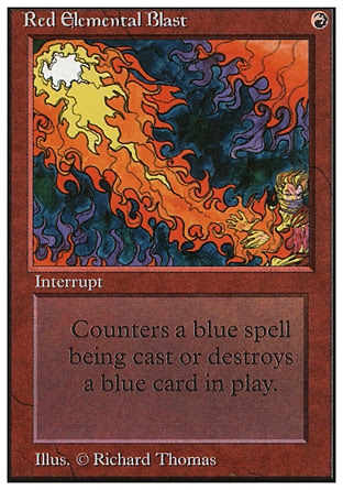




We get a couple more 'big fire/lightning' spells. Lightning Bolt, Red Elemental Blast, Firebreathing and Smoke. I like the flavour that Firebreahting gives anyone the ability to breathe fire, even your little goblins!


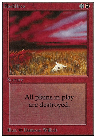
Red also, early on, has a lot of ways to interact with lands. Flashfire and Stone Rain destroys the terrain; Manabarbs (which look cool!) enchants a land and makes it fuck its owner -- which feels more Blue than Red; and Mana Flare causes all lands to give even more mana than they would.


Burrowing has a giant mole-dinosaur monster that looks like it would be an enemy for an early Super Sentai series. I like it. It's goofy. False Orders being a Red card is a fun little flavour of military tactics. I like the crude drawings done on the parchment. Did an orc draw it?


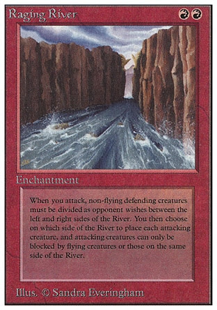
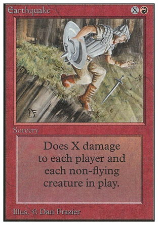
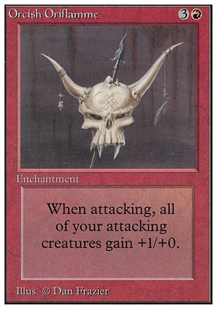
Red also gets a couple of 'natural disaster' spells like Raging River and Earthquake, albeit not as many as Green. What's an Orcish Oriflamme? Well, an 'oriflamme' is a knight's standard. Vocabulary!


That artwork for Earthbind is really... uh... something. Not to be crass, but someone in the office had bondage on their mind that day, huh?


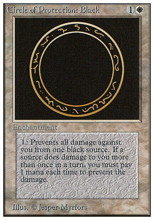
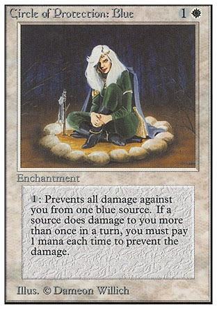
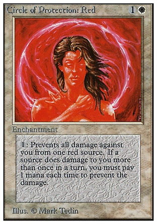
And here we go with the five Circles of Protection cycle, one for each colour. The Circle of Protection: Green has some really nice runic artwork, and I like the glyphs on Circle of Protection: White. That's the nicest thing I can say about them.


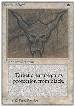
In addition to the Circle of Protection cycle, White has another cycle, which is the cheaper Ward, one for each colour. Not much to say here!


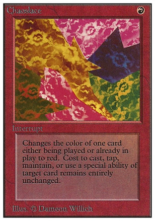
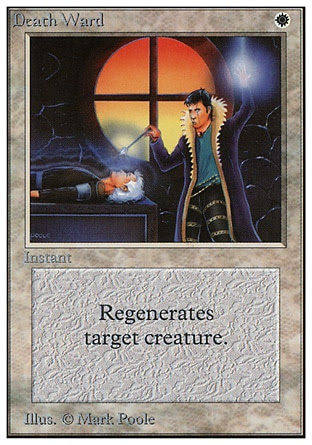
In addition to the five colour wards, we've also got Death Ward... which has nothing to do with the other Wards and instead has a regeneration effect. Tut-tut, no consistency here. That Death Ward guy kinda looks funky! I didn't mention it in the first part, but Purelace here is part of a cycle of five 'Lace' spells spread across all five colours that change other permanents' colours.


We've got a bunch of land interactions with Farmstead, Consecrate Land and Conversion. Love the fact that Castle is, indeed, literally a castle.


We've got a bunch of holy paladin/cleric/priest themed spells here. Or, well, three spells where divine intervention is happening, and then we have Healing Salve.


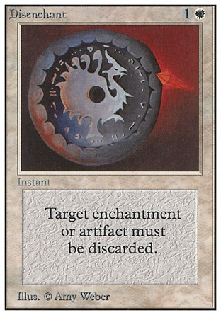
And here's a smattering of healing and buffing spells. Disenchant has a cool art drawn on that shield -- I notice that each colour has some way to deal with Artifacts, which kind of is a nice hint at how important artifacts will be both in lore and in the metagame.


Crusade is apparently one of the few cards that the official MTG site has essentially disowned due to being culturally insensitive. I personally don't think the card was made with malicious intentions, but that's way beyond the purview of what this blog has to say.


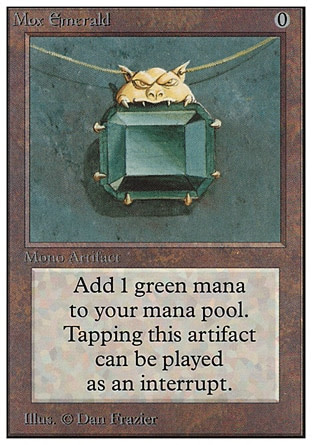
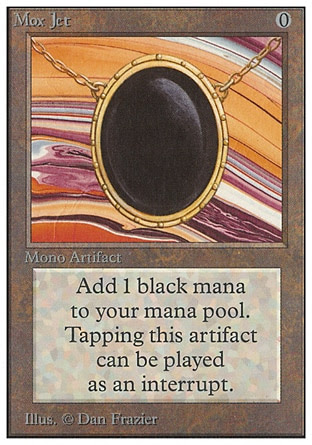
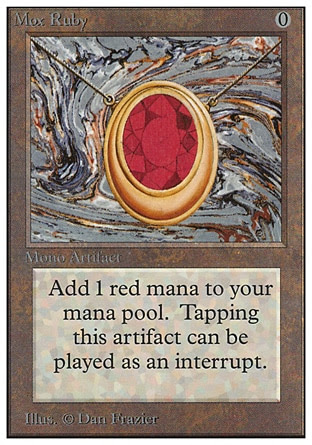
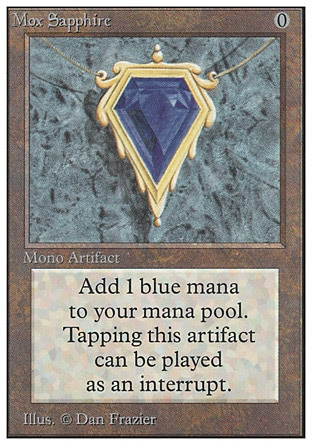
As mentioned above, we've got a cycle of jewelry that, like Black Lotus, is essentially hyper-efficient and unfair mana-ramping that kind of breaks the turn-based pacing that the game has. The five Moxen -- Mox Emerald, Mox Jet, Mox Pearl, Mox Ruby and Mox Sapphire below -- look boring as 'just' artifacts, but are super-powerful. Like the Black Lotus, there have been many attempts at making more 'fair' versions of the Mox over the years.


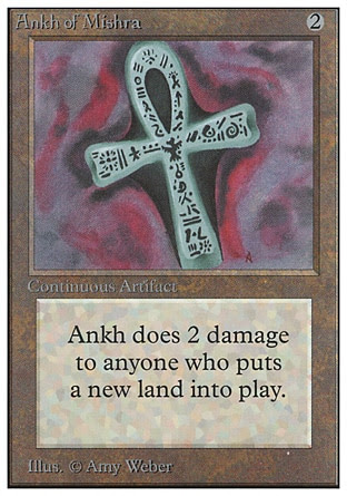
Ankh of Mishra! That's a rogue Mishra reference. Mishra is Urza's brother, and we'll see a bit more from the two of them in the Antiquities block onwards. I think I've seen Basalt Monolith be played around, too, as a mana-ramp card.


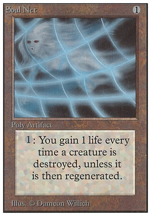
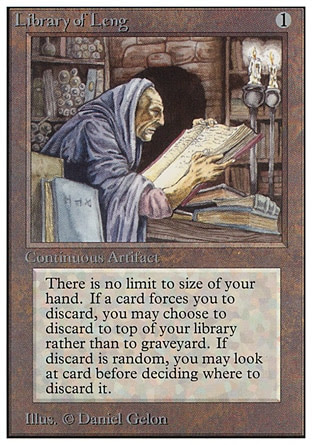
Soul Net just looks ridiculous! It's a net that catches ghosts, and its effect gives you life for every 'ghost' it captures! That's so weirdly sci-fi. Library of Leng is a Cthulhu Mythos reference!


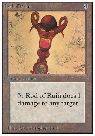
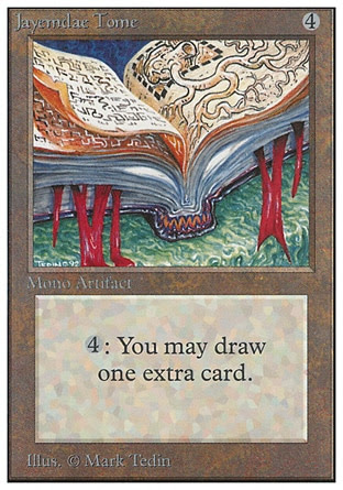
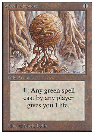
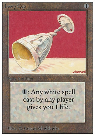
Along with Crystal Rod below, these four cards are a cycle that gives life from spells cast. Wooden Sphere looks super-cool with the intertwining wooden branches, and I just really like the Throne of Bane art in general with that full-bodysuit person slouching over it so.


Forcefield feels like such a weird sci-fi term, but apparently magicians can do it! I really like the artwork in Time Vault and Helm of Chatzuk. What is that thing wearing the Helm of Chatzuk? Some kind of purple blob-demon?


Illusionary Mask is one of the cards that started a poorly-defined 'cards face-down' effect that wouldn't be properly integrated into MTG until Morph almost a decade later.


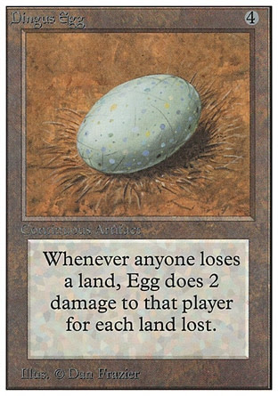
Heh heh, DINGUS Egg. I like Dingus Egg. I'm not sure what the fuck a Dingus is, and why its egg is dealing damage to people for lands lost. One of the biggest criticisms I have towards the artifacts isn't just that they're items, but these early ones had no context to them.


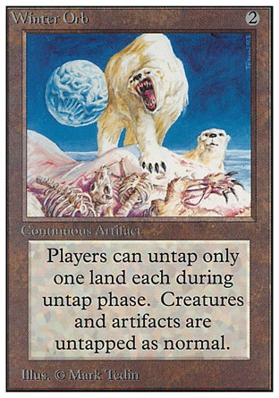
One could charitably say that Icy Manpiulator and Winter Orb might be foreshadowing the Ice Age block, but I really don't think so. Winter Orb is one of those super-powerful disruptive effect that really locks down the battlefield -- imagine a one-sided board-clear, followed up by a Winter Orb! There's not many ways for you to catch back up when you're only untapping a single land each turn.


Noooo that poor puppet in Black Vise. :(
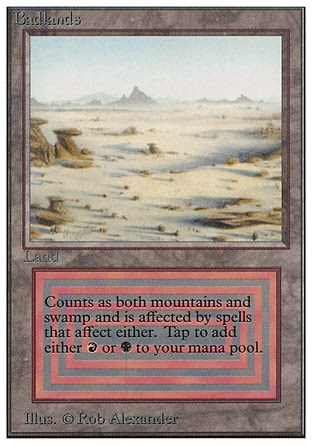
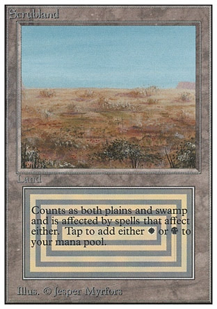
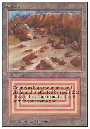
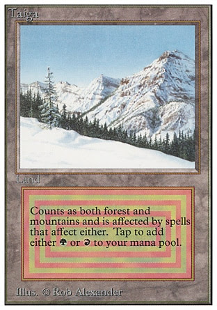
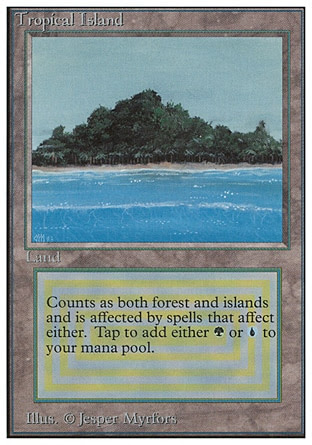
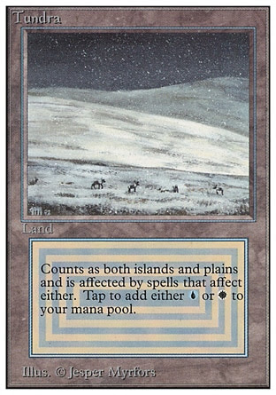
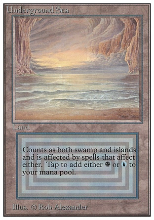
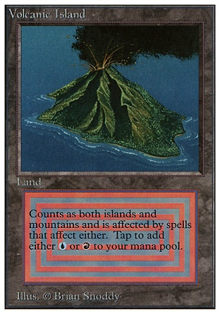
We'll cover the 'dual lands' now, and a lot of them are just the designers trying to think what terrain would happen if we want "mountain plus swamp".


I have even less to say about lands than I do artifacts, but I'm including these for completion's sake. Later expansions would eventually have the Lands represent the setting where some events in the lore take place, or locations to show off what the city or plane the set is all about looks like. But now they're just generic.


But one thing I do want to say about these dual lands is how terrible the templating is, with the concentric high-contrast squares making it a headache to look at, let alone read! I tend to be more of a 'modern MTG' guy in terms of which is the superior format, but classic MTG is a nice format too... except for these eye-searing double lands.
And that's it for Alpha/Beta/Unlimited, the very first huge set of Magic: The Gathering. It's been really fun going through these, as cynical as I might sound talking about some of these cards. It is clear that Magic needed to go through some growing pains as it is obviously brand-new and there was nothing like it before. Maybe some time in the future I'll pick and choose all of these classic monsters and see how they have been interpreted in the future. And... I'm quite excited to see what we have in the next couple of expansions!


As someone who knows a decent amount about MTG, these reviews are interesting to read(In a good way!) Seeing the cards effects/history be mostly ignored in favor of looking purely at the art/flavor text gives a interesting perspective. Like you'll spend more time writing on Granite Gargoyle than Serra Angel(who at the time was like THE white powerhouse creature and is generally seen as iconic) And then you look at the Moxen and as a sidetone mention " they're probably neat, kind of, from a gameplay standpoint" when the Moxen are considered so iconic and overpowered that they make up 5 of the Power 9 slots. It's just such a unique perspective to see that I haven't gotten anywhere else before.
ReplyDeleteI do dabble in Magic: The Gathering a bit, mostly with borrowed cards, quick forays into M:TG's not-always-great digital adaptations, and relatively more recently with friends in the Shadows Over Innistrad block, but there are so many cards and rules, and I am such a casual player that I really don't claim to really understand any more than the basic rules given to me in the basic sets. Like, I'm the sort of very, very casual player that will understand how a strong deck operates, but not individual cards.
DeleteAnd, well, I did one of these for Yu-Gi-Oh a while back, talking about the flavour, but M:TG have always held a more significant attempt at trying to build a cohesive internal world even while the main focus is (rightfully so) at game balance and the like. I haven't looked at all the M:TG sets as closely as I did the original "Unlimited" set, but I do know that M:TG puts a lot of emphasis on flavour and set coherence, which is why this is a fun little exercise for me -- I had wanted to do this with Hearthstone, initially, but I've had way too much Hearthstone content on this blog and frankly I'll just end up ranting about how the character was cool in World of Warcraft, or whatever, so I decided to delve into the longest-running TCG series and one that I am pretty blind about, flavour-wise.
But the intention of this series, for me at least, is to focus more on flavour... and as powerful as things like the Moxen are (and obviously instant mana generation is pretty damn powerful -- I know that much, at least) flavour wise they're just sort of pretty jewelry... Which doesn't really lend a lot for me to talk about. Scouting a bit ahead, I'm pretty sure a significant amount of the cards in Antiquities will end up being shrunken down to the "yeaaaah I'm sorry I don't have anything to say" sequence.