But... that's not really all the beta pokemon out there. Between concept art for "Capsule Monsters", the game that would be Pokemon, a manga detailing about the conception of Pokemon and focusing on the original Gamefreak team, and an uncovered bunch of back-sprites and sound files from Generation I games, we have a bunch of random other 'beta' Pokemon that I think I can talk about for a bit here.
It's nowhere as well-recovered as the clean files for the Spaceworld betas, and we don't get, like, clean sprites for some of them and there's a significant amount of speculation on what they are, but hey, let's just kind of talk about these old beta sprites and artwork, yeah?
(I know that there's a bunch of newer-uncovered Beta sprites, and there's some amazing Sugimori-style artwork done by the artist RacieBeep, but this article's just going to collect the information that is available circa January 2021)
Credits to:


Before we go into the more obviously-finalized sprites, I guess we'll quickly talk about a bunch of rough sketches from the development of Capsule Monsters, Satoshi Tajiri's brain-child of what would become Pokemon. And... they're pretty rough, yeah? "Buhii" and "Papyo" here are obviously just very rough sketches, with Buhii looking vaguely like a weird legless cat and Papyo looking like a Flumph-bug mutant creature. Not much to say here other than acknowledge that they exist. Bulbapedia identifies the creatures fighting on that Capsule Monsters art as a prototype version of "Gengar and Nidorino", based on the fact that it's similar to the opening sequence in Red & Blue... but that's pretty far off, I feel. The creature on the left looks like a prototype Godzilla-esque monster that would eventually morph into the likes of Rhydon, Nidoking, Nidoqueen, Tyranitar or Kangaskhan, while the weird vaguely wyvern-esque creature jumping up with stumpy wings and two legs could just be a generic random lizard monster.


It's worth noting that a lot of the early sketches of Capsule Monsters or Pokemon tend to revolve around Godzilla-esque dinosaurian monsters. Again, a lot of these has to do with the general look of Rhydon (often noted as the first Pokemon finalized in the Pokedex) or maybe Gyaon (more on him below), and the fact that a vaguely similar look tends to be used as the Substitute doll and those gym statues found in the first-generation games. Basically all the sketches in these Capsule Monster documents all had a variation of this pseudo-Rhydon pseudo-Nidoking creature walking around. The creature jumping out of the proto-Pokeball is called Rokku, literally just 'Rock'.
Also, check out that prototype Lapras. Man, I can totally see why they added Lapras's ears or whatever those things on its forehead is. Lapras just looks just kind of there without those, huh? Also, considering how the original first-generation games had Lapras represent the surfing sprite, they probably had this mental image of a dinosaur-like creature with a hard shell you can sit on being your water-transport buddy.


And here are more 'proto' Pokemon, from left to right we have Godzillante, Gorillaimo, Dragon 4 and Kabiin. And I'm pretty sure that these are less 'prototype Pokemon' and more just a bunch of sketches to test out the layout of the game. Godzillante and Gorillaimo are obviously a 'Godzilla vs. King Kong' deal, while Kabiin is apparently an in-joke to a nickname of a member of the development team, Nishino Koji, who apparently was a bit of a glutton and that nickname would actually be used for a final Pokemon, Kabigon, otherwise known as Snorlax. Again, not a whole ton to say here, these are rough sketches.


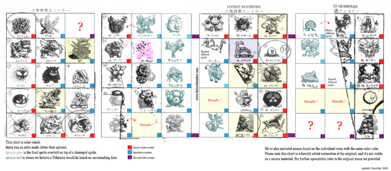
A lot of these 'lost' Pokemon are first revealed from a Satoshi Tajiri manga where blurry, low-res images of them cropped up in a list of sketches. The way the selection for what made it into the original 151 is by voting within the team's members, and there were a bunch of phases or periods where they started refining some of the more popular designs. And while some of them, for the longest time, only showed up in blurry, blown-up photographs in a manga that are taken from documents that are two-decade old, recently a bunch of ROM hackers managed to recover a whole bunch of back-sprites for these 'missingno' Pokemon.
And perhaps the most famous among them is Gyaoon, showing up in the Satoshi Tajiri manga, and we got Tajiri or Sugimori or someone tweeting a more high-res picture of the draft for Gyaoon, and two back-sprites from the beta demo appear to correspond to Gyaoon and a portential pre-evolution. Gyaoon basically seems to be the generic 'kaiju' Pokemon whose design would later evolve into either the Nidos or Tyranitar. And, yes, it might look pretty different if you compare them side-by-side, but considering just how different some of the beta designs in Generation II are (look at beta Dunsparce, or beta Ariados, or beta Noctowl), these designs clearly go through a fair amount of revisions. As the Capsule Monsters concept art show, they clearly want a bunch of Godzilla/kaiju-style monsters and it's no surprise we got a bunch in the first generation.

Also revealed alongside other proto-pokemon is Omega, who, notably, didn't make any further appearances in other datamined beta versions of the first generation games. It's the Mecha-Godzilla to Gyaoon's Godzilla, but I guess they wanted to not stretch themselves out too thin with concepts and it's not until I sat down and wrote this and realized how few Pokemon actually feel like robots. Like, Golurk and the Regis are more animated golems than anything, the likes of Steelix, Aggron and Duraludon are more metal-plated animals, and maybe the only ones that count are Metagross and Magnemite? And they look real weird. Omega here is kinda cute with its cannon arms, but when we finally get a metal kaiju-pokemon in Aggron I am happy that it's not as bland as this. Or as obviously a Mecha-Godzilla copy.


"Crocky" over here also shows up in the manga and in the demo back-sprites, and it's... it's a weird lizard-crocodile with huge eyes that bug out and had a bunch of hair (which it loses when it became a sprite). We would have a crocodile Pokemon in the second generation with the Totodile line, but this one clearly didn't have a lot in common with either the Totodile line or the Sandile line that came much, much later. Personally, I am actually not particularly broken up about this being lost or revised, a hyperactive crocodile really doesn't look super-interesting.


The fandom's consensus is that Barunda (a.k.a. Baloonda) here is reworked into the 'balloon pokemon' Jigglypuff, and the concept for a more balloon-looking Pokemon would later show up as Drifloon. A balloon with a cartoon face would be funny as heck, but considering how the Gamefreak staff whittled down a massive amount of potential monsters by popular vote, it's easy to see why this one got cut out.


Only known as Cactus, this one is... kind of bizarre? It's less of a cactus monster but rather a bunch of spiky balls arranged in a weird, almost-toppling tower (an exaggerated version of those bunny-ear cactus, I think), and it has a tail and a pair of feet. It's actually a weird, funky-looking monster. It's also pretty far from the actual cactus monsters we got (Cacnea, Cacturne, Maractus) and this one would probably work better as an enemy in something like the 2D Zelda games, I believe.

This is Beta Seel, also seen in the Tajiri manga on that page of the voting system. Here with its Japanese name (Pauwau), original Seel actually looked a bit more realistic and rugger, with... uh... are those bug mandibles? It's actually quite neat, if kind of ugly, although apparently notes on the documents do note that this is a design that needs improvement. And of course, all we got to see for the past two decades is just the Seel we're familiar with. And while I don't mind Seel and Dewgong, they are kind of boring and plain, aren't they? I do kind of wish that at least some of the roughness of Beta Seel made it into the final design.


Jaggu (or just Jagg) is pretty neat. It's interesting just how many times they tried to make a shark Pokemon, with Jagg here and later Ikari in the Gold/Silver beta, and it's not until the third generation when they decided that the torpedo half-a-shark Sharpedo is finally worthy of being a proper shark Pokemon. Jagg's actually pretty great, though! I mean, sure, the art we saw of it does kind of look unfinished, but the saw-shark protrusion doubling and giving us the silhouette of like a harpoon or something is kind of cool. I'm surprised that they didn't include Jagg in the final version of the first-generation games, considering how iconic of an animal sharks are.


Simply named with the English word for "Deer", this creature is honestly less of a deer and more of some sort of mutant war-mutant moose. There's a bunch of cartoon-reptile featuers and those spikes, the weird head and the stumpy, almost robot-like feet does make it a pretty menacing look. We would get a bunch of deer Pokemon down the road (Stantler, Sawsbuck, Xerneas) but none of them actually feel like this menacing, stabby monster. Again, not a particularly notable design, but I feel like Deer and Jagg are probably some of the better ones in what's essentially Gamefreak's old reject pile.


This one had its name covered, and has basically been called the Elephant by the fandom, this one is obscured but seems to just be a generic elephant on two legs. I'm actually glad this got cut out and when we do get elephants as Pokemon it would be the far more unique-looking Phanpy, Donphan, and later on Mamoswine, Cufant and Copperajah, none of which are straight-up lazy elephant-men. Again, I feel like there's a significant effort in the first generation to try and avoid the 'just an animal' trope. And while that's certainly not true for the entire Kanto pokedex (Goldeen, Pidgey, Spearow and Seel exist) I do appreciate that
the curation process does get rid of a bunch that would probably be a bit more forgettable.


As we leave the Tajiri manga behind, we're going to go through one of the newer finds of beta Pokemon, which is this batch of back-sprites. And here we see a bunch of familiar faces -- albeit only familiar if you're aware of the lost Pokemon in the Generation II betas. Here we have Mikon, Puchikon, Konya and Gyopin, a.k.a. Baby Vulpix, Baby Ponyta, Baby Meowth and Baby Goldeen. Again, it's interesting to see that they've been around since the first inception, I genuinely did think that they were added in Generation II when they wanted breeding to be a thing.


Speaking of familiar faces, Kotora and Raitora were also in the first-generation betas, and they even had a third, unnamed evolution! Not too much to say here, it's just interesting that Pokemon basically designed and later dropped a bunch of round tiger Pokemon twice.

We've known for a while that Pikachu and Raichu was originally intended to evolve into a third form, Gorochu, which was revealed in an interview in 2018 which would include 'fangs and horns'. We had no idea what it would look like (even though a bunch of fan art of a red-and-yellow oni Raichu made its rounds in the internet) and the closest we would get to see the enigmatic Gorochu is this back sprite. I mean, you can imagine your own horned Raichu, but considering just how much Pikachu has eclipsed its evolved sibling, it's safe to say that poor Gorochu would never ever make it back into the main-line games.

Buu is a bit of an interesting creature. Supposedly based on Woo, an Ultraman enemy that's a giant ice-dwelling yeti creature, 'Buu' here is apparently the ice-type counterpart to Electabuzz and Magmar (Elebuu and Buuba respectively in Japan) and would presumably morph into Jynx. This would make the 'buu' trio a trio of humanoid monsters that perfectly fit in with the Articuno/Zapdos/Moltres trio... and honestly, still, either way, Buu and Jynx both had that black face with thick lips that, regardless of the intent, is still extremely unfortunate. It's interesting to note where Jynx's origins might have came from (presumably they added the whole 'yuki-onna' bit or something), but still.

We've got this Middle Duck that was apparently meant to bridge the gap between Psyduck and Golduck, and it's... honestly, not that different, just a weirder Psyduck with dot eyes and an elongated skull. A good move, I think, to cut out what's essentially a redundant middle stage.

Speaking of missing evolution line members, we've got Baby Zubat, which is just a little body with bat wings! That's kind of adorable, and it does kind of lend a neat little progression where Baby Zubat gains a mouth and ears when it evolves into Zubat, and then gains eyes and feet when it becomes Golbat. I'm going to assume that Crobat was probably designed separately, and later folded into the Zubat/Golbat line when they lost the pre-evolution. That would explain why Crobat felt so oddly disjointed, design wise, from the other two bats.

One of the sprites that caused the most buzz and caused me to be aware of these beta sprites in the first place is this bizarre Marowak-Kangaskhan hybrid, lending a lot of credence to the fact that maybe Cubone is a baby Kangaskhan who lost its mother. How this would play into the Cubone/Marowak and Kangaskhan bit is a bit confusing, though. This is a Marowak with some extra back-spines that seems to have adopted a baby Cubone on its own... but how does it work, evolution-wise? Do we go Cubone into Marowak into Momrowak? Where does Kangaskhan fit into all this? Is the Kangaskhan an alternate evolution or something? The mind boggles, and while they've clearly taken a completely different direction with Marowak and Kangaskhan, and both of them have gotten alternate forms without any sort of tie-in to each other, it's still interesting to note that the fandom was right all along.

A back sprite that you think would belong to one of the Nido family, but this one doesn't correspond to any of the actual existing Nidoran, Nidorino or Nidorina back-sprites. Probably just a first draft that didn't get deleted.

This one, meanwhile, is often speculated to be a Magneton pre-evo, but it's probably more likely that it's a draft sprite for Magneton itself since both Magnemite and Magneton exists in the demo, and unless they made an alternate evolution for Magnemite (and remember generation I wasn't big on that because they wanted to make Eevee special) I don't see that happening.

So back in the original beta, Squirtle, Wartortle and Blastoise were in the game... but not in the same evolutionary line! Wartortle evolved into this Wartortle Evolution, which presumably is just Wartortle but with extra features, while Blastoise was a completely separate, unrelated cannon-turtle monster. I've always thought it was weird that the Squirtle line went from a turtle into a turtle with a bushy tail and ears into a regular turtle with cannons on its back. Turns out they weren't even meant to be related in the first place! Although maybe the original Wartortle evolution might've simply been too similar to Wartortle.

The other sprites in the beta don't really correspond to anything and while Helix Chamber does make some really educated guesses, no one but those people in Gamefreak is going to know whether this dude is really a Blastoise pre-evolution with bubble cannons and snot bubbles or if it's anything related to Blastoise at all.


These Squid Boys are pretty obviously a bunch of squids, which probably was cut out because it was too boring. Worth noting that no modern-day squid has those swirling hard, external shells, because at one point in the squid's evolution the shells become lighter internal 'skeletons', so to speak. And this might be meant to show this, how cephalopods (other than the nautilus) lost their shells through a period of evolution. That's neat. We didn't get them, though, and got the more exotic-looking Omanyte and Omastar instead, and it's really surprising that we wouldn't get a proper squid until Inkay and Malamar around one and a half decade later.


A bunch of maybe-Lizard-boys. It's really hard to have any sort of opinion on these, although I kind of feel like the smallest one in the evolution line does kind of look like Kurusu from the Gold & Silver beta.


These are a bit harder to tell, the Weird Fish that Helix Chamber speculates might be similar to Mario's Cheep Cheep enemies. It's really hard to tell with these generation I back-sprites, but the general consensus is that they're weird bird-fish things.


Another duo that is basically hard to tell, these are weird bald sumo dudes with topknots. Helix Chamber speculates that they might be sumo frogs based on potential cheek things, but I personally go 'eh'. It could literally be anything.
A bunch of other proto-designs in the Capumon/Capsule Monsters pitch also includes a bunch of proto-Pokemon design, which are, again, pretty sketchy although Helix Chamber did end up getting someone to essentially recreate the sprites in nicer detail. We get to see a bunch of Pokemon that essentially didn't change until they became the first-generation sprites -- this includes Cubone, Gastly, Pinsir, Blastoise, Staryu and Tangela. And, sure, Gastly looks weird but that's how his original generation I sprite looked, and while some of the others might have different proportions (and names), it's not too far off from how lumpy the first-generation sprites might look.
Oh, hey, that's Omega, too, next to Blastoise! Looking at them side-by-side, Blastoise might actually be one of the 'kaiju' Pokemon, huh? I didn't really consider it. Proto-Lapras from above with no ears and stub-flippers also show up. What looks like a Cloyster without horns is actually proto-Shellder, and presumably there was a bit of name-swapping when they designed what we would know as Shellder. Proto-Rhyhorn really looks like the first draft of the far-cooler design we know now, and looks more like many of the draft spiky-rhinoceros monsters we saw in the Capumon drafts. Maybe they didn't decide on the 'rock' part until later, and only had Rhyhorn as this weird rhinoceros/triceratops hybrid?
Proto-Tentacool, or "Ambler", as it's called here, was kinda interesting. It had modern Tentacool's head but a whole load of extra little tentacles, making it look like more of a weird jellyfish-squid fusion. Proto-Scyther (next to Pinsir) had really nothing in common with his final design beyond being a dinosaur with mantis claws. And man, it's interesting how wildly different the same concept can be, huh? Proto-Scyther looks so lumpy and almost comical, whereas the modern-day Scyther had great traits of both dinosaurs and praying mantises and looked unbelievably sleek.
Proto-Arcanine ("Wing" here instead of his final Japanese name, "Windy"), is... a lot more different. Look at those hooves, and the bizarre, almost draconic snout! "Wing" here was clearly meant to be a Kirin/Qilin which suddenly made its whole 'legendary' status more sense. Of course, modern Arcanine made it more of a lion-dog fusion based on a different Chinese guardian statue, but it's interesting to see where it came from.
Most interesting, though is that giant Dune worm with no eyes, giant antennae and a massive lamprey mouth. And that... is proto-Gyarados, which genuinely baffled me. Gyarados didn't start off as a dragon or sea serpent, but some weird monster lamprey leech thing? It's very cool, although admittedly, might fall under the same banner of copying another pretty common monster trope.

Proto Ivysaur here is seen in Bulbapedia, and look at that poor frog, it's basically fallen down and looks like it can barely crawl. Considering how the original Venusaur sprite basically recycles this look from proto Ivysaur, I wonder if the original concept had a 'parasitic plant' gimmick which was dropped.


Found in the Generation III Ruby/Sapphire beta are the back-sprites for.... Shellos and Gastrodon! And that's not like some huge event or anything, since the two of them showed up a generation later, but Proto-Shellos here actually mixes and matches features, having the colouration and head-bulbs of the modern pink Shellos, but the back-fins of the modern blue Shellos. And Proto-Gastrodon is all covered in a rocky bit that somewhat resembles the modern pink Gastrodon... but a lot rockier.
Other than Shellos and Gastrodon supposedly debuting a generation earlier, generation 4 didn't seem to have a whole ton of scrapped content, or maybe Nintendo is just a lot better at hiding their 'beta' versions and the like. A massive amount of sprites were leaked, but the most interesting bit for me is that there were a whole lot more of gender differences for Pokemon from the first three generations than what we got. A lot of them were redundant and a lot of what we actually got were barely noticeable anyway, so it's probably a good thing (particularly with the 3D and later Switch model conversions) that they limited the amount of variation among these designs. In retrospect, maybe they already knew that they were converting to 3D models sooner or later, and cutting down the amount of models they have to convert is certainly a smart idea.


And... that's about it! This has been fun, a nice little jaunt into what-could-have-been for the Pokemon franchise, seeing the creation in the behind-the-scenes of the design of these 800+ Pokemon. And honestly, the Generation I and II ones are probably the most fascinating since it's when they were just conceptualizing the franchise and trying to set the tone and theme of the franchise going onwards. Seeing how it's been immensely successful for close to two and a half decades now, they certainly made a lot of great choices. None of these honestly feel like "man, we could've gotten a classic" in the same way that I feel about some of the Spaceworld Gold/Silver ones like the Tangela evolution or Ikari. But it's still neat to imagine what could have been, though.
- Bulbapedia's page on Unused Pokemon
- Helix Chamber's List of Proto-Generation I Pokemon
- Helix Chamber's article on Generation I development cycle
- Helix Chamber's article on more lost Pokemon
- TCRF.net's coverage on the Gold and Silver betas
- TCRF.net's coverage on removed Generation I Sprites
- Lava Cut Content, which covers a lot of miscellaneous cut content in the games, and a lot of fascinating collection about other behind-the-scenes design of Pokemon
- The source Diamond and Pearl Beta Leak, and in Youtube.
Before we go into the more obviously-finalized sprites, I guess we'll quickly talk about a bunch of rough sketches from the development of Capsule Monsters, Satoshi Tajiri's brain-child of what would become Pokemon. And... they're pretty rough, yeah? "Buhii" and "Papyo" here are obviously just very rough sketches, with Buhii looking vaguely like a weird legless cat and Papyo looking like a Flumph-bug mutant creature. Not much to say here other than acknowledge that they exist. Bulbapedia identifies the creatures fighting on that Capsule Monsters art as a prototype version of "Gengar and Nidorino", based on the fact that it's similar to the opening sequence in Red & Blue... but that's pretty far off, I feel. The creature on the left looks like a prototype Godzilla-esque monster that would eventually morph into the likes of Rhydon, Nidoking, Nidoqueen, Tyranitar or Kangaskhan, while the weird vaguely wyvern-esque creature jumping up with stumpy wings and two legs could just be a generic random lizard monster.
It's worth noting that a lot of the early sketches of Capsule Monsters or Pokemon tend to revolve around Godzilla-esque dinosaurian monsters. Again, a lot of these has to do with the general look of Rhydon (often noted as the first Pokemon finalized in the Pokedex) or maybe Gyaon (more on him below), and the fact that a vaguely similar look tends to be used as the Substitute doll and those gym statues found in the first-generation games. Basically all the sketches in these Capsule Monster documents all had a variation of this pseudo-Rhydon pseudo-Nidoking creature walking around. The creature jumping out of the proto-Pokeball is called Rokku, literally just 'Rock'.
Also, check out that prototype Lapras. Man, I can totally see why they added Lapras's ears or whatever those things on its forehead is. Lapras just looks just kind of there without those, huh? Also, considering how the original first-generation games had Lapras represent the surfing sprite, they probably had this mental image of a dinosaur-like creature with a hard shell you can sit on being your water-transport buddy.
And here are more 'proto' Pokemon, from left to right we have Godzillante, Gorillaimo, Dragon 4 and Kabiin. And I'm pretty sure that these are less 'prototype Pokemon' and more just a bunch of sketches to test out the layout of the game. Godzillante and Gorillaimo are obviously a 'Godzilla vs. King Kong' deal, while Kabiin is apparently an in-joke to a nickname of a member of the development team, Nishino Koji, who apparently was a bit of a glutton and that nickname would actually be used for a final Pokemon, Kabigon, otherwise known as Snorlax. Again, not a whole ton to say here, these are rough sketches.
A lot of these 'lost' Pokemon are first revealed from a Satoshi Tajiri manga where blurry, low-res images of them cropped up in a list of sketches. The way the selection for what made it into the original 151 is by voting within the team's members, and there were a bunch of phases or periods where they started refining some of the more popular designs. And while some of them, for the longest time, only showed up in blurry, blown-up photographs in a manga that are taken from documents that are two-decade old, recently a bunch of ROM hackers managed to recover a whole bunch of back-sprites for these 'missingno' Pokemon.
And perhaps the most famous among them is Gyaoon, showing up in the Satoshi Tajiri manga, and we got Tajiri or Sugimori or someone tweeting a more high-res picture of the draft for Gyaoon, and two back-sprites from the beta demo appear to correspond to Gyaoon and a portential pre-evolution. Gyaoon basically seems to be the generic 'kaiju' Pokemon whose design would later evolve into either the Nidos or Tyranitar. And, yes, it might look pretty different if you compare them side-by-side, but considering just how different some of the beta designs in Generation II are (look at beta Dunsparce, or beta Ariados, or beta Noctowl), these designs clearly go through a fair amount of revisions. As the Capsule Monsters concept art show, they clearly want a bunch of Godzilla/kaiju-style monsters and it's no surprise we got a bunch in the first generation.
Also revealed alongside other proto-pokemon is Omega, who, notably, didn't make any further appearances in other datamined beta versions of the first generation games. It's the Mecha-Godzilla to Gyaoon's Godzilla, but I guess they wanted to not stretch themselves out too thin with concepts and it's not until I sat down and wrote this and realized how few Pokemon actually feel like robots. Like, Golurk and the Regis are more animated golems than anything, the likes of Steelix, Aggron and Duraludon are more metal-plated animals, and maybe the only ones that count are Metagross and Magnemite? And they look real weird. Omega here is kinda cute with its cannon arms, but when we finally get a metal kaiju-pokemon in Aggron I am happy that it's not as bland as this. Or as obviously a Mecha-Godzilla copy.
"Crocky" over here also shows up in the manga and in the demo back-sprites, and it's... it's a weird lizard-crocodile with huge eyes that bug out and had a bunch of hair (which it loses when it became a sprite). We would have a crocodile Pokemon in the second generation with the Totodile line, but this one clearly didn't have a lot in common with either the Totodile line or the Sandile line that came much, much later. Personally, I am actually not particularly broken up about this being lost or revised, a hyperactive crocodile really doesn't look super-interesting.
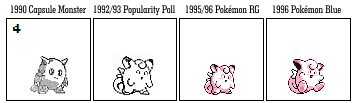
The fandom's consensus is that Barunda (a.k.a. Baloonda) here is reworked into the 'balloon pokemon' Jigglypuff, and the concept for a more balloon-looking Pokemon would later show up as Drifloon. A balloon with a cartoon face would be funny as heck, but considering how the Gamefreak staff whittled down a massive amount of potential monsters by popular vote, it's easy to see why this one got cut out.
Only known as Cactus, this one is... kind of bizarre? It's less of a cactus monster but rather a bunch of spiky balls arranged in a weird, almost-toppling tower (an exaggerated version of those bunny-ear cactus, I think), and it has a tail and a pair of feet. It's actually a weird, funky-looking monster. It's also pretty far from the actual cactus monsters we got (Cacnea, Cacturne, Maractus) and this one would probably work better as an enemy in something like the 2D Zelda games, I believe.
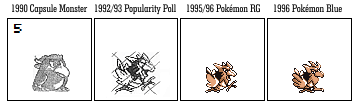
This is Beta Seel, also seen in the Tajiri manga on that page of the voting system. Here with its Japanese name (Pauwau), original Seel actually looked a bit more realistic and rugger, with... uh... are those bug mandibles? It's actually quite neat, if kind of ugly, although apparently notes on the documents do note that this is a design that needs improvement. And of course, all we got to see for the past two decades is just the Seel we're familiar with. And while I don't mind Seel and Dewgong, they are kind of boring and plain, aren't they? I do kind of wish that at least some of the roughness of Beta Seel made it into the final design.
Jaggu (or just Jagg) is pretty neat. It's interesting just how many times they tried to make a shark Pokemon, with Jagg here and later Ikari in the Gold/Silver beta, and it's not until the third generation when they decided that the torpedo half-a-shark Sharpedo is finally worthy of being a proper shark Pokemon. Jagg's actually pretty great, though! I mean, sure, the art we saw of it does kind of look unfinished, but the saw-shark protrusion doubling and giving us the silhouette of like a harpoon or something is kind of cool. I'm surprised that they didn't include Jagg in the final version of the first-generation games, considering how iconic of an animal sharks are.
Simply named with the English word for "Deer", this creature is honestly less of a deer and more of some sort of mutant war-mutant moose. There's a bunch of cartoon-reptile featuers and those spikes, the weird head and the stumpy, almost robot-like feet does make it a pretty menacing look. We would get a bunch of deer Pokemon down the road (Stantler, Sawsbuck, Xerneas) but none of them actually feel like this menacing, stabby monster. Again, not a particularly notable design, but I feel like Deer and Jagg are probably some of the better ones in what's essentially Gamefreak's old reject pile.
This one had its name covered, and has basically been called the Elephant by the fandom, this one is obscured but seems to just be a generic elephant on two legs. I'm actually glad this got cut out and when we do get elephants as Pokemon it would be the far more unique-looking Phanpy, Donphan, and later on Mamoswine, Cufant and Copperajah, none of which are straight-up lazy elephant-men. Again, I feel like there's a significant effort in the first generation to try and avoid the 'just an animal' trope. And while that's certainly not true for the entire Kanto pokedex (Goldeen, Pidgey, Spearow and Seel exist) I do appreciate that
the curation process does get rid of a bunch that would probably be a bit more forgettable.
As we leave the Tajiri manga behind, we're going to go through one of the newer finds of beta Pokemon, which is this batch of back-sprites. And here we see a bunch of familiar faces -- albeit only familiar if you're aware of the lost Pokemon in the Generation II betas. Here we have Mikon, Puchikon, Konya and Gyopin, a.k.a. Baby Vulpix, Baby Ponyta, Baby Meowth and Baby Goldeen. Again, it's interesting to see that they've been around since the first inception, I genuinely did think that they were added in Generation II when they wanted breeding to be a thing.
Speaking of familiar faces, Kotora and Raitora were also in the first-generation betas, and they even had a third, unnamed evolution! Not too much to say here, it's just interesting that Pokemon basically designed and later dropped a bunch of round tiger Pokemon twice.
We've known for a while that Pikachu and Raichu was originally intended to evolve into a third form, Gorochu, which was revealed in an interview in 2018 which would include 'fangs and horns'. We had no idea what it would look like (even though a bunch of fan art of a red-and-yellow oni Raichu made its rounds in the internet) and the closest we would get to see the enigmatic Gorochu is this back sprite. I mean, you can imagine your own horned Raichu, but considering just how much Pikachu has eclipsed its evolved sibling, it's safe to say that poor Gorochu would never ever make it back into the main-line games.
Buu is a bit of an interesting creature. Supposedly based on Woo, an Ultraman enemy that's a giant ice-dwelling yeti creature, 'Buu' here is apparently the ice-type counterpart to Electabuzz and Magmar (Elebuu and Buuba respectively in Japan) and would presumably morph into Jynx. This would make the 'buu' trio a trio of humanoid monsters that perfectly fit in with the Articuno/Zapdos/Moltres trio... and honestly, still, either way, Buu and Jynx both had that black face with thick lips that, regardless of the intent, is still extremely unfortunate. It's interesting to note where Jynx's origins might have came from (presumably they added the whole 'yuki-onna' bit or something), but still.
We've got this Middle Duck that was apparently meant to bridge the gap between Psyduck and Golduck, and it's... honestly, not that different, just a weirder Psyduck with dot eyes and an elongated skull. A good move, I think, to cut out what's essentially a redundant middle stage.
Speaking of missing evolution line members, we've got Baby Zubat, which is just a little body with bat wings! That's kind of adorable, and it does kind of lend a neat little progression where Baby Zubat gains a mouth and ears when it evolves into Zubat, and then gains eyes and feet when it becomes Golbat. I'm going to assume that Crobat was probably designed separately, and later folded into the Zubat/Golbat line when they lost the pre-evolution. That would explain why Crobat felt so oddly disjointed, design wise, from the other two bats.
One of the sprites that caused the most buzz and caused me to be aware of these beta sprites in the first place is this bizarre Marowak-Kangaskhan hybrid, lending a lot of credence to the fact that maybe Cubone is a baby Kangaskhan who lost its mother. How this would play into the Cubone/Marowak and Kangaskhan bit is a bit confusing, though. This is a Marowak with some extra back-spines that seems to have adopted a baby Cubone on its own... but how does it work, evolution-wise? Do we go Cubone into Marowak into Momrowak? Where does Kangaskhan fit into all this? Is the Kangaskhan an alternate evolution or something? The mind boggles, and while they've clearly taken a completely different direction with Marowak and Kangaskhan, and both of them have gotten alternate forms without any sort of tie-in to each other, it's still interesting to note that the fandom was right all along.
A back sprite that you think would belong to one of the Nido family, but this one doesn't correspond to any of the actual existing Nidoran, Nidorino or Nidorina back-sprites. Probably just a first draft that didn't get deleted.
This one, meanwhile, is often speculated to be a Magneton pre-evo, but it's probably more likely that it's a draft sprite for Magneton itself since both Magnemite and Magneton exists in the demo, and unless they made an alternate evolution for Magnemite (and remember generation I wasn't big on that because they wanted to make Eevee special) I don't see that happening.
So back in the original beta, Squirtle, Wartortle and Blastoise were in the game... but not in the same evolutionary line! Wartortle evolved into this Wartortle Evolution, which presumably is just Wartortle but with extra features, while Blastoise was a completely separate, unrelated cannon-turtle monster. I've always thought it was weird that the Squirtle line went from a turtle into a turtle with a bushy tail and ears into a regular turtle with cannons on its back. Turns out they weren't even meant to be related in the first place! Although maybe the original Wartortle evolution might've simply been too similar to Wartortle.
The other sprites in the beta don't really correspond to anything and while Helix Chamber does make some really educated guesses, no one but those people in Gamefreak is going to know whether this dude is really a Blastoise pre-evolution with bubble cannons and snot bubbles or if it's anything related to Blastoise at all.
These Squid Boys are pretty obviously a bunch of squids, which probably was cut out because it was too boring. Worth noting that no modern-day squid has those swirling hard, external shells, because at one point in the squid's evolution the shells become lighter internal 'skeletons', so to speak. And this might be meant to show this, how cephalopods (other than the nautilus) lost their shells through a period of evolution. That's neat. We didn't get them, though, and got the more exotic-looking Omanyte and Omastar instead, and it's really surprising that we wouldn't get a proper squid until Inkay and Malamar around one and a half decade later.
A bunch of maybe-Lizard-boys. It's really hard to have any sort of opinion on these, although I kind of feel like the smallest one in the evolution line does kind of look like Kurusu from the Gold & Silver beta.
These are a bit harder to tell, the Weird Fish that Helix Chamber speculates might be similar to Mario's Cheep Cheep enemies. It's really hard to tell with these generation I back-sprites, but the general consensus is that they're weird bird-fish things.
Another duo that is basically hard to tell, these are weird bald sumo dudes with topknots. Helix Chamber speculates that they might be sumo frogs based on potential cheek things, but I personally go 'eh'. It could literally be anything.
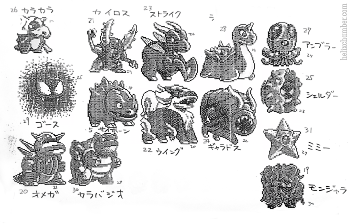
A bunch of other proto-designs in the Capumon/Capsule Monsters pitch also includes a bunch of proto-Pokemon design, which are, again, pretty sketchy although Helix Chamber did end up getting someone to essentially recreate the sprites in nicer detail. We get to see a bunch of Pokemon that essentially didn't change until they became the first-generation sprites -- this includes Cubone, Gastly, Pinsir, Blastoise, Staryu and Tangela. And, sure, Gastly looks weird but that's how his original generation I sprite looked, and while some of the others might have different proportions (and names), it's not too far off from how lumpy the first-generation sprites might look.
Oh, hey, that's Omega, too, next to Blastoise! Looking at them side-by-side, Blastoise might actually be one of the 'kaiju' Pokemon, huh? I didn't really consider it. Proto-Lapras from above with no ears and stub-flippers also show up. What looks like a Cloyster without horns is actually proto-Shellder, and presumably there was a bit of name-swapping when they designed what we would know as Shellder. Proto-Rhyhorn really looks like the first draft of the far-cooler design we know now, and looks more like many of the draft spiky-rhinoceros monsters we saw in the Capumon drafts. Maybe they didn't decide on the 'rock' part until later, and only had Rhyhorn as this weird rhinoceros/triceratops hybrid?
Proto-Tentacool, or "Ambler", as it's called here, was kinda interesting. It had modern Tentacool's head but a whole load of extra little tentacles, making it look like more of a weird jellyfish-squid fusion. Proto-Scyther (next to Pinsir) had really nothing in common with his final design beyond being a dinosaur with mantis claws. And man, it's interesting how wildly different the same concept can be, huh? Proto-Scyther looks so lumpy and almost comical, whereas the modern-day Scyther had great traits of both dinosaurs and praying mantises and looked unbelievably sleek.
Proto-Arcanine ("Wing" here instead of his final Japanese name, "Windy"), is... a lot more different. Look at those hooves, and the bizarre, almost draconic snout! "Wing" here was clearly meant to be a Kirin/Qilin which suddenly made its whole 'legendary' status more sense. Of course, modern Arcanine made it more of a lion-dog fusion based on a different Chinese guardian statue, but it's interesting to see where it came from.
Most interesting, though is that giant Dune worm with no eyes, giant antennae and a massive lamprey mouth. And that... is proto-Gyarados, which genuinely baffled me. Gyarados didn't start off as a dragon or sea serpent, but some weird monster lamprey leech thing? It's very cool, although admittedly, might fall under the same banner of copying another pretty common monster trope.
Proto Ivysaur here is seen in Bulbapedia, and look at that poor frog, it's basically fallen down and looks like it can barely crawl. Considering how the original Venusaur sprite basically recycles this look from proto Ivysaur, I wonder if the original concept had a 'parasitic plant' gimmick which was dropped.
Also seen from Helix Chamber are these, "Omuomu", which is the bird that would later be revised into Spearow, and Pippi, otherwise known as Clefairy. Look at how weirdly rocky and rugged proto-Clefairy looks! I would beleive that this one is an alien in a heartbeat. That said, though, I'm happy it's revised into the Clefairy we all know and love now, because that's a design that's both a cute fairy but also something that might be an alien. Original Spearow looks nothing like its modern-day counterpart and looks more like Iago's ugly cousin, and apparently in the Tajiri manga Spearow was very nearly crossed out and outvoted.


That's it for the Helix Chamber stuff, and since we're already at it, I figured why not go through a bunch of other beta stuff we know? These ones have been floating around the internet since the third or fourth generation, I believe, because I remembered finding them. Kokana, Kasanagi and their unnamed final form seem to be some sort of bizarre prototype sketches of a bug Pokemon, and Kokana does have the same sort of weird mouth that Weedle does, albeit its legs are teeny-tiny and looks more like a grub. I'm not sure what's going on with the faces of the second and third forms, though. A coccoon with hands and a bizarre face (with a mustache?) is bizarre. The final form is like some sort of beetle with Mickey Mouse hands. Maybe they would rework this into what is now Ledian? Eh. I'm indifferent to these.


The Proto Poliwag line is actually remarkably similar to the modern-day designs, although the proportions are all different. Proto Poliwag has no mouth and a mere nub-tail. Proto-Poliwrath has a crown on its head (so that's where the King's Crown came from?) and is a lot chubbier and seems to have a mouth. Meanwhile, the Poliwhirl remained more or less similar to the Poliwhirl we know, but reportedly the game designers ended up feeling that players might be upset if Poliwhirl evolved into a 'weak looking' design, which is why they redesigned Poliwrath into the angry, more muscular form. Okay!

And Proto Dragonair is a lot less sleek and more like a traditional sea serpent, with scales and spines all over. And not that this wouldn't be a good design if drawn properly (and not a low-resolution photograph of a sketch) but I do like how sleek the modern Dragonair is.


These three are apparently designs drawn by Sugimori as a cover for a Japanese magazine, and was originally claimed to be 'unrelated to Pokemon'. As you can see, though, that giant kaiju is clearly prototype Tyranitar, albeit with different arms and a different colour. Which ends up bringing to mind the other two creatures shown on the cover. The Turtle is honestly generic enough that it could be anything, although by design or by coincidence, its head does bear some resemblance to Tirtouga, released nearly a decade later. And then there's that bizarre mixture of Clefairy and Hitmontop, which is more literally a top with a bunch of feet kicking around. Not too much to say here, it's kind of bizarre but not quite as bizarre as the other Proto-Hitmontop with three eyes.


It's the first two generations that I feel had the most ideas tossed around, and since they didn't really had a lot of information security or whatever, I guess they had a lot more random concept art tossed around. But we have also known about these concept art for generation III for a long time, with Bunny-ears Proto Torchic and this "Latiken" both being pretty common images seen online. Proto-Torchic is already very close to its final design other than the ears (which look creepy), but it's so interesting how this "Latiken" would eventually split into two designs. You can already see the almost-finalized arms and legs that correspond to Blaziken, as is the feathery down; as well as the airplane vibe, the colour scheme layout and the general head/neck shape of Latias and Latios here. Most interesting to me, though, is that if "Latiken" did precede Blaziken and Latias in conceptualization and was split into two, then Blaziken's legs were originally meant to be the jet-exhaust of a flying chicken jet. Huh!


That's it for the Helix Chamber stuff, and since we're already at it, I figured why not go through a bunch of other beta stuff we know? These ones have been floating around the internet since the third or fourth generation, I believe, because I remembered finding them. Kokana, Kasanagi and their unnamed final form seem to be some sort of bizarre prototype sketches of a bug Pokemon, and Kokana does have the same sort of weird mouth that Weedle does, albeit its legs are teeny-tiny and looks more like a grub. I'm not sure what's going on with the faces of the second and third forms, though. A coccoon with hands and a bizarre face (with a mustache?) is bizarre. The final form is like some sort of beetle with Mickey Mouse hands. Maybe they would rework this into what is now Ledian? Eh. I'm indifferent to these.
The Proto Poliwag line is actually remarkably similar to the modern-day designs, although the proportions are all different. Proto Poliwag has no mouth and a mere nub-tail. Proto-Poliwrath has a crown on its head (so that's where the King's Crown came from?) and is a lot chubbier and seems to have a mouth. Meanwhile, the Poliwhirl remained more or less similar to the Poliwhirl we know, but reportedly the game designers ended up feeling that players might be upset if Poliwhirl evolved into a 'weak looking' design, which is why they redesigned Poliwrath into the angry, more muscular form. Okay!
And Proto Dragonair is a lot less sleek and more like a traditional sea serpent, with scales and spines all over. And not that this wouldn't be a good design if drawn properly (and not a low-resolution photograph of a sketch) but I do like how sleek the modern Dragonair is.
These three are apparently designs drawn by Sugimori as a cover for a Japanese magazine, and was originally claimed to be 'unrelated to Pokemon'. As you can see, though, that giant kaiju is clearly prototype Tyranitar, albeit with different arms and a different colour. Which ends up bringing to mind the other two creatures shown on the cover. The Turtle is honestly generic enough that it could be anything, although by design or by coincidence, its head does bear some resemblance to Tirtouga, released nearly a decade later. And then there's that bizarre mixture of Clefairy and Hitmontop, which is more literally a top with a bunch of feet kicking around. Not too much to say here, it's kind of bizarre but not quite as bizarre as the other Proto-Hitmontop with three eyes.
It's the first two generations that I feel had the most ideas tossed around, and since they didn't really had a lot of information security or whatever, I guess they had a lot more random concept art tossed around. But we have also known about these concept art for generation III for a long time, with Bunny-ears Proto Torchic and this "Latiken" both being pretty common images seen online. Proto-Torchic is already very close to its final design other than the ears (which look creepy), but it's so interesting how this "Latiken" would eventually split into two designs. You can already see the almost-finalized arms and legs that correspond to Blaziken, as is the feathery down; as well as the airplane vibe, the colour scheme layout and the general head/neck shape of Latias and Latios here. Most interesting to me, though, is that if "Latiken" did precede Blaziken and Latias in conceptualization and was split into two, then Blaziken's legs were originally meant to be the jet-exhaust of a flying chicken jet. Huh!
I don't have much to say about Proto-Groudon and Proto-Treecko here. Proto-Groudon is a lot more hunchbacked than the final one, but it's the head that's the biggest change, with the prototype version looking more armoured and grumpy. Proto Treecko, meanwhile, is a lot less stylized and the bottom left version looks a lot more gecko-esque. It's nowhere as sleek as the final version of the Treecko we know, and at least two of these had Grovyle and Sceptile's arm leaf blades. As neat as these concept art looked, I'm happy that they would eventually completely overhaul Treecko's face into what we now know.
Found in the Generation III Ruby/Sapphire beta are the back-sprites for.... Shellos and Gastrodon! And that's not like some huge event or anything, since the two of them showed up a generation later, but Proto-Shellos here actually mixes and matches features, having the colouration and head-bulbs of the modern pink Shellos, but the back-fins of the modern blue Shellos. And Proto-Gastrodon is all covered in a rocky bit that somewhat resembles the modern pink Gastrodon... but a lot rockier.
Other than Shellos and Gastrodon supposedly debuting a generation earlier, generation 4 didn't seem to have a whole ton of scrapped content, or maybe Nintendo is just a lot better at hiding their 'beta' versions and the like. A massive amount of sprites were leaked, but the most interesting bit for me is that there were a whole lot more of gender differences for Pokemon from the first three generations than what we got. A lot of them were redundant and a lot of what we actually got were barely noticeable anyway, so it's probably a good thing (particularly with the 3D and later Switch model conversions) that they limited the amount of variation among these designs. In retrospect, maybe they already knew that they were converting to 3D models sooner or later, and cutting down the amount of models they have to convert is certainly a smart idea.
Of course, yet another leak with far, far more than just gender differences of older Pokemon ended up showing up in 2020... with some of the Pokemon clearly already conceptualized, but some only having very, very rough and clearly-just-placeholder sprites. There are still some interesting prototype versions of all the Sinnoh pokedex, though, which is interesting.
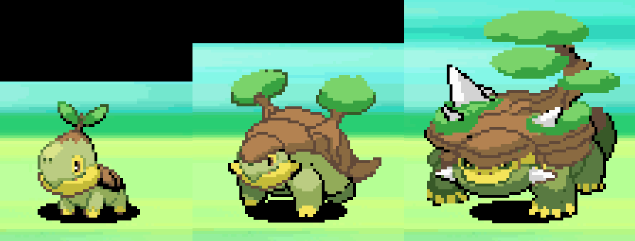
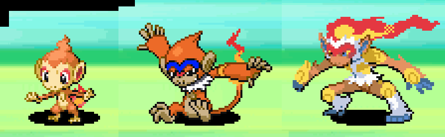
Take these Beta Sinnoh Starters, for example. Some of them (Turtwig, Piplup, Empoleon, the entire Chimchar line) are more or less finalized. Granted, the sprites look somewhat rougher, and Infernape in aprticular look like they haven't done some of the shading or added his tail, but the real interesting ones are Beta Prinplup, Beta Grotle and Beta Torterra. Beta Prinplup looks more like an obvious middle-ground between Piplup and Empoleon, and perhaps shares too much features with Empoleon which is why they ended up with a more unique design. Beta Grotle is... somewhat similar with the final one, although I can see why they ixnay'd the awkward bonsais here and swapped it with bushes.
Beta Torterra, though! The bonsai garden idea was already in place, sure, and I can totally handwave the trees and features being a bit rough. It is a beta build and one that's still in early development... but man, considering both Turtwig and Grotle already have their snapping turtle faces decided even in this stage, it's so, so bizarre seeing Torterra with a dopey, smiling huge face. It does take away a lot from what Torterra's vibe would be in the final game. The garden-shell also feels a lot more flat instead of the more armoured turtle-shell vibe of the real Torterra that we got, so all in all I'm actually happy we got all of these changed. Mostly, the Diamond & Pearl leaks just really ends up giving us a neat look at how they went from clearly already-defined concepts into the final designs we had now.
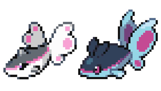
The Beta Gible line, on the other hand... wow, what a departure, huh? Nevermind the colours, which lean more towards a less-badass brown-red instead of blue. Look at just how different the concept ended up being! And sure, just like Beta Garchomp, the design still ends up being finalized as a raptor-shark-jet thing, but shit, it's really different, huh? Beta Gible reminds me of Betamon or Gizamon from Digimon, being a four-legged blob baby with a fin on top. It's a lot more shark-y than its final design, and honestly, putting a coat of paint on this one and I would totally love this thing. Beta Gabite, on the other hand... yeah, it sure is a mid-point between Beta Gible and Beta Garchomp, but a long-necked dinosaur with shark fins does look bizarrely awkward between little blob-frog-baby and jet-raptor. In retrospect, that's probably why they changed Gible from quadrupedal to bipedal in the final design.
And Beta Garchomp... proportions aside and that awkward, weird crotch, this basically ended up becoming the final version of Gabite, doesn't it? So it's like they deleted the middle form, moved Beta Garchomp in the middle, and added a final, spikier and scarier form. I also really liked just how much sleeker and smoother the final Gabite and Garchomp were compared to Beta Garchomp, and the addition of hammerhead shark head-thingies definitely gave them a lot more personality. These aren't bad, but, again, comparing them to the final product, you can see why these were cut.
Due to the size of the D/P beta, I'm not going to talk about every single beta sprite, and especially these. Again, it's easy to mock these for being so scribbly, but they were clearly just sort of rough placeholder images, and maybe they were trying to test out poses, or the Sugimori team's artwork aren't finalized yet -- Regigigas, Carnivine, Shinx and Shaymin are already basically set in stone, they just basically ended up fleshing out the specific details. And sure, Beta Probopass is missing his hat and mini-noses, but again you can totally see the basic concept of the thing already finalized.
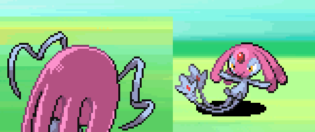
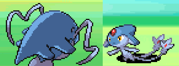
The Lake Pixies, in particular, already had basically finalized front sprites... but their back-sprites do show us that at some point, their head-crests were more different and they had Suicune-esque antennae. I really wonder if their faces would be different and if they would've felt a lot more unique.
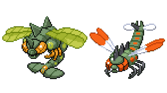
There really isn't a good place to source all the images from, so I'm picking from different sources. It's interesting that Beta Yanmega is actually a lot more monstrous, although a lot of the details are similar. He's got more exaggerated back-spikes and chunkier tail-bits, as well as an extra bulb connecting the bug legs to the body. I actually like the more monstrous Yanmega, although I definitely think that the final design's colours win out.
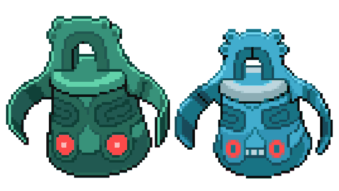
Beta Bronzor is only slightly different, having an extra number of details, but Beta Bronzong... yeah, changing those creepy dead-set eyes into the more friendlier-looking one in the final design, as well as adding a mouth, really does make Bronzong into a far, far friendlier-looking creature, huh? Part of me really do love Beta Bronzong, but on the other hand one of the principles of Pokemon is how every creature must look 'like it can be your friend'. That Beta Bronzong looks like it would rather kill me and bury me in a swamp than being my friend.
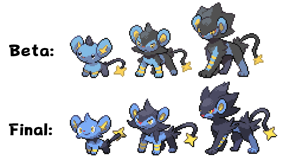
The Beta Shinx Line! Beta Luxio is basically just only slightly unrefined, and Beta Luxray had a bit of a haircut, but Beta Shinx is super-duper popular for basically being a lot more baby than its already cute finalized form. That tuft of hair! And those mousy eyes! As cute as it was, though, this one, I think, was changed more to fit the Pokemon aesthetic of more anime eyes, which, for better or for worse, permeated the third generation onwards.
Beta Rotom was just a very simplified blob of electricity with a couple of hands. And man, I do like just how much was changed while the idea of 'a ghost lightning-blob with hands' remains with the finalized Rotom. Was it already decided at this point that Rotom was going to possess electronics? We'll never know. I can totally see why this one was junked, for sure.
Beta Darkrai looks so goofy, being a far, far less badass-looking skinny ghost-man with a giant S on his face. One of the most interesting thing is that someone had this Beta Sprite in mind when they designed the Japanese logo for the Darkrai movie, which is like such an obscure easter egg that was certainly made pretty deep into Diamond & Pearl's life. I do really like the fact that this weird giant letter-in-the-face design was scrapped. The final Darkrai design isn't like, anything super-special as far as fantasy ghosts go, but it's still a lot cooler than this.
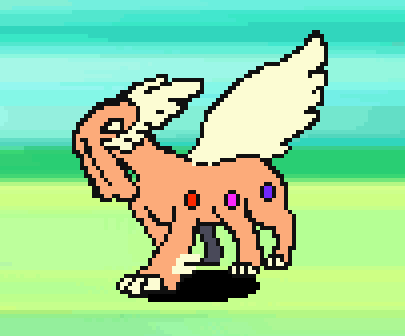
Beta Giratina is... uh... okay, wow, what the heck? Named "Chimairan", this is clearly still a in-development sprite due to the lack of shading, but it looks like Raikou and Therian Landorus slammed together and made a baby. It's a four-legged orange beast with maybe one wing and a bunch of face-tendrils instead of a mouth? That sure is a weird, quasi-angelic looking being. I like the giant devil-centipede we got, but was this supposed to be a completely different 'character' than Giratina? Or did the concept of Chimairan evolve into Giratina later on?
And yeah, Beta Arceus is just a weird doodle with creepy circle eyes. While some people theorized that Arceus might just be meant to be a meta-physical being and this misty thing is his avatar or something... I do like the idea that the god of Pokemon is just a fancy llama, which the franchise does manage to portray pretty well anyway. This Beta Arceus does end up being the genesis of some really badass and spooky fan art, though! Like this one by CaptainPiika.
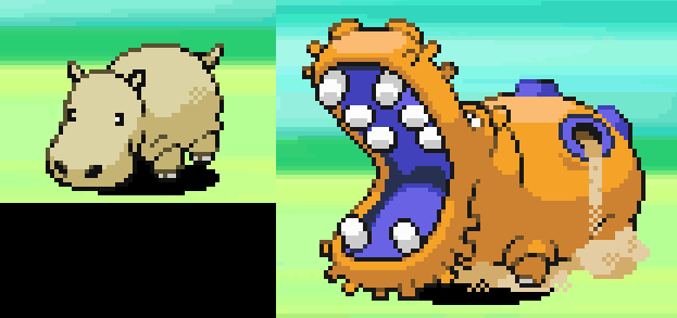
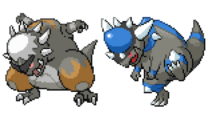
Going a bit more quickly now, Beta Hippopotas! It's a mite too detailed to be a placeholder like Carnivine or Arceus, but I guess they went backwards after designing Hippowdon and decided it needed a baby. This one is literally just a hippo. Beta Hippowdon is... it's a garish orange-and-purple, and there are a fair bit of differences. A more straight set of jaws, random bristles, and very different tiny-feet. All in all, it's neat to see just how a couple of slight tweaks did end up improving Hippowdon's design, even if it's not one of my favourites.
Beta Finneon isn't too different, if anything, it's got a more simplified body and a less butterfly-inspired set of tails. The white-pink-black colouration is neat, but nothing to write home about. Beta Lumineon, on the other hand... she's interesting, and I really would've liked to see this concept brought to fruition. A lot more in keeping with the anatomy of the Tripod Fish that it's slightly based on, Beta Lumineon has a longer, more eel-like body with butterfly wings on her front half. It's weird, sure, and this sprite is nowhere near finalized... but both the black-with-neon-markings look and the far more memorable silhouette makes me think that if they had followed through with Beta Lumineon, it might not have been as forgettable as it ended up being.
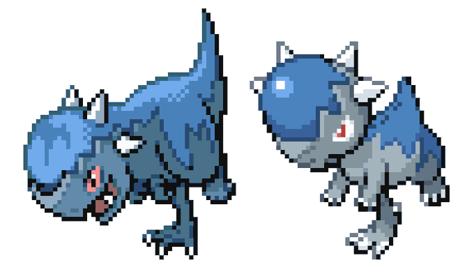
Okay, this is interesting. Beta Cranidos is a lot cooler looking than its final form, with a scrappier look and a design that felt more natural in that of a Pachycephalosaurus. Maybe that's why they scaled it out a bit, to make Cranidos more of a cartoon dinosaur than just a dinosaur? I'm more or less indifferent about Beta Rampardos, I feel, the weirder proportions and the arms being so far back on its body looks weird to me. The arrangement of the spikes around its head is interesting, but I wouldn't say that it's a straight-up improvement to real Rampardos.
Beta Togekiss is... uh... it's more of a plane than real Togekiss, huh? I wouldn't mind having a slightly more eerie and badass-looking alternate evolution for the Togepi line, but not at the expense of the Togekiss we got. I feel like a huge factor of the Togepi line is how friendly it is, and taking it out for this more eerie, spooky version isn't something that I felt works particularly well.
Beta Combee is actually a design that snuck its way into a Sun & Moon (or Sword & Shield?) artbook before, and it's basically a simple but interesting change. Instead of weird faces, the little hexagons used to own baby faces sucking on pacifiers. Okay, sure? That's a bit too werid for me. Beta Vespiquen has a lot of the designs we'll see in the final design, but I guess she got toned down for how... angular and alien-looking she ends up being? I do like the addition of green and purple to her palette, and that face does look pretty badass.
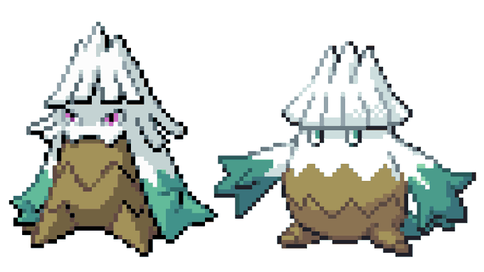
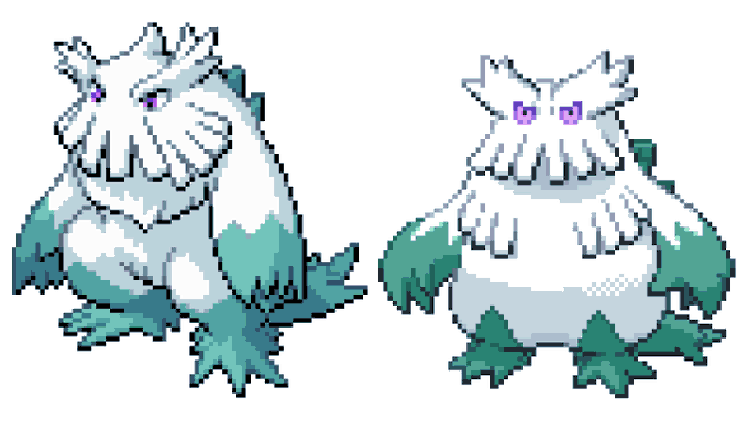
Beta Snover and Beta Abomasnow... uh... they look more... lady-like, I guess? Sort of? I dunno. They look so awkward! Beta Snover looks a bit shriveled up and honestly a fair bit more monstrous. I'm not sure which one I prefer, but I really do like Snover as this cute, Moomin-esque fat plant baby. I certainly don't like Beta Abomasnow. It leans a bit more into the yeti vibe, but I really do like the far more likable and more plant-esque final Abomasnow we got.
And here is our last prototype Pokemon, one from generation V, some random sketches for what would become Sawsbuck. Not much to say here.
And... that's about it! This has been fun, a nice little jaunt into what-could-have-been for the Pokemon franchise, seeing the creation in the behind-the-scenes of the design of these 800+ Pokemon. And honestly, the Generation I and II ones are probably the most fascinating since it's when they were just conceptualizing the franchise and trying to set the tone and theme of the franchise going onwards. Seeing how it's been immensely successful for close to two and a half decades now, they certainly made a lot of great choices. None of these honestly feel like "man, we could've gotten a classic" in the same way that I feel about some of the Spaceworld Gold/Silver ones like the Tangela evolution or Ikari. But it's still neat to imagine what could have been, though.
No comments:
Post a Comment