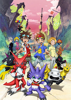
 After the whole epic battles of Xros Wars's two seasons, we get a spinoff-sequel starring a new protagonist and a barely coherent and poorly-defined concept. Digimon Xros Wars: The Young Hunters Who Leapt Through Time is a bizarre mix of various concepts cobbled together to form a pretty confusing set of episodic battles and a poorly defined battle royale to "hunt" as many Digimon that manifests into the world. It follows Xros Wars' lead of at least utilizing a bunch of older, ignored Digimon like Psychemon and Astamon, something that I do appreciate, but the writing is utterly abysmal, and even for a toyline tie-in cartoon aimed for children, Hunters was pretty piss-poor. It's mostly remembered by the fandom for the last two or three episodes, which is basically the only episodes that really tie in to Xros Wars in any meaningful fashion, and also features all of the protagonists in Digimon's history teaming up.
Anyway... let's just rip off this band-aid, shall we? And, yeah, I might sound a bit too negative, but, man, it was pretty torturous to work through Hunters as a show. Everyone in it is unlikable, most of the returning cast are pretty mis-handled, and the plot is pretty must a jumbled cryptic mess. Say what you will about 02 and Frontier, they are at least somewhat solid in what they do, they're just not good. This series is just flat-out bad. But hey, we're not here to bash the series, we're here to talk about the designs.
________________
Gumdramon
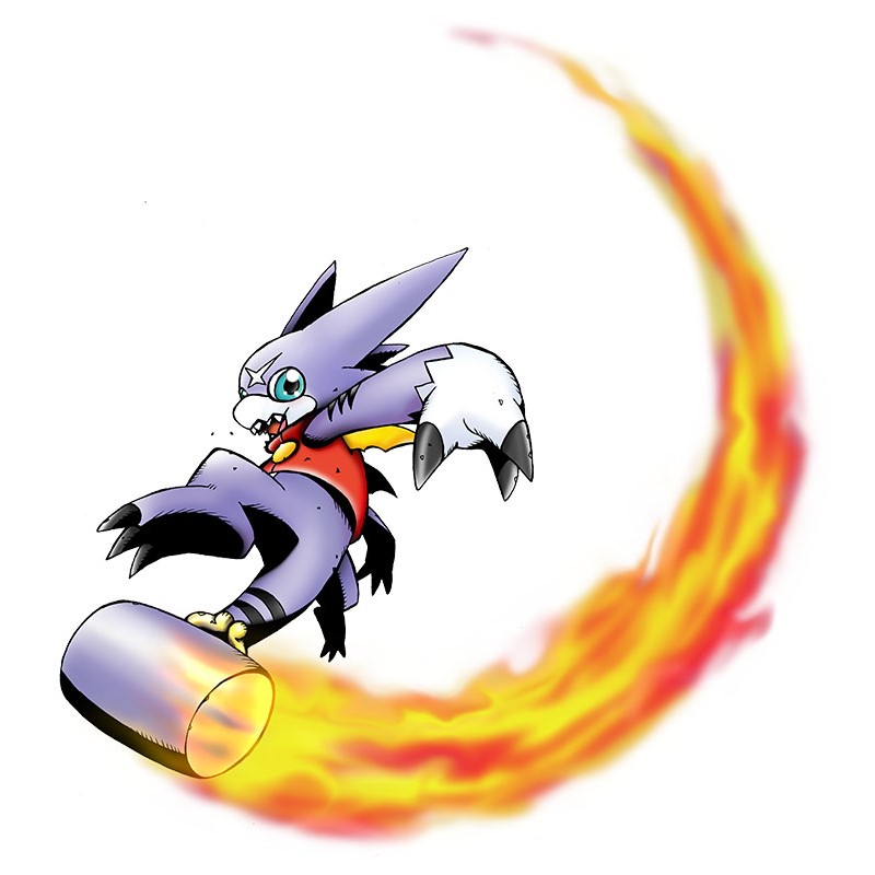
Gumdramon's whole gimmick is that its hammer-tail can stretch, hence the name 'gum', which you would think would lead to some Monkey D. Luffy and Elongated Man style hijinks... but, nope, similar to the lack of creativity that went into making Gumdramon's design, the action scenes that Gumdramon is in basically goes around the same "whack enemies with the hammer". When all you have is a hammer, I guess. I really don't want to make my feelings for the show influence my feelings on the designs of its characters, but man I do not care for Gumdramon at all, this messy, "let's lump a bunch of features together onto a generic Veemon body" design.


 3/10.
3/10.Arresterdramon
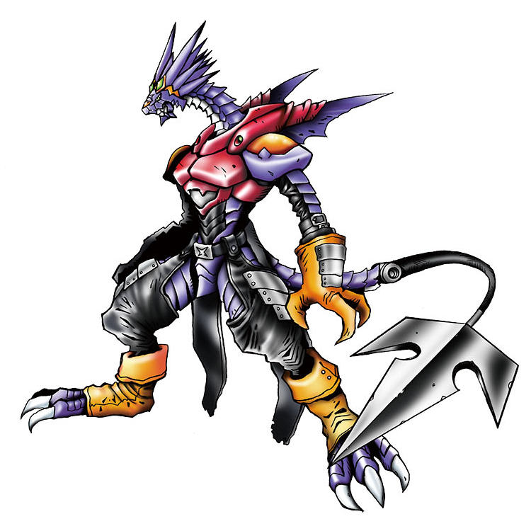
Jeez, what a horrifying mess. Like, I tend to try and understand that sometimes things appeal to other people, but Arresterdramon is just one godawful mess of a design. The colour scheme is okay enough, a combination of purple, red, black and yellow is pretty pleasant, but the skinny dragon-man in... leather pants and... cyborg armour? With a metal trident tail? Digimon has had a bunch of dragon-men over the years, and while they aren't my thing, I could at least appreciate designs like Darkdramon or Dorugoramon or ShineGreymon at least looked pretty cool. Arresterdramon is just a mess! Nothing to say here. Just not a big fan.
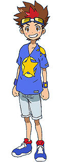
I guess I can talk about the protagonist here, Akashi Tagiru. He's... he's a tool. He embodies all the annoying parts of Shonen anime protagonists without any of the likable parts. That's about all I can say about him.


 0/10.
0/10.XrosUpArresterdramon [most of them] & Arresterdramon Superior Mode
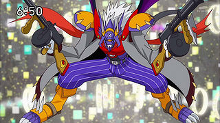
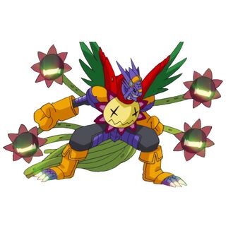
Evidently, Bandai didn't think much of Arresterdramon. See, the gimmick of this show is "Xros Up", which they try to imply is different from DigiXros, but is basically the same thing. Unlike Shoutmon's alternate forms which at least received some wacky names, Every single dang one of Arresterdramon's forms are known as "XrosUpArresterdramon". And... and, well, they're at least somewhat cooler by virtue of featuring cooler-looking designs.
Like these two! Featuring Astamon and Blossomon, the former ends up giving Arresterdramon a badass trenchcoat, scarf, mafia pants, and bonus points for the mafia pants actually matching Arresterdramon's purple scheme. Meanwhile, Blossomon adds a whole ton of colours that sort of clash with Arresterdramon's already busy colour scheme, but the layout of the different Blossomon heads actually make it a pretty neat looking Dr. Octopus esque hybrid. Also love the tail of vines.


 4/10 for these two.
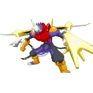
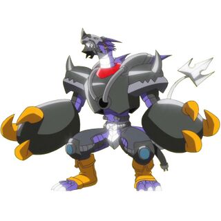
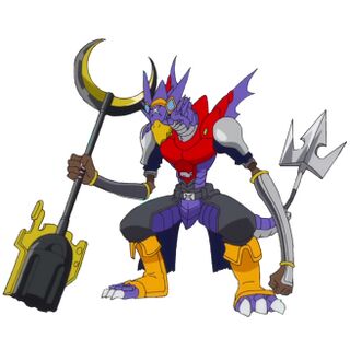


The rest of them, though, just look minimal-effort, like they just slapped random features onto Arresterdramon as accessories without much care, and in that last one, the fusion with Ogremon, the result actually looks even more hideous. I'm not sure if the animation staff just doesn't give a shit, or if it's a deadline thing, or what, but jeez. Honestly, at this point, I feel bad poking fun at XrosUpArresterdramon. Not even Bandai cared to give any of these official artwork, or real names, or even profiles.
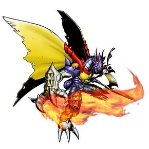
Oh, and this is Arresterdramon's evolved form, "Arresterdramon: Superior Mode", which is just... the fucking same thing, but with Bagramon's right arm because of some bullshit backstory that doesn't make Gumdramon any more interesting, and a bunch of tattered-looking wings. I... I really don't care for this form.


 0/10.
0/10.Ekakimon
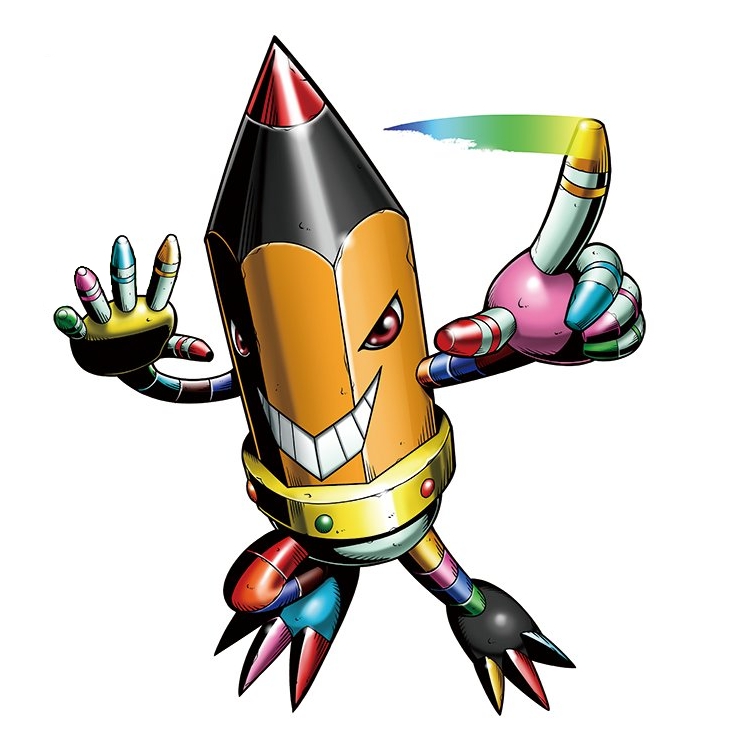
Ekakimon, named after "ekaki", Japanese word for artist, is one of the couple of villains-of-the-week that isn't a pre-existing Digimon. And Ekakimon is basically a fun little pencil with robot arms and legs, all coloured differently, and it basically has the ability to make drawings real. But, of course, instead of being one of the most powerful creatures ever, Ekakimon is reduced to being kind of a joke, because Hunters is unable to hold any sort of tension in any of its episodes. Ekakimon is an alright looking design, all things considered, even if it does feel minimal effort. I do like that one of his attacks is apparently called "Mini Mini Ekakimon", where Ekakimon will just draw extra smaller versions of himself to attack the enemy. I don't like this one, but it's neat enough and inoffensive enough.


 4/10.
4/10.Yakiimon
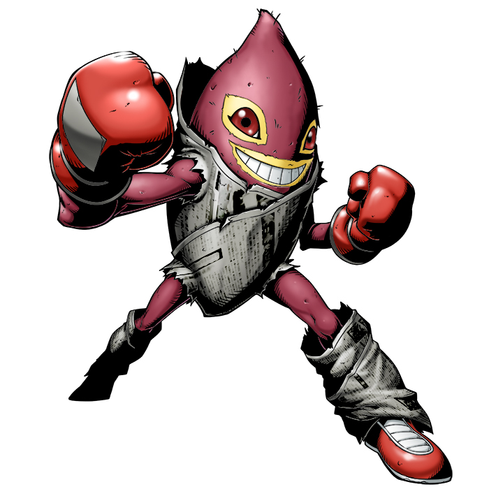
Borrowing his name from the Japanese word for sweet potato, Yakiimon is... well, the idea of a boxing sweet potato is a ridiculous one, but that's kind of all there is to Yakiimon. There's no wacky twist, no funny exaggeration, no nothing. He's just... a sweet potato with a grin, with limbs, and the limbs have boxing gloves. He has Nike shoes, too. This is, like, the first draft of a monster. Or something that relies on its lore to be interesting. Or a background character or something. I don't like this one. He's so bland and boring. I'm not sure why Yakiimon feels so boring, but it's just such a mundane-looking interpretation of something that should be hilarious and ridiculous.


 2/10.
2/10.Bacomon
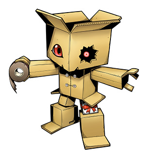
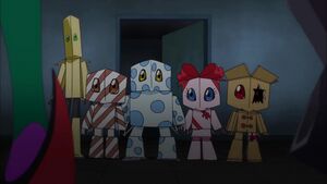
Oh, hey, something from Hunters I legitimately like. Bacomon (named after the Japanese word for cardboard box, not after bacon) is a fun little golem made entirely of cardboard boxes, and I really do love how the whole thing looks like someone stacked a bunch of boxes together in rough approximation of a golem, and I absolutely love the wacky little details that go into him. That one gift box that serves as an upper leg, the fact that he's holding some tape, the zip-tie locks that serve as "buttons", and I absolutely love the fact that his right eye seems like a generic painted-on anime eye, but the broken hole shows a creepier pinpoint eye inside the dark void in his head. See? Bacomon could've been so boring, but these details end up making Bacomon look so much more interesting, unlike silly Yakiimon up above.
Bacomon is, of course, a timid little creature that finds security in his cardboard boxes, which is kind of a ripoff of Gabumon... but at least it looks unique. It will apparently "pack" whoever tries to peek inside the boxes in a box of its own. In the Hunters episode, there are apparently a lot of variations, although most of them are based on gift boxes and stuff. A pretty awesome little box monster!
Bacomon is, of course, a timid little creature that finds security in his cardboard boxes, which is kind of a ripoff of Gabumon... but at least it looks unique. It will apparently "pack" whoever tries to peek inside the boxes in a box of its own. In the Hunters episode, there are apparently a lot of variations, although most of them are based on gift boxes and stuff. A pretty awesome little box monster!


 8/10.
8/10.Sagomon
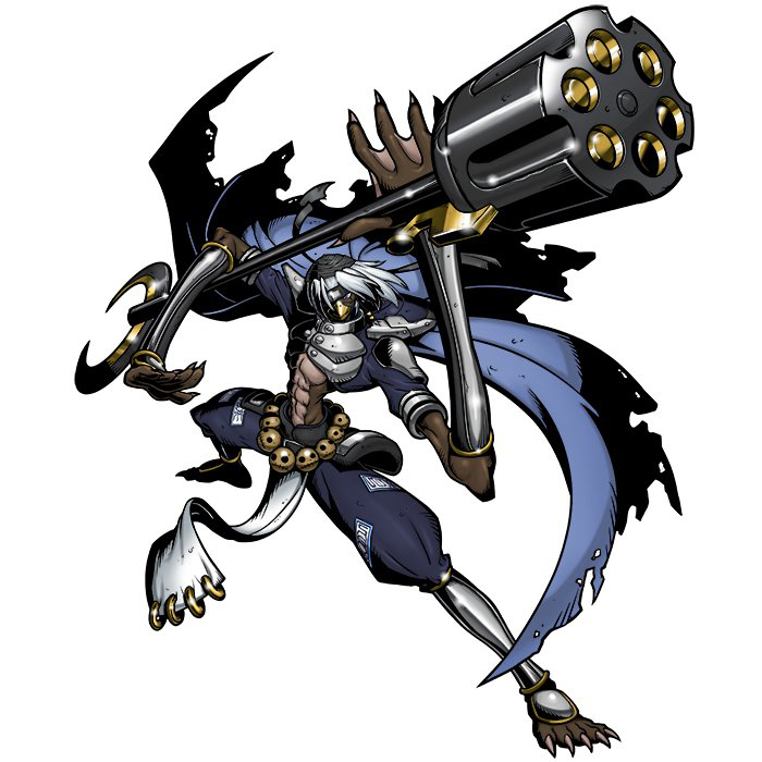
A long while back, we had Gokuwmon, based on Sun Wukong/Son Goku, the Monkey King, protagonist of iconic Japanese novel Journey to the West. So after Gokuwmon and Shawujinmon, Hunters decided to complete the trifecta by adapting the main characters of that novel into Digimon. Except... we already have a Shawujinmon, but they ended up taking Sha Wujin's Japanese name, Sa Gojo, to make Sagomon here. Who is exactly the same with Shawujinmon, but in blue. And this is such a less interesting colour palette compared to Shawujinmon! At least Sagomon has some unique lore, which is the fact that it has nine skulls as a belt, and if one of the skulls is stolen, he will transform into a demon. Overall, though, kind of an uninspiring repaint. Sagomon is one of the few Digimon "hunted" by Tagiru, but unlike the cast of Xros Wars, Tagiru basically never actually uses the Digimon he "hunts", in full opposition of the core themes of the previous show.


 5/10.
5/10.Gokuwmon
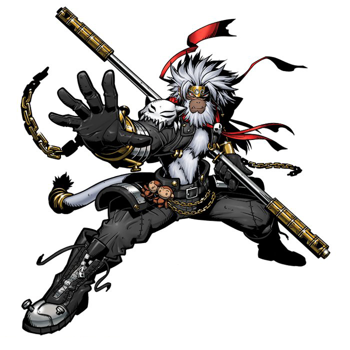
Not to be confused with Gokumon, Gokuwmon is based on Son Goku/Sun Wukong, the Monkey King. And he's... he's basically honestly an anime version of the Monkey King, with no real twists. It's kind of a cool monkey with the cool staff that Wukong has, but at the same time there really isn't much creativity that went into designing this thing, huh? We've had Digimon based on legends or literature before, but all of them at least tried to make things look unique. Gokuwmon is just literally Sun Wukong with some anime accessories. Like everything in the Hunters era except Bacomon... nearly zero effort went into this thing, they just took Sun Wukong and just slapped some cargo pants on him. Bleh.


 3/10.
3/10.ChoHakkaimon
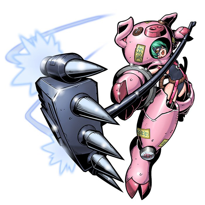
Sun Wukong's second brother-in-arms is the lustful pig demon, Zhu Bajie, who is often portrayed as being a lustful, greedy and gluttonous pig-man who is, like the rest of the cast, trying to find redemption after being befriended by Wukong and his master. And Digimon's adaptation of Zhu Bajie (or Cho Hakkai, as he's known in Japanese)? This.
Yeah. A loli girl dressed in a bizarre patchwork mech suit, holding a gigantic rocket-powered rake in an adaptation of Zhu Bajie's rake weapon. ChoHakkaimon actually received a fair amount of screentime in Hunters, being the evolved partner of human antagonist Airu... evolving from Opossumon of all things. I'm genuinely not sure what to make of ChoHakkaimon here. She's at least not super-sexualized, but the decision of making the inner humanoid lady dressed in nothing but a one-piece swimsuit is bizarre. Honestly, I don't actually hate this design as much as I thought I would... it's just utterly bizarre and borderline offensive. Which is a shame, because in any other situation, I'd take Pig D.Va with a rocket hammer and the backstory of a fallen angel as a very creative decision, but ChoHakkaimon just really rubs me the wrong way.


 1/10.
1/10. Sanzomon & Shakamon
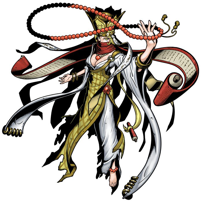
Sun Wukong's monk master in the Journey to the West novels is a male monk named Tang-Sanzang (Sanzo in Japanese), who is... a monk! That teaches Wukong, Bajie and Wujin Buddhist virtues, while also being someone for them to protect, as consuming his flesh would make the demons that they encounter in the journey immortal. Sanzomon is a Perfect-level monk Digimon that is... just a human. A woman, too, and a woman monk showing off cleavage for no real reason. A very boring design that's honestly "just a human", and not one I like at all. Not sure why some TCG's also chose to sexualize Sanzomon, either. I completely forgot that Sanzomon was apparently someone involved in Gumdramon's backstory, sealing his power with that golden band.
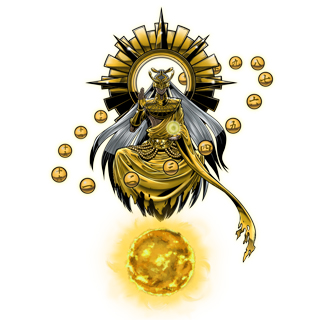
Shakamon is based on Buddha, and is supposed to be the Ultimate-level evolution to Sanzomon. I've never really been a fan of outright adaptations of religious figures. Things like Lucemon are somewhat less offensive, I feel, because they're just taking a creative spin on it. Shakamon here is just a female Buddha, though, with no other twist other than that. Again, not a big fan, and honestly I really feel that this entire set of Journey to the West inspired Digimon ended up being pretty unfortunate and honestly somewhat offensive than anything.


 0/10.
0/10.Ganemon

Hooo, are we over? Neat, because this next one is at least somewhat charming. Ganemon (kogane meaning money) is a 10-yen coin with a face and a dapper mustache, a top hat, and a set of cartoon string limbs, holding a briefcase and holding a stack of bills. Not the most impressive design, but far, far more charming than Shakamon or Sanzomon or whatever. It's apparently a swindler that would get people to steal money for him, and also gang-presses an army of lesser coin Digimon, the Zenimon and KoZenimon, to work for him. Apparently its mustache is a radar for money, and it's going to eat said money to make him grow in size. Not the most creative monster design, but at least it's actually neat.


 6/10.
6/10. Zenimon & KoZenimon
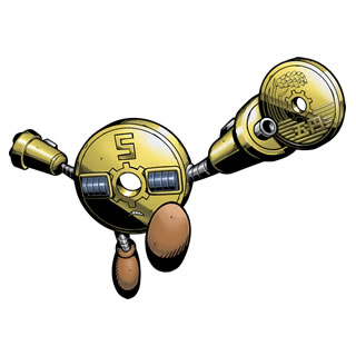
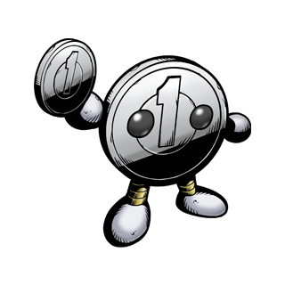
And I actually like these two as well! Apparently they're all sitting around in Ganemon's trunk, and are basically the same design as Ganemon, but based on different yen coins, and with a less-humanoid set of peepers compared to Ganemon. Where Ganemon has a money-radar mustache, Zenimon can actually emit waves that attract money. Do like its stubby gun-port fingers, and the bizarre, roller-like eyes it has. KoZenimon is cute, with those beady eyes and those little stump-hands. Not the most engaging or impressive-looking Digimon, but definitely some of the better ones Hunters has to offer. Which says more about this era than of the quality of the coin bros, though.


 5/10.
5/10. Jokermon

Ehhh it's just a dude in a clown suit, basically what you get when you combine Batman villains Joker and Harley Quinn, drawn it in anime style, and give him a scythe. The result isn't by itself a bad design, but, man, talk about lack of creativity! Just compare Jokermon here to previous clown-man Piemon, which still looks like a Digimon due to his bizarre proportions and accessories. Jokermon could just be a generic random clown-themed enemy from [insert random anime] or [insert random video game], and you wouldn't be able to tell. He's visually all right, and doesn't offend me like some of the above... but he feels like he should be a character in an anime instead of a digital monster.


 2/10.
2/10. Pillomon (a.k.a. Pillowmon)
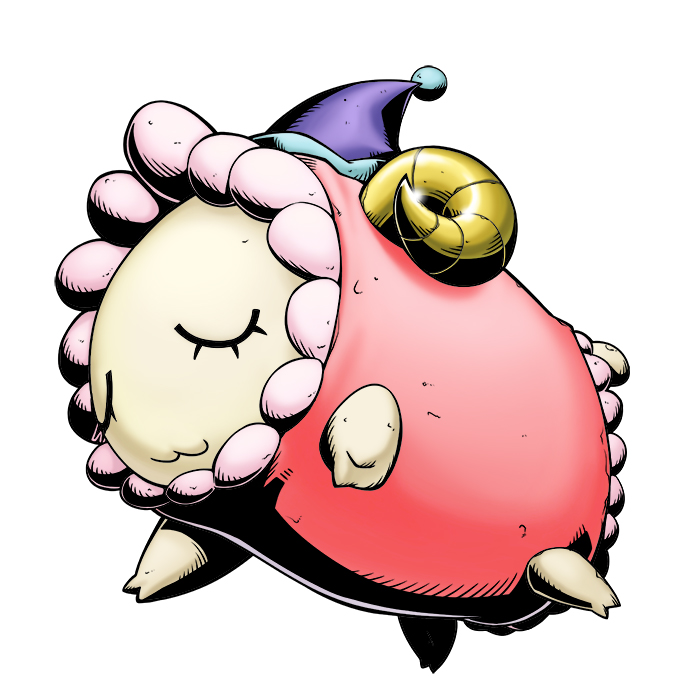
Oh, I get it, because you count sheep to sleep. Pillomon is kind of a bland one, but at least it's way more creative than Jokermon or Yakiimon in that it actually looks like a wacky Digimon instead of an idea plagiarized from another franchise. Of course, while it's an adorable sheep-pillow with a fun little night-cap, apparently Pillomon will steal and eat your dreams, because, well, it's a Digimon. I do like the little detail that Pillowmon attacks by snorting bubble, and the effect of the bubbles -- lulling enemies into a deep sleep, or tormenting them with nightmares -- depends on how soundly the Pillomon itself is sleeping. Not my favourite design by a long shot, but not a bad one.


 5/10.
5/10. 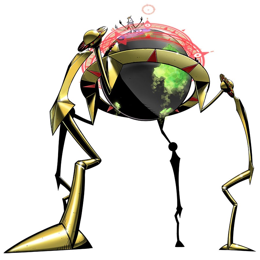

And here's the final big bad of Hunters, Quartzmon, a mighty giant globe with spindly spider legs, and a vague ring of red energy, from which Quartzmon's central body pokes out. It's like the concepts of Apocalymon meets the D-Reaper, but with all the cool goth-punk themes from Apocalymon removed, and the techno-Cthulhu themes from D-Reaper removed. Quartzmon is still miles and miles cooler than the likes of Sanzomon or Jokermon, but at the same time, there is a significant feeling of "been there, done that". The highlight of the design is definitely that central body with the bizarre mask and random horns sticking out of its head, as well as the four twisted arms, looks somewhat neat, definitely feeling like a tamer version of the D-Reaper agents from Tamers.
Quartzmon's whole deal is a generic destroy-the-world plan, and he basically feels like an anime summer movie villain -- a somewhat neat design, built up to be so badass it needs a super form to take down, but ultimately forgettable due to any lack of character or motivation. He's all right, I suppose, but we've had so many "world-ending walking Armageddon" Digimon from Apocalymon to Arkadimon to the various Millenniummons to Ogudomon to Lucemon to the other Demon Lords to Yggdrassil to the D-Reaper, that this globe with legs just feels underwhelming.


 5/10.
5/10. More random stuff from tie in video games below. I don't have much nice things to say about them.
Armamon & OmegaArmamon: Burst Mode
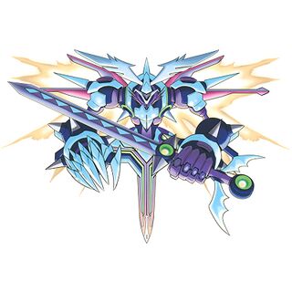
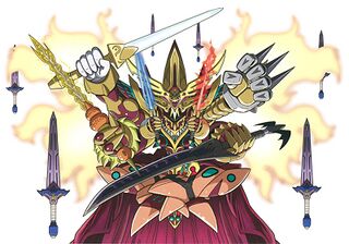
Are we over with Hunters? Thank god. Let's cover a bunch of random miscellaneous Digimon, yeah? Armamon (left) is one of the main villains of a Nintendo DS game to tie in with Xros Wars, and Armamon's basically a walking plot device that's a "legendary weapon" digimon. He sure is holding a sword and has a sword for a lower body, and looks like a mechanical angel-demon thing. Not the most creative design, but okay. OmegaArmamon: Burst Mode (right) is just a bunch of badass sounding words strung together to give Armamon a completely unwarranted and badass final transformation. Apparently the combined forms of Armamon and the demon lord Barbamon (the old man one). OmegaArmamon looks like he's a rejected Yu-Gi-Oh card design, honestly, and I just can't think of anything nice to say about him.


 1/10.
1/10. Hubmon
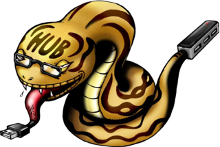
A bit of an quasi-unofficial Digimon, Hubmon is a snake with a USB port for a tongue, and a USB hub for a tail. He's apparently a mascot in one of the video game sites. He's... he's not particularly creative, and that stylized set of glasses on his face really make it obvious that he's meant to be a tongue-in-cheek design. Actually don't mind this all that much, though.


 4/10.
4/10. Targetmon
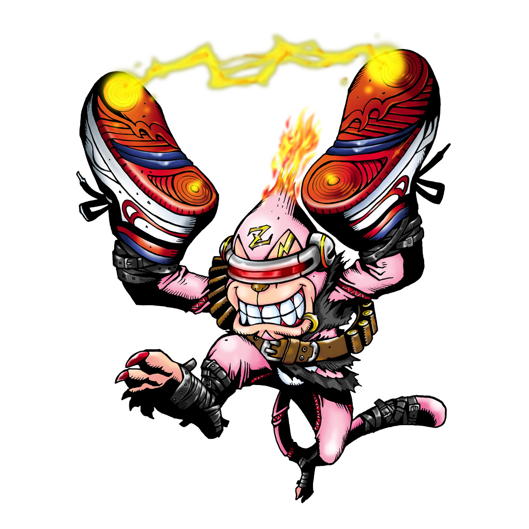
Targetmon here is an Adult-level puppet Digimon originally released as a TCG-exclusive Digimon (and there's a metric-ton of those in the upcoming reviews), but has basically been adopted as an official one, showing up in some anniversary Digivices. He's... he's a nasty-looking pink monkey with Cyclops' glasses, an ammo bandoleer, and like a dumb monkey he's holding two shoes in his hands, and they're connected with electricity or some shit? It's apparently an Etemon pre-evolution, but I honestly don't find anything about this thing charming. Honestly, I feel bad even giving this a point at all. I really don't like this thing. Ew.


 0/10.
0/10. Soundbirdmon

Huh, actually a neat-looking one, but sadly not one that has appeared anywhere outside of a TCG. Soundbirdmon is a fun combination of a musical note, a bat, and general tattered-looking shadow creatures, and I really love how the 'tail' ends up both looking like a scythe and the accent of a musical note. Absolutely love the tattered wings and the speakers built into Soundbirdmon's tattered wings. And despite its pretty gothic look, Soundbirdmon isn't some sort of demonic shadow beast. It's just a bird-blob that unleashes loud noises. Pretty neat!


 5/10.
5/10. Omegamon Zwart, Omegamon Zwart D, Omegamon Alter-B
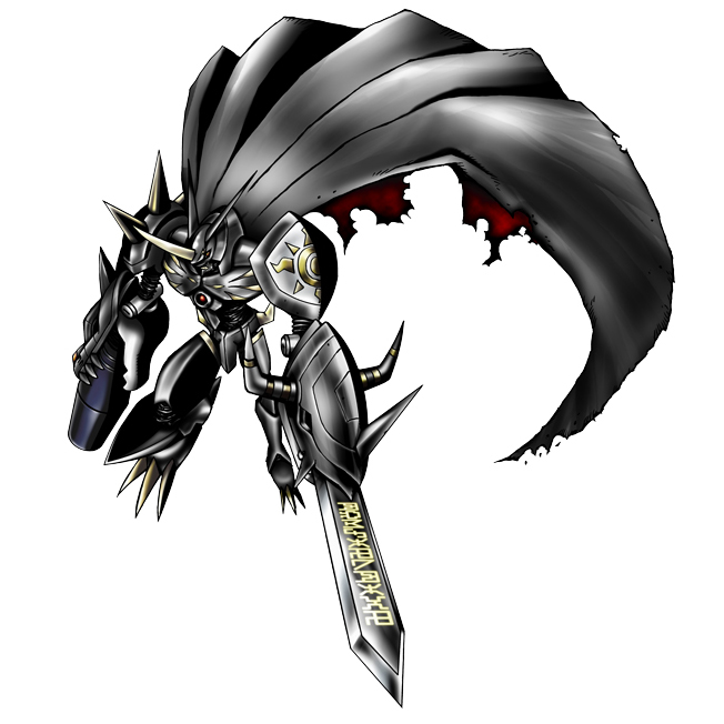

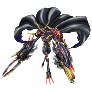
Oh, hey, black repaints. Much creativity, much wow.
These Omegamons are basically various villains in various video games. "Zwart" is the most boring, just being a straight-up black repaint, but I actually appreciate "Zwart-D" and "Alter-B" actually taking their time to alter the looks of Omegamon. Zwart-D's artwork really makes Omegamon look tattered, like some sort of desiccated mummy, and I absolutely love those thin, skeletal feet and the cloud of miasma around those raggedy capes. Alter-B sort of adds some Tron lines and spikes and changes the weapons of the arms, which is kinda-sorta neat.
Actually not a bad set of black repaints, Zwart aside! And, yeah, I am praising a bunch of black repaints over half of the Digimon on this page. And if you think I'm negative in this one, wait for the next segment...


 4/10.
4/10.
Fun fact: Soundbirdmon actually appears in the new Digimon 2030 reboot.
ReplyDeleteAll of these Digimon Reviews all the way up to Tri were written without me being aware (and still not really aware of) the new rebooted series! They've just been sitting unedited in my 'drafts' folder since the end of 2019, probably.
DeleteI do like the visuals of Soundbirdmon, and he (she?) would probably work pretty well in animated format.
Yeah, the 2020 reboot shows off a lot of older digimon that never appeared in the anime before. Off the top of my head there's Fangmon, Groundramon, and Gokumom
Delete