
 The final entry in our rapid-fire shiny review list! This one's going to probably be slightly longer because they actually put in a lot of effort for these two generations, making them the most pleasant shiny pokemons to date.
Not much to say. As always, Shiny Pokemon are all after the break.


Pretty neat, and the fact that it's not a simple one-on-one colour switch really shows the more amount of care given to the shinies of the sixth generation onwards. Chespin and Quilladin look positively pleasant with that brown chesnut colour, and I actually like the darker browns and greens of Chesnaught so much more than the official colouration.


Fennekin's silver fox deal looks so amazing, but contrasted with the red ear-furs? Pretty neat. Braixen's purple is okay, and Delphox looks pretty mystical swapping out the traditional fiery colours with silvers and purples. Still keeps the red ear-flame things, though, which is neat.


Froakie and Frogadier actually don't look super different, but Greninja becomes jet-black and actually looks far more like a ninja. Hell, the tongue-scarf even gets to become blood red! It's a simple colour scheme, but such a badass-looking one.


Very much less dirty-looking and far more pleasant looking overall, and that's saying much from someone who doesn't like DIggersby. Just keeping most of the coloration into tones of gray is surprisingly neat, huh?


They really don't do a lot for these, huh. Fletchling and Fletchinder in particular look disappointing, although Talonflame being far more orangey-red is very neat.


Scatterbug and Spewpa's silver colours are very, very pleasant, and Spewpa's black 'clothes' is very neat too. All the Vivillon forms retain their many, many, many wing patterns, but just swap out the main body. Which is a shame, but I guess is to be expected.


White-cub Litleo is neat! The Pyroars are boring.


Flabebe and Floette just swaps out the colours of their main bodies' highlights, but Florges just looks absolutely pretty with a dark purple ballroom dress deal. As with Vivillon, their flower colours don't change.


Not my favourite, but they're neat. Gogoat's particularly pleasant, with the golden horns and the zebra-like pattern.


Red pandas! It's neat. I also like how Pancham's fists are red... are they like blood-red or something? Neat.

Furfrou's okay. As a black shiny he's actually rather low-key.


Espurr's pink and nice, but the golden-white Meowstics are amazingly graceful and I absolutely love them.


All the swords are absolutely awesome-looking! Aegislash's red-rimmed black blade and the black-and-gold shield are all striking, but Doublade's entirely red blades and purple scarves are neat. My favourite has to be Honedge, though, whose scarf is a neat red-and-blue colour scheme that looks so cool.


Spritzee's a very pleasant shade of purple, and Aromatisse's pink-and-purple colour scheme is a lot nicer than her pink-and-pinker regular colours.

AAAAA CHOCOLATE CAKE PERFECT SHINY WE'RE DONE HERE


These are... actually pretty okay. As a relatively dull colouration, it's an interesting mixture of colours, though.


The change isn't that much, but just swapping the main claws of the barnacles into green and just edging the darkness and shade of the other colours makes for a strikingly different colour. Not my thing, though.


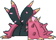
Skrelp's maroon-and-baby-blue is amazingly well-done, still looking sickly but also looking pretty at the same time. Dragalge's head-leaf is actually given a green colouration, which ends up causing it to look so much more vivid compared to the leaf in its original form.


Ohhh these two are so pretty. Like, turning a lobster from blue to red is child's play, but the neon blue highlights on the edges of Clawitzer's scales? Just straight-up beautiful.


Surprised that they actually kept some yellow parts, actually, even though the main bodies became red. Ends up looking kind of unique, although not really my thing.


They're just blue, but they're very distinct from their original versions, and I actually like Tyrantrum's colours here due to it causing his design to not look quite as cluttered.


Swapping out the light blue for white really makes these two so much more graceful and icy-er. Definitely pretty.

Sylveon's baby-blues work amazingly well as an alternate colouration that still screams "Fairy", right? It also helps that Sylveon still keeps a bit of pink for her eyes, ears and tips of her ribbon tendrils. Very awesome.

WOOO HOO MUCHA LIBRE! Easily one of my favourite colourations, just giving Hawlucha a wonderful 'heel' style colour scheme that honestly ends up looking just as good and a very amazing contrast to the 'heroic' Hawlucha. Both normal and shiny Hawlucha look particularly great lined up against each other.

Looks like a chocolate candy again, actually ending up identical with Alola Raichu. It's neat.

Carbink is a shiny pokemon that just swaps around the shading and brightness of the main colours, but ends up making Carbink look pretty striking, honestly.


Gold and pale pink aren't the first colour choices for the Goomy line, but they look pretty great, don't they?

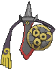
Golden Klefki! It's not as striking due to the nature of Klefki's very thin body, sadly.


Holy shit, these guys are amazing! How do you make ghost trees look more awesome? Paint the wood silver and the leaves red, like a dying tree at autumn. Trevenant just looks so amazing in shiny form, and it's just such an amazingly striking and well-done colour scheme, and so thematic, too!


Pumpkaboo's purple pumpkin is so awesome and adorable! The Gourgeist version is a bit less impressive, but it's still absolutely nice. Pumpkaboo is probably one of the nicer-looking shinies in this list, honestly.


Could've chaned more, because they kept the main ice parts blue, but it's not horrible.


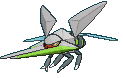
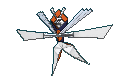
Noivern looks absolutely badass, like a toy out of the 80's. Look at that bright neon green and that dark red! Somehow it works so well. Noibat just swap out the purple and bright greens, I think, but that also ended up looking quite cute.


Xerneas's white-and-baby-blue colouration looks majestic as fuck. Yveltal's the opposite, with the black being changed into white and turning Yveltal into like a strip of bacon, but I actually love Yveltal a lot. Somehow that white ends up looking far more sinister in that Bleach-esque fashion since I know that Yveltal is the god of death. Also, bacon! Fear the bacon of death!


50% Zygarde's white-and-bright-green colouration is absolutely amazing-looking. The other two not so much.

Diancie's all right. The dark pink's neat, but not particularly spectacular.

Hoopa looks like literal piss. It's not a phrase I've used on this particular page yet, and it's honestly unfortunate that every single colour on what was once a colourful creature ends up looking like piss.

Garish but okay.


Rowlet and Dartrix's paler and darker shades respectively are neat, but Decidueye's dark wings and dark-green hoodie, combined with the red highlights for his bowtie and glasses ends up actually highlighting the ghost side of this owl archer.


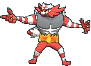
Just changing the dark whites into whites makes Litten and Torracat look amazingly beautiful, and the whites and oranges complement each other well. Not so sure that I like how the colours ended with Incineroar, because I kinda had hoped they did a completely different wrestler theme like Hawlucha, but it's okay.


Brionne has an amazing lavender paint scheme! Popplio's just darker but all right, and Primarina is... is pretty cool! I like how from the waist down it's essentially the same colour, but the frills are changed to a nice lacy pink and the hair gets turned to blonde. Neat stuff.


Pikipek's boring, but both Trumbeak and Toucannon changes the colours of the beak into a far more awesome-looking watercolour splash. Toucannon is perhaps one of the better shinies in this generation, and swapping out a bunch of other colours are great, too.


Yungoos' lavender-silver shade is great, but I'm not a big fan of Gumshoos' pink, though.


Grubbin's okay, Charjabugs red is neat, but Vikavolt's mainly-silver body and the green highlights on his stag beetle horns ends up looking pretty amazing.

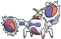
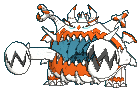
Crabrawler's lavender, red and orange paint scheme is gloriously colourful and looks like some sort of fruity-mix ice cream. Ditto for Crabominable, which looks like some sort of elaborate colourful candy.


The white pom-poms and the white body on the Pau Oricorio are both neat, but the completely-different colour-swapping on the Sensu and Baile Oricorios look absolutely stunning. The Sensu's main pale blue with lavender highlights is graceful, and the Baile's black with red highlights are just amazing.


Pink Cutiefly is a cutie! I'm glad they didn't go for this obvious colouration for the regular colours, but as a shiny? It's precious.


![[Image: lycanroc-midnight.gif]](https://lh3.googleusercontent.com/blogger_img_proxy/AEn0k_u5NoY4Km9siAEMpGDUo3NEhRdHViDWhghMGdCdpBYg0nwFVIX_aLDGbVyVrZ7mjQd_ephuesExaqeHDJhw2G9ooWSDchcJDhNn0ZvtJG0PJ4yjsrOiRMN2d3eFLi8uON50pH5q_Cr5V81VJ2rWH64w62mjIeK3yLdC=s0-d)

Blue doggos aren't particularly interesting, but I'm struct at how silly that the two four-legged Lycanrocs are honestly pretty similar other than the eyes and the tuft of white fur.


God damn, the golden eyes on the school-form Wishiwashi just makes the form look just so damn imposing, dunnit? Regular Wishiwashi's okay.

Hey, we get some traditional red starfishes! It's a neat shade of red, too! I kinda wish that the main 'body' ends up getting their colours changed to contrast, but a small complaint.


Orange horsies! They're not particularly innovative, but they look neat.


Oh my god, these are awesome. The combination of black and dark purple work so well on the spiders' bodies, but the bright red eyes with yellow highlights just make this colour scheme work so amazingly well.


Fomantis and Lurantis swap out their bright pink flowery colourations for a more mundane, old-school-pale-green-shiny colours. Not a big fan, but definitely a great contrast to the original forms.


Morelull looks amazingly colourful with those multi-coloured mushrooms on his head, but Shiinotic's bright yellow and dark brown ends up looking like a tasty, decorated pastry of sorts.


Golden Bewear and Stufful looks just so goddamn cute. That is all. Honestly, this entire list is just me singing praises at how cool and cute these are, right?


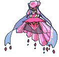
Yet another batch of very striking shinies. It's a simple muting of the dark pink and white, but the change of the green parts of the line's leaves into dark lavender just makes the evolution line look so gloriously regal.

It's just the main fairy body that swaps colours into bright blue, but it's neat.


Oranguru's purples and pinks work well, while Passimian swaps out his sleeves and berry-helmet and presumably plays for the away team.


Wimpod's red highlights are amazingly done, but Golisopod ends up being somewhat of a disappointment, only swapping out the anetnnae.

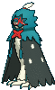
Oh boy, black-sand Sandygast and Pallosand look so goddamn cool, and there's even an area in Alola (and Hawaii!) that has nothing but black sand. It just looks so awesome and sinister, and I'm definitely a huge fan of these two.


M'eh. This is actually the only shiny so far in this page I used the word 'meh' on, actually.


Minior is actually unchanged... until you crack the shell and see that the main core within is actually jet-black, and it's glorious.

Komala's pillow changes into a funky little pink-and-white colour scheme, and I find it ridiculous and hilarious at the same time that the main koala body isn't really changed.

It's a bit of a weird, muted colour, and I actually am not a particularly big fan of this one.

Another m'eh.

I would say "m'eh", but they're actually going for a pretty creepy sepia-photograph deal and that actually works for the creepiness of Mimikyu.

Ey, this is is fucking glorious! Bruxish's shiny form just looks amazingly colourful, like another different variant of tropical fish with a naturally obnoxious colouration.

Drampa's orange, and that's a neat colour on him. Not much to say about this one.

Oooh, blood-red Sargassum algae makes Dhelmise look pretty great! The rusty anchor and the silver steering wheel are all neat details, too.


Gold and pink aren't a pair of colours I think would work together well on these three, but by god they really rock those colours.


Hey, another set of "let's just make them black because black looks pretty!" And... and it's definitely a successful attempts. The Tapus are particularly great to do whis with thanks to them keeping the totem highlights of white and whatever their original secondary colours are.


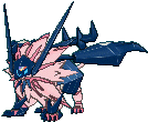
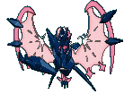
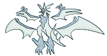
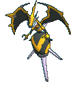
Cosmog and Cosmoem look boring, but Solgaleo looks amazing, and Lunala looks straight-up phenomenal. Lunala keeps those bat-arm-skeleton things and the contrast of the dark blue on the panorama of blood red is just amazing.

M'eh.

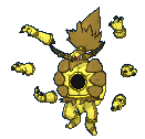
Okay, kinda gross, but the blood-filled muscles are still red, and I guess that's because the blood that Buzzwole drinks remains red, while the rest of him changes colour to neon green? Weird choice, but what did you expect for Buzzwole?

Nice black dress that Pheromosa got, but kind of disappointed that the cockroach wing-cape doesn't get changed.

The cables are blue, and it's not as neat as the others.
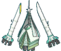
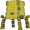
White Celesteela is appropriately majestic. I love how they kept the original pale-green highlights.
It's a small change, eliminating the yellow bits and replacing them with white. But it's... it's not one that I particularly like.
Oh wow what the shit is this? This is absolutely glorious. Mainly white, but with the most neon shade of orange as highlights? We need a lot more shinies with oranges.

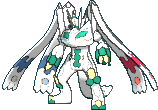
Regular Necrozma is boring, Ultra Necrozma's silver colours are okay, but the pinkiness of the fused forms are actually pretty neat, and the two-tone pink-and-dark-blue deal makes the fused forms look so much cleaner than their regular "mix Solgaleo and Lunala with Necrozma" paint scheme.

Barely noticeable.

Also barely noticeable -- I think Marshadow's colours in his animations change? Either way, m'eh.

Poipole's white-with-yellow highlights are neat, and Naganadel straight-up goes for a bee dragon theme and I love it.
It's a golden wall. It's okay. I mean, it's a good shiny, but being placed in-between the glorious bee dragon that is Naganadel and the insane disco ball that is Blancephalon makes the "yep paint it gold" shiny look underwhelming.

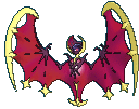
Speaking of which... disco all night! Shiny Blancephalon looks amazing.

Shiny Zeraora looks neat! The mainly white fur is well-done, and I like how the main form's yellow and teals are transplanted into different parts of the body. Actually like this colouration significantly more than regular Zeraora.
Aaaaaand... we're done! All the shines reviewed! Yay for me!
No comments:
Post a Comment