

Ehhh not much different.


These look pretty washed out, but Thwackey looks like a banana or something. Not terrible shinies, but could be better.


Huh. Scorbunny is another one that's pretty washed out, but I'm a huge fan of Raboot's gray fur and its new white-and-red hoodie muffler. Cinderace is a m'eh; the shade of gray doesn't quite look good on it. I feel like they missed out an opportunity with Giga Cinderace's big-ass fireball; it could've been blue or white or something.


Y'know what? These neon colours with bright cyan and pink actually work pretty well, particularly on shiny Sobble's grayish-blue skin. Inteleon ends up looking kinda icky. G-Max Inteleon has a fully white tail-tower, though, which is cool. (I couldn't find a small gif from pkparaiso, the source I borrow the rest of these from)


Noticeably different, but not exciting.

Yellow Rookidee is amazing. The two Corvi's just exchange their dark blue and black respectively for a pretty nice shade of silver, and I do like how it looks. One of the nicer alternate palettes, I feel.


Oooh oooh ooh I love this. Laender and purple are such a great colouration on Dottler and the two Orbeetles, and the slapping that nice shade of orange for Dottler's face and Orbeetle's horns look great, too. It's even a neat nod to purple ladybugs, which is a photo that went viral -- and ended up getting debunked.


Mmm, nice. I prefer the standard red shade, but gray and black is classy.


Eldegoss is cute with the pink and all, but the wildly pastel-coloured Gossifleur is easily the winner here. Gossifleur honestly just ends up looking like such a better dedsign than Eldegoss overall.


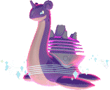
They be cute black sheep. The original shinies in Pokemon. I like them.


Chewtle looks like a kid's product with crayola, it's kinda amazing. Drednaw's a'ight.


Pink Yamper's neat. Boltund's whatever.


I do like that only part of the Rolycoly line becomes the gray shiny colouration, and in Carkol and Rolycoly in particular really helps to pick out the details of their anatomy.


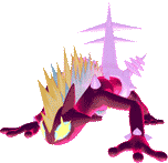
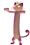
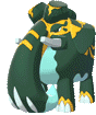
Hahahaha the red apes just straight-up become green. That's great. Probably my favourite shiny of the bunch.


What changed? -looks up sprites side by side- Oh okay, that's kinda hard to noti


Delightfully orange.


All right.

Gloriously shockingly pink and neon. I prefer regular Toxtricity since the darker purple works for the punk theme, but it's all right

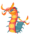

Centiskorch is great, with the little legs and back all coloured a neat shade of metallic blue, but it's hard to realize Sizzlepede's changed its back colours from this angle.


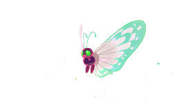
Oooooh these two look great. The colours just change wildly and just like Hawlucha before them it really looks amazing!


The cups become pink? It's neat.


Very monochrome. I love it.


VERY loud in Impidimp and Morgrem's case, and they are some of the more neat-looking shinies. Love Impidimp's gray-white tongue. Grimsnarl's a bit obvious with white hair. Maybe it's just an old Grimmsnarl.


OH BOY WHAT IS THIS COLGATE SHIT GOING ON RIGHT HERE? These are amazing.


Galarian Meowth's gold and pretty neat, and I guess it's meant to look a bit more like regular Meowth? Perrserker's all right, I suppose. Giga Meowth barely looks different.


I like that it's just the core coral that becomes a shade of gray and black for these two, while the ghostly ectoplasm remains the same.


Y'know maybe not all Galarian forms' shinies should just be straight up "take the original colouration and slap it on them". Farfetch'd looks boring. Sirfetch'd looks like pee, but at least it's different.


M'eh. Very muted.

Very loud, white and pink make for a pretty effective combination.


All the Alcremies basically end up having the same base body, and that's kinda disappointing but also probably just as well, not a lot of people are going to see these in-game models anyway.

Ooh you look like a fancy chocolate bar. I like him.

Eh. It's something.


Eeeeeh. They're a bit more sickly-green I guess? Not the biggest fan, real-life moths are so varied that I really wished that they could've done something else.
Okay this one's actually kinda neat. They just swapped the grays around, but what a nice shiny it makes.


Eiscue realizes he dipped his head into strawberry milk instead of the frigid ocean water.


All right, I suppose.


I'm not sure why they kept the sides the same colour? Wouldn't it be great if all the colours changed?

Not particularly noticeable.


Oh, it's cool, all of the fossils are just washed-out like an old photograph or something. It's consistent across all four of them, I kinda like it.


Eh.


Dragapult looks great, the others are all right.

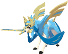
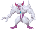
It's just making the colouration a bit more monochrome and Za-cyan. I actually kind of prefer this look to the regular one, makes the design a lot less busy.

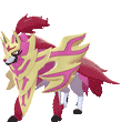
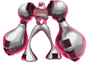
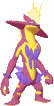
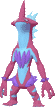
And I definitely prefer Za-magenta, especially without that shield. That's a pretty pink wolf right there.
Very monochrome. Not terrible, though.
Y'know what? These neon colours with bright cyan and pink actually work pretty well, particularly on shiny Sobble's grayish-blue skin. Inteleon ends up looking kinda icky. G-Max Inteleon has a fully white tail-tower, though, which is cool. (I couldn't find a small gif from pkparaiso, the source I borrow the rest of these from)
Noticeably different, but not exciting.
Yellow Rookidee is amazing. The two Corvi's just exchange their dark blue and black respectively for a pretty nice shade of silver, and I do like how it looks. One of the nicer alternate palettes, I feel.
Oooh oooh ooh I love this. Laender and purple are such a great colouration on Dottler and the two Orbeetles, and the slapping that nice shade of orange for Dottler's face and Orbeetle's horns look great, too. It's even a neat nod to purple ladybugs, which is a photo that went viral -- and ended up getting debunked.
Mmm, nice. I prefer the standard red shade, but gray and black is classy.
Eldegoss is cute with the pink and all, but the wildly pastel-coloured Gossifleur is easily the winner here. Gossifleur honestly just ends up looking like such a better dedsign than Eldegoss overall.
They be cute black sheep. The original shinies in Pokemon. I like them.
Chewtle looks like a kid's product with crayola, it's kinda amazing. Drednaw's a'ight.
Pink Yamper's neat. Boltund's whatever.
I do like that only part of the Rolycoly line becomes the gray shiny colouration, and in Carkol and Rolycoly in particular really helps to pick out the details of their anatomy.
Hahahaha the red apes just straight-up become green. That's great. Probably my favourite shiny of the bunch.
What changed? -looks up sprites side by side- Oh okay, that's kinda hard to noti
Delightfully orange.
All right.
Gloriously shockingly pink and neon. I prefer regular Toxtricity since the darker purple works for the punk theme, but it's all right
Centiskorch is great, with the little legs and back all coloured a neat shade of metallic blue, but it's hard to realize Sizzlepede's changed its back colours from this angle.
Oooooh these two look great. The colours just change wildly and just like Hawlucha before them it really looks amazing!
The cups become pink? It's neat.
Very monochrome. I love it.
VERY loud in Impidimp and Morgrem's case, and they are some of the more neat-looking shinies. Love Impidimp's gray-white tongue. Grimsnarl's a bit obvious with white hair. Maybe it's just an old Grimmsnarl.
OH BOY WHAT IS THIS COLGATE SHIT GOING ON RIGHT HERE? These are amazing.
Galarian Meowth's gold and pretty neat, and I guess it's meant to look a bit more like regular Meowth? Perrserker's all right, I suppose. Giga Meowth barely looks different.
I like that it's just the core coral that becomes a shade of gray and black for these two, while the ghostly ectoplasm remains the same.
Y'know maybe not all Galarian forms' shinies should just be straight up "take the original colouration and slap it on them". Farfetch'd looks boring. Sirfetch'd looks like pee, but at least it's different.
M'eh. Very muted.
Very loud, white and pink make for a pretty effective combination.
All the Alcremies basically end up having the same base body, and that's kinda disappointing but also probably just as well, not a lot of people are going to see these in-game models anyway.
Ooh you look like a fancy chocolate bar. I like him.
Eh. It's something.
Eeeeeh. They're a bit more sickly-green I guess? Not the biggest fan, real-life moths are so varied that I really wished that they could've done something else.
Okay this one's actually kinda neat. They just swapped the grays around, but what a nice shiny it makes.
Eiscue realizes he dipped his head into strawberry milk instead of the frigid ocean water.
All right, I suppose.
I'm not sure why they kept the sides the same colour? Wouldn't it be great if all the colours changed?
Not particularly noticeable.
Oh, it's cool, all of the fossils are just washed-out like an old photograph or something. It's consistent across all four of them, I kinda like it.
Eh.
Dragapult looks great, the others are all right.
It's just making the colouration a bit more monochrome and Za-cyan. I actually kind of prefer this look to the regular one, makes the design a lot less busy.
And I definitely prefer Za-magenta, especially without that shield. That's a pretty pink wolf right there.
Very monochrome. Not terrible, though.


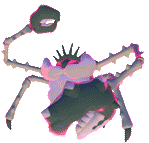
They swap the colours of their lips and fingers. Bland.

I have no idea what's different until I see them side-by-side. It's the weird stomach parts. Underwhelming.


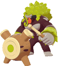
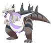
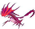
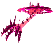
Both are pretty subtle, but Regieleki losing all the blue and swapping it to white; and Regidrago's different dragon skull is a lot more noticeable than Zarude. Neither are particularly spectacular, though.

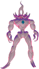
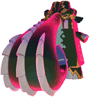
I very much prefer their original colours, but Glastrier's purple ice spikes and Spectrier's maroon hair and hooves are very neat.

Serviceable, I suppose.


Mmmmm cotton candy of different flavour! Nice and pretty.


Shiny Slowpoke and Slowbro are actually pretty cool and neon and nice and look like Baskin-Robbins ice cream. Shiny Slowking is just a slightly different shade of pink. Boring.

I feel they could've done a better effort here.


I feel they could've done a better effort here.
Oh, okay, all the Galarian legendary birds just have their original Kanto colours as shinies. Neat. Can't say I'm overtly impressed, the whole 'oh, the regional variant shinies look like the originals' bit sort of ran out of steam pretty quickly for me.


Is the Zen mode even different? Darumaka and Darmanitan has an interesting colour scheme, but it's not that different.

Oh look it's the regular Stunfisk colours slapped on Galarian Stunfisk! I actually like this one.


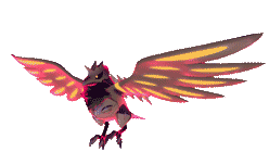
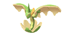
Also another one that's m'eh. Could've at least changed the big-ass wings that dominate much of this one's design.

Not sure what changed.
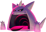
White Gengar is a pretty cool Gengar, as usual!
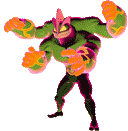
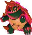
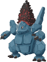
Green Machamp is a pretty gross Machamp as usual, although the combination with the cracked magma orange knuckles does make it look a lot better than regular shiny Machamp.
Gray and classy.
Lavender and classy.
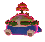
Did the tree change colour too? I can't tell. Otherewise m'eh.
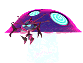
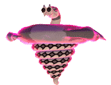
Anemic and gigantic.
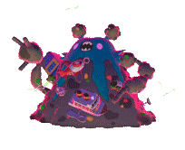
I'm not sure if a lot about Garbodor changes other than the ripped-up trash bag face. Eh.
Is the Zen mode even different? Darumaka and Darmanitan has an interesting colour scheme, but it's not that different.
Oh look it's the regular Stunfisk colours slapped on Galarian Stunfisk! I actually like this one.
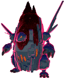
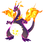
Eh. I feel like withot the glowing red edges that all the G-Max models have the black Charizard would look a bit sharper and more imposing. All three of them are all right, they're basically the regular shinies turned into G-Max.
Also another one that's m'eh. Could've at least changed the big-ass wings that dominate much of this one's design.
Not sure what changed.
White Gengar is a pretty cool Gengar, as usual!
Green Machamp is a pretty gross Machamp as usual, although the combination with the cracked magma orange knuckles does make it look a lot better than regular shiny Machamp.
Gray and classy.
Lavender and classy.
Did the tree change colour too? I can't tell. Otherewise m'eh.
Anemic and gigantic.
I'm not sure if a lot about Garbodor changes other than the ripped-up trash bag face. Eh.
No comments:
Post a Comment