As a regular disclaimer in any M:TG article I do... I don't really know stuff like the proper meta at the time and I might get a bunch of things wrong. This series is going to be mostly talking about monster designs and flavour design.
Anyway, away we go into Unglued!
- Click here for the previous part, Urza's Destiny.
- Click here for the next part, Mercadian's Masques.
- Click here for the index.
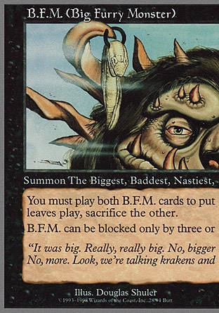
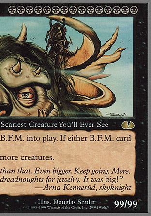
Let's start off with my favourite colour, Black, and here's a sample of what an Unglued card at the time is. I'm not sure if we ever actually got a gimmick like this in future sets, but B.F.M. here isn't a wide card. It's actually two cards, that combine to form a single card with the standard M:TG monster, representing you summoning a 99/99 Big Furry Monster that also requires you to pay a frick-ton of black mana, and can only exist if both card sits no the board, because it's such a big furry giant-thing. The actual B.F.M. himself is honestly kind of bland, just a furry giant ogre giant thing, until you look at his earrings and realize that he's got two gigantic double-digit stat animals -- a Polar Kraken and a Phyrexian Dreadnought -- as earrings. And so the flavour text suddenly makes sense. Keep going, no, more!
Also adorable is the race or creature type or whatever that this creature has. The Biggest, Baddest, Nastiest, Scariest Creature You'll Ever See.
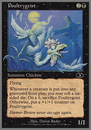
Some of the cards are honestly not even that joke-y. There's a running gag of Chickens as a race being featured in Unglued, which is frankly kind of tame, and sometimes an Unglued card is just a funny chicken creature (the set's symbol is a cracked egg, hence the chicken thing). Like the Poultrygeist here, a pun on poltergeist. It's a ghostly chicken, and you have to appreciate just how nasty-looking the warty chicken looks. That's a scary ghost chicken! The flavour text for these cards are also more tongue-in-cheek. Effect-wise, other than the rather seldom-seen-in-regular-sets die-rolling, Poultrygeist isn't actually super wacky.
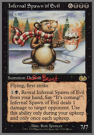
One of my favourite cards in this set, Infernal Spawn of Evil, is easily the best disconnect between the card name and the card art. Look at that card art! What a pleasant mouse with a scarf holding a cup of warm cocoa! It's like something that you'd see in, like, a Christmas card or something. Yet it's a fucking Infernal Spawn of Evil, a 7/7 mighty creature at that, and I absolutely do love how the "Summon Demon" has demon crudely scrawled out with a marker and replaced with Beast. Considering how 'demons' are phased out of M:TG cards at this point because of all the religious scares, it's a neat little meta-commentary. Absolutely also love the wacky triggered effect. "It's coming!" indeed.
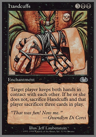
Another part of Unglued is to have the game involve rules that aren't exactly conventional. Like Handcuffs, where you literally force your enemy to pretend their hands are being cuffed (their hands are in contact with each other all the time) and if they fail to do this, like, say, when they're drawing a card, some calamity befalls them. As a side-note, I looked up who Gwendlyn Di Corci is and, well, suffice to say that she's the sort of person who would really appreciate handcuffs.
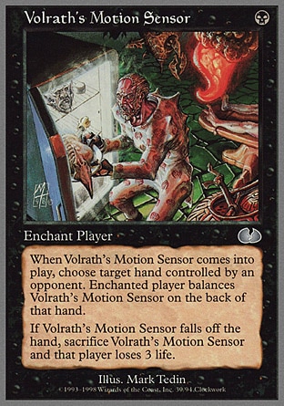
Volrath's Motion Sensor is... uh... is that zombie-looking dude in pajamas stealing some food (is that fried Sliver?) from the fridge, triggering a bunch of nasty Rathian traps? Silly zombie dude, you can live in Volrath's apartment, but you don't go around stealing his sliver steak! I like this artwork more than I probably should. Of course, the Un-sets are non-canon so this probably didn't happen, but there's nothing to say that Volrath doesn't actually own a refrigerator in his nightmare plane of Rath and he booby-trapped his favourite food. Volrath sounds like the type of crazy motherfucker to do that.
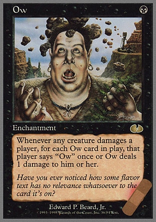
Ow is a card showing some poor schmuck getting a rock smashed over his head, and the effect is pretty fun, forcing players to say 'ow' any time they take face damage. I like the little band-aid on the lower right corner of the card -- Unglued cards do things like this, messing around with the format of the card by adding random bits and bobs around the card itself. I absolutely love the flavour text for this one, because it's absolutely true. "Have you ever noticed how some flavor text has no relevance whatsoever to the card it's on?" Preach, Ow, preach.
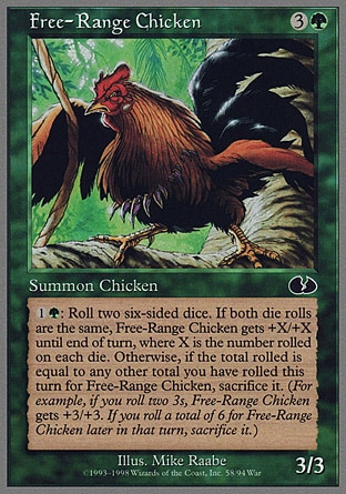
We're not going in any particular order, I'm just going through cards randomly. Let's go with green. Another chicken card here, Free-Range Chicken. It is just literally a rooster pecking on like a vine or something. The effect isn't quite as interesting, but it's hilarious to note that the chicken is 3/3, which is stronger than some knights in armour in M:TG land, and it has the potential to grow even stronger when you roll a die.
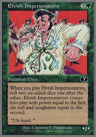
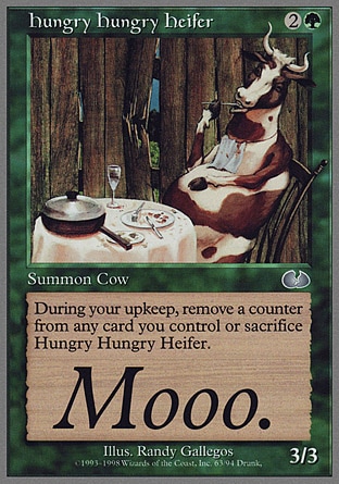
Elvish Impersonators is also an Elvis impersonator, and this artwork of an elf being a fat Elvis Presley impersonator is done exactly just for the sake of that pun. It's a fat Elvish Impersonator! That's fun. Hungry Hungry Heifer is a parody of Hungry Hungry Hippos, a children's game, and it shows a cow dining complete with table, napkin, and cutlery. There's really nothing much beyond that, though, it's just the silly surrealness of seeing a realistic cow sitting and acting like a human. Also, it's flavour text of MOOO is in a gigantic text size for no real reason other than Unglued.
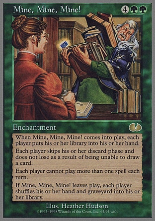
Mine, Mine, Mine! is actually kind of fun. The artwork is already pretty funny, showing a wizard attempting to use a library card to check out a gigantic stack of books, and the effect has you draw your entire library/deck and use the entire deck as your hand.
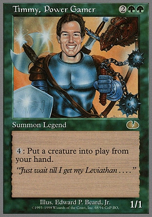
Timmy, Power Gamer, has a face in the artwork that tells me that the artist definitely took like a mugshot of some real person (likely a member of the M:TG development team) and drew the rest of the artwork around him. Timmy's a reference to a system of how M:TG classifies its players, and there's a Timmy inside every one of us. Timmys just want to summon big huge chunky monsters like giant dragons and wurms and krakens and demons and smash the enemy's face in with huge things. Relatable!
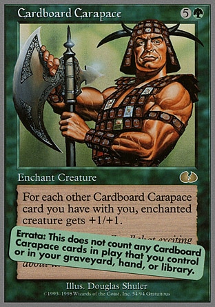
Cardboard Carapace has this barbarian-looking dude with a big mean axe with armour made entirely out of Magic: The Gathering card. It literally counts Cardboard Carapace cards that you, the player, bring with you but don't bring into play. How do you confirm the amount of Cardboard Carapace cards that you have? Well, clearly, by emulating the card art! There's that errata sticker that covers the flavour text. As with any TCG game, there are a fair amount of erratas and rulings over M:TG's history, of course.
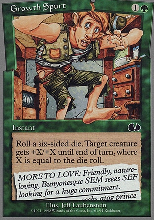
Growth Spurt shows some poor dude suddenly growing super-large in his bedroom. I like the artwork, it's silly. The effect of the instant is kind of a boring buff, with the only interesting thing involved being the involvement of dice, which this set really seems to like. The flavour text is, uh, one of those newspaper ads of single dudes looking for partners. Cut off at the bottom is apparently someone looking for an Atog prince. Okay, then, hopefully whoever's looking for said prince doesn't have a lot of artifacts in their house.
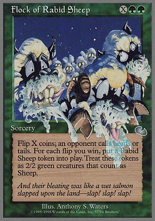
It's a Flock of Rabit Sheep, and they're so rabid that some of them are even pouring out of the frame of the artwork, and the one that's in the most foreground is slobbering all over the effect text and has knocked over the cracked-egg symbol! The flavour text is ridiculous, for sure, but the card art with the overly-cartoony teeth and eyes are glorious.
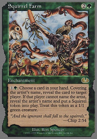
Squirrel Farm! Y'know, some animals are just funnier than others, and squirrels is another one that M:TG will low-key continue to have appear even in main serious sets. I love the mischievous grin on the squirrel on the left, and I love the utterly crazy manic look that the farmer has as he's trying his best to save that huge chunk of corn. The effect is hilarious, too, forcing the opponent to guess the illustrator of a card. Respect your illustrators! I respect you, Ron Spencer, your artwork are always fun. I love that the card's green and brown parts seemed to have been nibbled by squirrels, and the flavour text is a bit of a pastiche on a bible verse.
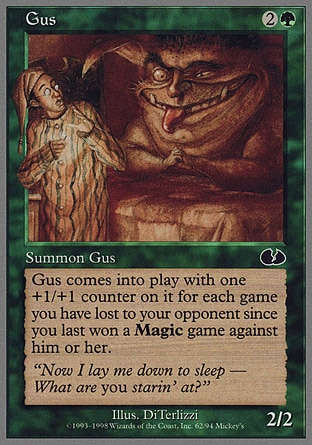
Gus is a huge grinning fat imp-thing that's bothering some poor dude in a nightcap that just wants to sleep. Its effect is kind of m'eh, though, just buffing Gus depending on the amount of wins and losses you have with a specific opponent, which is sure out-of-the-box but not as zany as some of the other effects on this set. I really do like the artwork for Gus, though, and I do like that it's just "Summon Gus". He's not a legend, and apparently Gus isn't the name of this specific creature, but a whole race of creatures called Gus.
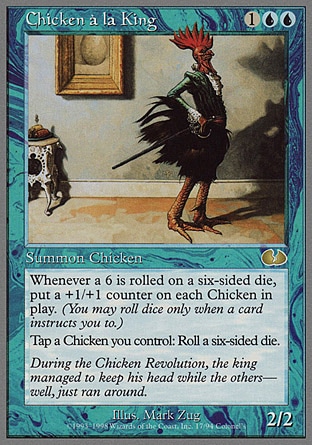
Blue now, and I think the Blue cards of this set are my favourite of the set! Chicken a la King is the colour's resident chicken, and it's actually got synergy with other chicken cards! I absolutely love the flavour text referencing the phrase about chickens running around with their heads cut off, I absolutely adore the artwork of a slim chicken-man gentleman with a rapier, but the best part of it has to be the little detail of the portrait in the Chicken a la King's wall being of an egg. Is that, like, the Chicken equivalent of a baby photo? That's adorable!
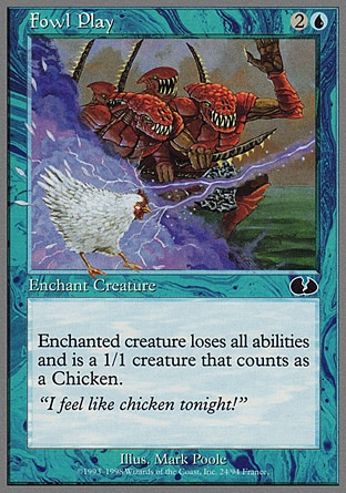
Oh, haha, Fowl Play, and the pun with the flavour text is neat. It's not that creative mechanic-wise, basically being a polymorph spell, but it fits in the whole chicken theme of the set, and I do like those red-skinned, knobbled-headed fanged humanoids in the background.
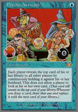
Psychic Network is a fun fun fun art piece of a bunch of magicians basically doing the magic equivalent of a pay-service thing. I love the magic eight-ball confusing the redhead mage, I love the dude in the center is basically playing Tetris, and that dude on the top right side of the artwork is clearly doing something skeevy based on his expression. The effect is interesting, too, even if I don't think it's particularly thematic.
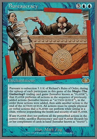
Blue has a bunch of cards that are in-jokes to the development process of the game, because, well, Blue is the 'smart' colour, right? So you have cards like Bureaucracy, which is literally just a gigantic wall of text because it's formatted in the way that a bland, super-officious document would be. "The upkeep of each participant in this game of Magic: The Gathering (R) trading card game (hereafter known as "PLAYER")" indeed! I also love the little subtle gag of red tape around the card art. I'm not sure what that logo on the desk is meant to be, though. It looks like it's a reference to something.
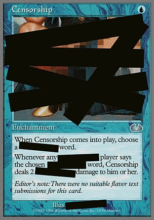
Censorship is glorious. It's just huge black redacted stripes all over the card, and you can see that the card art is even blurred under all of the black bars. Hell, even the illustrator's name is censored! I do like that the card effect straight-up censors a word (you could pick a word like 'draw' or 'attack' or 'card'). The flavour text is also fun.
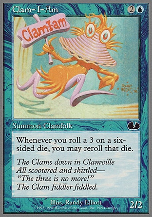
Clamfolk! Clams are another animal that's just hilarious, and I absolutely love Clam-I-Am, who is drawn in the art style of Dr. Seuss and is a reference to Sam-I-Am in both name and flavour text. I don't remember if the Clamfolk would make any sort of other appearances down the road, but I do like them. Design-wise they're whimiscal, straight out of a children's storybook with a clam as the main part of the face and the 'mouth', with goggle-eyes and a humanoid body glued onto it.
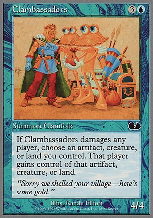
Clambassadors is another rather simple pun, but the flavour isn't the most interesting? I guess the Clamfolk solve all their problems by basically paying them off. Neat.
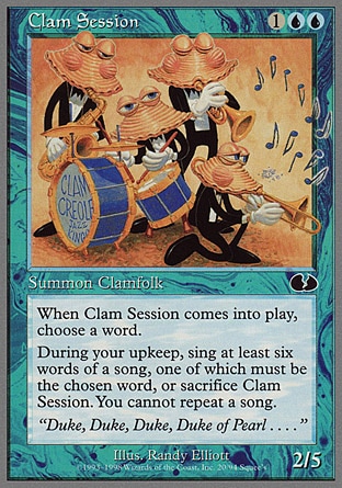
And, of course, there is Clam Session, the third of our Clamfolk, and it's a quartet of Clamfolk doing a jam session. They're the Clam Creole Jazz Kings, apparently, and the effect is fun, where the player that summons Clam Session chooses a word, forcing everyone to sing a song with that word in it. Fun, fun, fun!
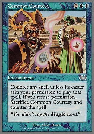
Common Courtesy is an enchantment that's another one of the couple of counterspell cards in this set. There are also "Sorry" and "Checks and Balances" below, but neither of them are all that interesting, but I absolutely love the subtle touch of them bolding the word Magic in the flavour text. Gotta respect the name of the game!
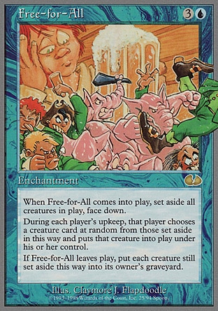
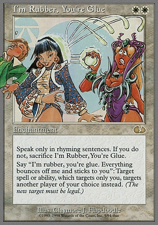
And the reason I included Common Courtesy is so that I can put these two art pieces together, because Claymore Flapdoodle (a.k.a. Phil Foglio) illustrated both of these artworks, and the dude that gets punched by that Alf-looking elephant-man in Free-for-All gets punched all the way to the card art for the White card I'm Rubber, You're Glue. The two cards don't actually have anything to do with each other beyond sharing an artist, which I think makes the joke a bit more ridiculous. Free-for-All is just a card that flips every other monster down and slowly summons them into the battlefield, while I'm Rubber, You're Glue forces the user to speak only in rhyming sentences.
I'm not sure what's going on in Free-for-All, with that giant man with a giant tankard of beer. Or are the elephant-men and green-suited Leprechaun-esque people actually tiny? Meanwhile, the purple-dressed mage in I'm Rubber, You're Glue has the most hilarious expression in realizing that her magic bolts are being reflected straight to her face.
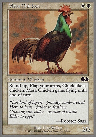
Another chicken, this time the Mesa Chicken! I don't remember any specifics and I'm a bit too lazy to look it up, but there are a bunch of cards in White called Mesa Unicorn or whatever, right? THis one has a particularly fun effect, where you, the player, must act like a fool chicken to give the Mesa Chicken flying. The flavour text is also over-the-top, which is fun.
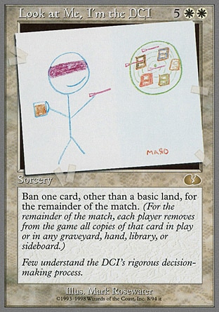
Look At Me, I'm the DCI has the most hilarious artwork. The DCI, as google tells me, is the governing body behind things like banned cards, restricted cards and the way that the competitive gameplay is governed, and the artwork (done by Maro?) is just a scribbled dude in a blindfold holding a mug of beer tossing darts at cards on a dartboard as a self-deprecating way to show off the "rigorous decision-making process" that the DCI uses to ban a card. Of course, the card effect also bans cards in-game!
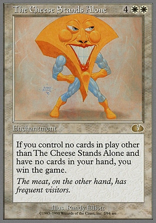
Hi-ho the derry-o, the Cheese Stands Alone! It's one of those nonsensical nursery rhymes, but M:TG has made the Cheese into this exaggerated shape with a ridiculous grinning face and huge cheeks and huge chunky muscular arms that look like they're transplanted from a superhero toy. The effect is fun, allowing you to win the game if the Cheese does truly stand alone. That flavour text could be a bit dirty if you think about it a bit too much.
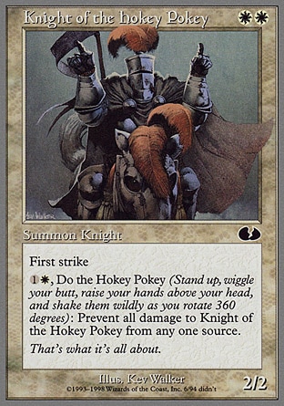
Knight of the Hokey Pokey is also another one that does a nursery rhyme, and tells the player to do the Hokey Pokey dance. I do like the contrast between the serious-looking design of the helmeted knight and his horse, but the pose is him doing the hokey-pokey dance. It's ridiculous. I love it.
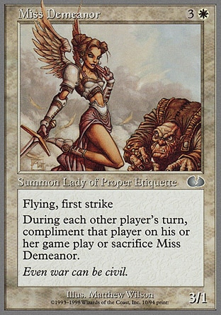
Miss Demeanor is just a pretty angel lady whose name is a fun little pun, and maybe I'm just growing old but sometimes puns are enough. I love that the creature type is "Lady of Proper Etiquette", and you have to complement your enemy otherwise Miss Demeanor gets disgusted with you and flies off.
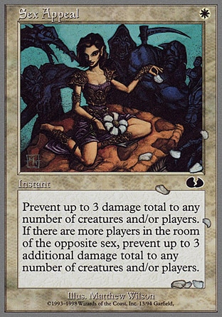
Sex Appeal is... it's probably a card that's going to cause a lot of complaints if it were ever printed nowadays, but the card itself honestly isn't even that offensive, just a lady in a dress plucking flowers while dark monsters around her watch her or something. The effect is just preventing damage if there are members of the opposite gender. Okay?
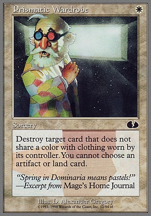
Prismatic Wardrobe is a fun card effect, too, where you destroy cards based on the colour and whether the controller wears an article of clothing that matches the colour of the card. I like that the bearded gnome-esque dude is wearing a multi-coloured shirt and those 3D-red-and-blue glasses. Presumably, he's not playing a deck with Black or White cards, huh?
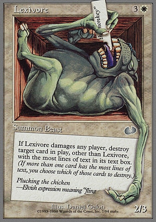
Lexivore is a huge, fat green toad-goblin-bear creature that eats words. I like how uncomfortable-looking the creature looks as it's trapped in the box-like frame of the card, and it's eating and chomping on the text box of his own card. Its effect, of course, has the Lexivore devour whatever card in the game that's the most verbose. Lexivore also has a fun nonsensical flavour text that, I think, mocks the Mirage block.
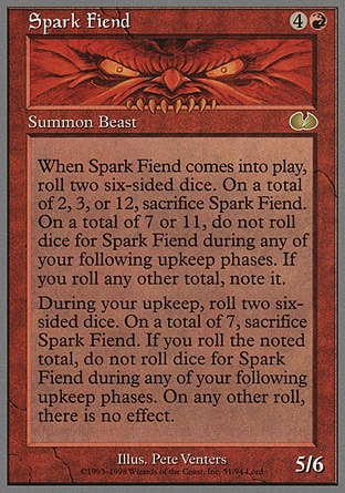
Speaking of wordy cards, presumably the Lexivore is the primary predator of the Spark Fiend, whose card text takes up 75% of the card volume. You can barely see his face. Unglued does everything over-the-top, so Spark Fiend is basically mocking the sheer amount of text that some M:TG cards have. Silly Spark Fiend, we can't even see you!
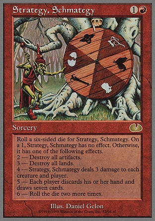
Strategy, Schmategy has a goblin spin around one of those spinning wheels, and the choices of the symbols are... uh... there's the Unglued cracked-egg symbol, there is a rooster head, a straight-up chicken, there's a glasses and a mustache, a goblin head, and I'm not even sure what the lower left thing is. It's a far more interesting dice effect, with each dice causing a crazy wacky effect.
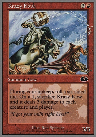

KRAZY KOW IS KRAZY, look at those huge eyes bugging out and the completely crazy expression she has and those mighty arm muscles and the fact that she's beating the farmer so hard that the milk's spilling all over the rest of the cards. Isthat the same farmer that got beaten by the squirrels in Squirrel Farm? Poor farmer.
Chicken Egg is a chicken hatching out of an egg, complete with rooster plume and whatnot. Its artwork is a parody of Rukh Egg! You can only hatch the egg into a larger 4/4 giant chicken if you roll the dice well! And apparently Jaya Ballard, task mage, wants to make chicken nuggets. Chicken nuggets exist in Dominaria, it appears.
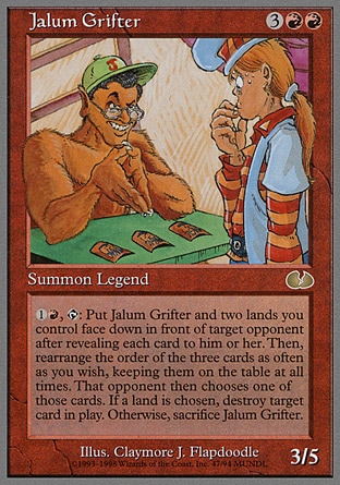
Jalum Grifter is a hairy, shirtless man with a hat that's telling that other dude to pick a card, any card, and you can totally tell that he is not an honest man. He's also a legendary creature for some reason, and I'm going to assume that Jalum is a member of the M:TG development team and this is a tribute to whoever Jalum is.
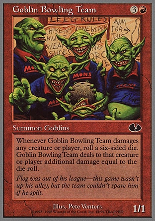
Goblin Bowling Team is a quintet of goblins that play bowling! The artwork is fun as usual with grotesque goblin expressions, the fifth goblin giving thumbs-ups even when his face is being squished with the coconut bowling ball, the "aim for this" instruction on the upper right side of the background, and the random list of "leeg rules" on the back. Apparently, chickens (or chikens) must wear shoes, and no orcs are presumably allowed there.
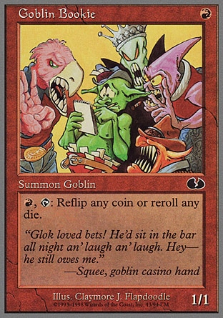
Goblin Bookie is another piece of delightfully funky artwork with a lot of over-exaggerated creatures around that poor, overwhelmed goblin. I like that the bird-man has an oversized arm and huge teeth in his beak, and I also like the very gangster-esque red-fanged creature on the bottom right.
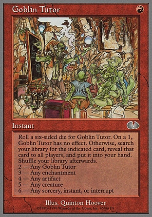
Goblin Tutor, meanwhile, is a tutor card (that uses a dice, of course, to determine what card you're drawing) and it has a wizened old goblin actually teaching a small group of goblins about stuff. Probably how to do bowling or to handle a bookie job. Apparently this is a joke, because at the time of Unglued's printing, all the other colours had tutor cards, and not red.
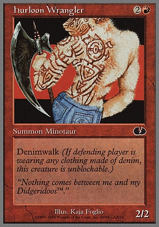
Hurloon Wrangler is sort of a parody on the half-tattooed Hurloon Minotaur, and... and I'm not quite sure why the heck everything around this card is about jeans? The minotaur looks like he's posing for a jeans ad, the flavour text is something about didgeridoos, and the keyword that Hurloon Wrangler has is "Denimwalk". What if your opponent takes off their denim pants, though? Does that make Hurloon Wrangler useless?
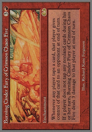
Burning Cinder Fury of Crimson Chaos Fire is a hilariously long name, and the card is also on its side for some reason. I know a lot of M:TG gimmick cards also do something like this where they're on their side. Of course, Burning Cinder Fury interacts with how you 'tap' a card in M:TG. The artwork is... uh.. well, I'm not sure what it is. It's a burning lava crater or rock of some sort?
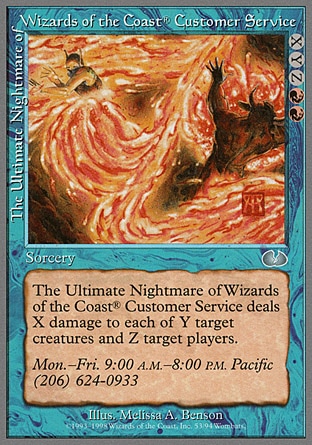
Nope, I didn't misplace a blue card. The Ultimate Nightmare of Wizards of the Coast Customer Service is actually a red card, judging by its placement in the expansion and the summoning cost, but it's got blue borders because this is Unglued so why the fuck not. The X/Y/Z bit is a bit bizarre, the artwork isn't quite as zany as it could've been, and the flavour text, presumably, is the actual WOTC customer service number.
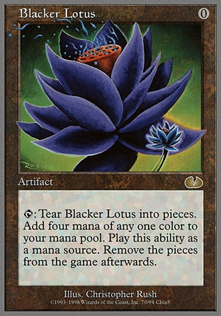
Blacker Lotus is a bigger, blacker Black Lotus, but instead of being a super-overpowered card, Blacker Lotus requires you to actually tear the card into pieces. You don't get to play a super-overpowered mana source without a sacrifice, and the sacrifice in this case is actually tearing up Blacker Lotus.
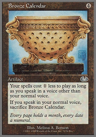
Bronze Calendar has kind of a boring artwork (is that bowl even a calendar? Am I missing something?) but I love the effect, where you have to speak in any other voice that's not a normal voice, which would be fun if you or your opponent knows how to impersonate voices.
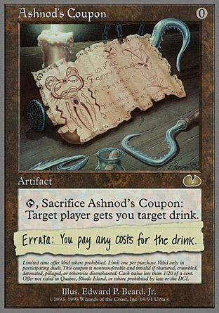
Ashnod's Coupon, meanwhile, is an coupon for a drink! You play it, then you sacrifice the card, then your opponent "gets you target drink"... but the hastily pasted errata makes sure that, no, you can't get your opponent to buy the most expensive cocktail in the nearby restaurant through a card game. It's a fun joke, and I love the small print at the bottom of the card.
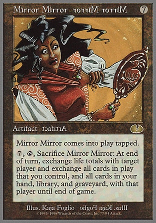
Mirror Mirror has its card name, its card type and its illustrator reversed, which is neat and its effect causes, uh, everything to be mirrored and you swap everything with your opponent. Neat, but I feel like they could've done more. with the mirror theme.
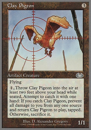
Clay Pigeon is a literal pigeon made out of clay, flying around, in a reference to those clay disks that people shoot when practicing with firearms. That alone is already neat, and the sort of modern-day-reference that M:TG can't make in regular sets. Its effect also parodies how a clay pigeon is utilized IRL, where you throw it into the air and attempt to target it -- with one hand instead of a gun.
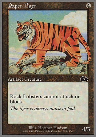
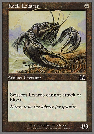
Oh, hey, these three are hilarious. Paper Tiger, Rock Lobster and Scissors Lizard below are a parody of rock, paper, scissors, and the Paper Tiger causes Rock Lobsters to be absolutely negated, and so on and so forth. That's a glorious cycle of cards, and the puns on the flavour text of all three are hilarious, but best of all the three artifact creatures are actually decent monster designs!
Paper Tiger could've just been a giant origami tiger, but I love the contrast between the super-realistic tiger face with the rest of the tiger's body, which is made out of paper. Rock Lobster is a more straightforward creature, just a giant lobster bursting out of the beach that's made out of rock, but I don't think that the Rock Lobster is rock-y enough. It's hilarious, though, to think that this massive, gigantic lobster (which has claws) is completely negated by an origami tiger.

Scissors Lizard is also very cool, with its front legs and face being made out of scissors, and I love the haphazard way that the scissors are jammed through its snout. I didn't realize until putting these three cards side-by-side that the Scissors Lizard is actually standing on top of paper, the Paper Tiger is standing on rocks, and the Rock Lobster is... uh... presumably those crushed metal debris are the remains of the many scissors lizards that the Rock Lobster has murdered.
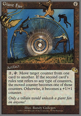
Giant Fan is just literally a giant fan blowing people around. What is that thing on the top left, though? It looks liek a bizarre creature. I like that the things immediately around the artwork -- the card name, the cost, the card type and the expansion symbol -- are also being blown away.
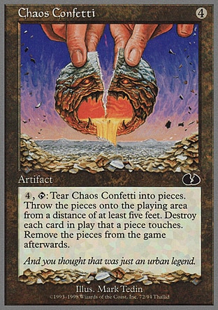
Chaos Confetti is a homage to Chaos Orb, and a reference to an urban legend where someone won a competition by ripping up their Chaos Orb and destroying the enemy board. That poor huge tumour-moon in Chaos Confetti is clearly distressed as giant human hands are ripping it up. I like the fact that there is a pile of ripped-up Chaos Confetti cards all around the bottom of the card art and text box. Of course, the effect of Chaos Confetti also involves you tearing up this card.
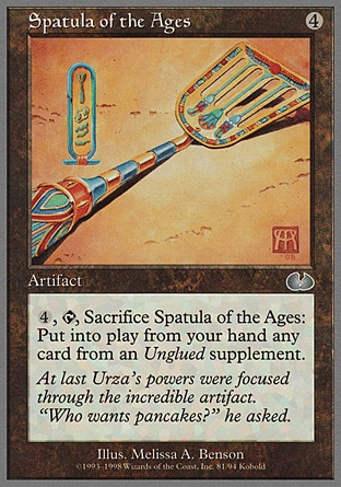
Spatula of the Ages is an Egyptian-hieroglyphs-inspired spatula. I love that the hieroglyphs on the left side of the spatula involves a spatula, fried eggs and little squiggly lines I'm interpreting as bacon, and a frying pan. The Spatula of the Ages look fancy, and apparently Urza uses this to make pancakes. That Urza, such a crazy man!
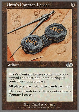
Urza's Contact Lenses is a parody of an already funny card, Glasses of Urza. Sometimes all you need to do is to reference a card and take it to its logical exaggeration. Considering some artwork of Urza features him without his glasses, I'm going to have to say that this is the canon-iest of the Unglued cards.
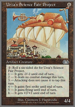
Urza's Science Fair Project has a glorious artwork. I'm not sure what the fuck is going on here, and just what Urza did with his science fair project that causes a gigantic face that's all teeth with a monocle, and trumpets and little whirly-copter things jutting out of the side of the heads, but it looks insane. I'm not sure what's going on here, but I love it.
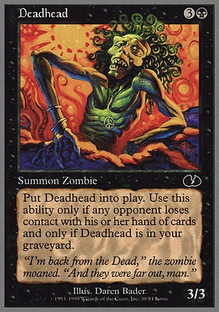
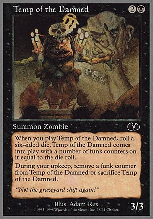
There are, of course, a bunch of cards that I don't have much interesting things to say, and some whose jokes might fly over my head. Deadhead is... it's a hippie zombie? Or something? The effect is a fun one, where Deadhead jumps from the graveyard into play if your opponent 'loses contact with his/her hand of cards'.
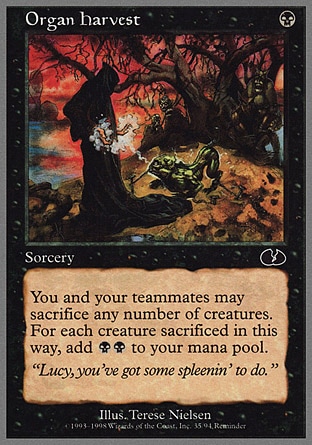
Organ Harvest could honestly be a serious card, if not for the spleen pun on the flavour text. Likewise, I'm not quite sure about the flavour behind Temp of the Damned. I guess the trogg-looking dude in the foreground is an incompetent temporary worker or something that's frustrating the giant in the background? Or something? Eh.
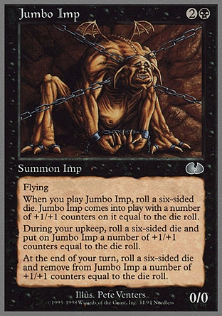
Jumbo Imp is also another one that has artwork that really does feel like it could be in a regular set, although it sure is a neat-looking big imp with tiny wings. The card's basically a gigantic mass of text where the Jumbo Imp sort of grows and shrinks via +1/+1 counters when you roll dice, which... is interesting, but not as funny or zany as the rest of the set.
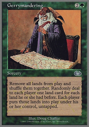
Gerrymandering is a real world, meaning "to manipulate the boundaries of (an electoral constituency) so as to favor one party or class." And now you, too, have learned an obscure word! I love these fantasy-themed games and settings, they teach me a lot of new words! No one would know what 'ichor' means if not for D&D, after all.
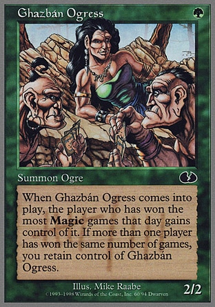
Ghazban Ogress is a reference to Ghazban Ogre, and apparently the Ghazban Ogress is such an opportunist that when she comes into play, she moves to the side of whichever player has won the most games that day. There's a little count-mark behind the text on the card, and the two ogres in the background are actually playing M:TG in order to impress the lady. Not the most flavourful art-to-effect association, but a fun effect.
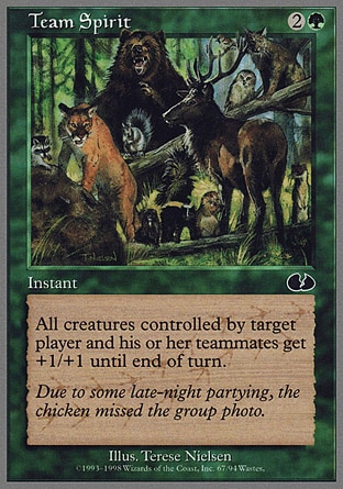
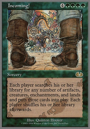
Team Spirit isn't particularly fun, just a bunch of animals gathered together, but the flavour text lampshades how there isn't a chicken in this chicken-themed set, and you have chicken footprints on the background of the card text. A subtle joke, I like it. Incoming! is a card art that I feel could be in a regular M:TG set, too, just a dude about to stand against a whole army of monsters. There are footprints on the background of this card too.
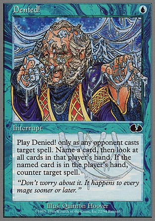
Denied! is another one with things in the background of the text, this time those bent icicle-things, but it's basically a Counterspell effect that is a bit more involved in fucking around with your enemy's hand. The flavour text is about erectile dysfunction, but the mage kind.
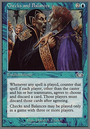
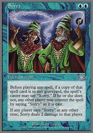
Checks and Balances is yet another counterspell effect, but it's only in a game with three or more players and more than one player must basically agree to counterspell the third player's spell or whatnot. Neat-o. I considered putting Sorry in the main body of the article, but it's basically, well, got a similar concept with a lot of the other Unglued blue cards. You say sorry a lot to counter spells and stuff.
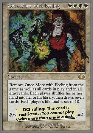
Once More With Feeling's got a pretty serious-looking artwork, which I don't think quite fits with the effect of the card where you basically reset the game and play a sudden-death game without the cards currently in play and in graveyards. Thankfully, as the pasted-over ruling notes, you can't have more than one of this sorcery in your deck.
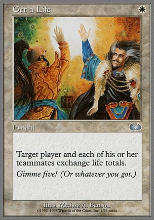
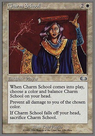
Get a Life is sort of a weak pun on you 'getting' the life points of the enemy. The card art and the flavour text is more about giving each other a high-five, though. Charm School is another one that kind of gets you to do something that's ridiculous, but balancing a card on top of your head isn't quite as funny as Handcuffs or Knight of the Hokey Pokey.
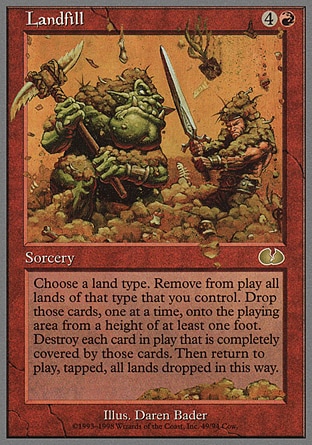
Landfill has a huge fat ogre-goblin dude fighting with a man as dirt falls all around them and into the card text box below. The artwork looks like poop, and the effect involves you throwing cards around. It's not as interesting or punny as it could've been, though.
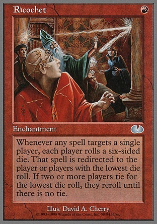
Ricochet isn't that funny, and the artwork's perhaps a bit too serious. The only real thing that makes this Unglued is the usage of dice and random effects and stuff.
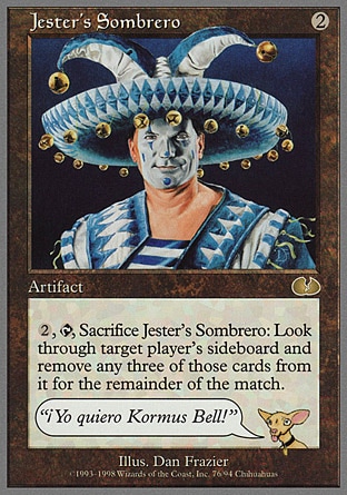
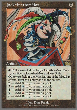
Jester's Sombrero is a reference to Jester's Cap, except sombreros are funnier and there's also a chihuahua in the text box. It's cute. Jack-in-the-Mox is a reference to the Mox series of cards, but is otherwise not as interesting other than, again, the usage of dice, which is unconventional for sure but nowhere that funny.
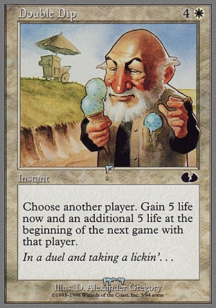
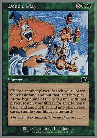
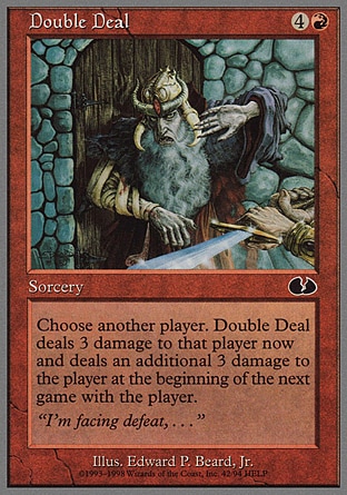
There are also a cycle of cards with the "Double X", which, like, these sorceries that affect both players? The flavour text basically sets up a poem in the order that's shown here -- Double Dip, Double Play, Double Deal, Double Take and Double Cross -- which is kind of neat. None of the cards themselves are super interesting, though, effect-wise or artwork wise. Double Dip has an old dude enjoying ice cream, which is the sort of modern stuff you very rarely see in M:TG artwork, and the ice cream's dripping into the flavour text frame.
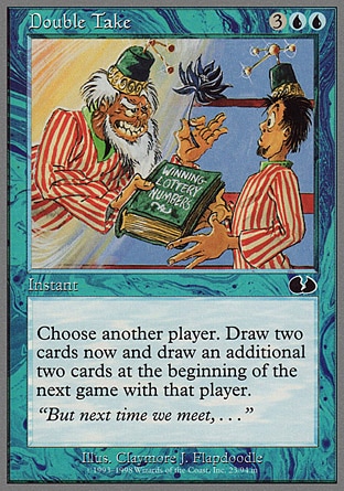
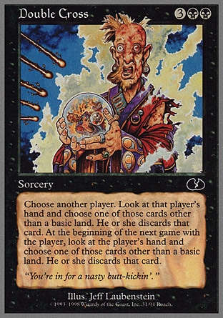
I love that Double Cross's artwork shows the wizard dude seemingly being burned by the magic missiles coming at him. That crystal ball, it truly shows the future! Double Take seems to show the striped-shirt dude with a fez visited by... an older version of himself? Which is giving him a book of winning lottery numbers and a Black Lotus? Is the dude on the left time-traveling in order to profit from fortunes?
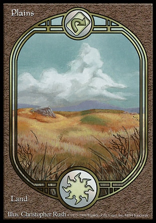
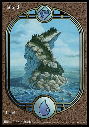
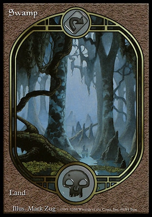
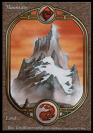
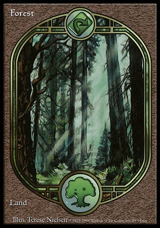
The land cards for this set all feature unconventional full-card artwork, which is quaint at this point in time considering that we've had a lot of actual proper sets with full-card artwork in a similar format to this. It's neat, though, to see that the art division has been mucking around with the idea of using vertically-stretched artworks for cards for a while, and I kind of want to say that Unglued might be an experimental ground for some unconventional format-breaking card design?
Anyway, that's it for Unglued, you crazy, crazy card set! Maybe sometime soon I'll finally finish the draft for Mercadian Masques!
Seeing BFM 's 2 cards together be incorporated with the fuse mechanic was kinda crazy.
ReplyDeleteDamn zombies stealing food.
Like the little overlap touches like the bandage on ow.
Flapdoodle was a good name choice.
Keeping track of a hand after playing MIne Mine Mine is hell.
"Like wet salmon slapped" makes me uncomfortable. Damn Rabid Sheep.
SQUIRRELS! Based off a Mark Rosewater articles looks like we might see them return to a greater degree over the next couple sets which would be a pleasant time.
Chicken a la King might be one of the best card names in all of Magic.
Fun fact, Censorship is part of the art for Keeper of the Mind(Which was cropped)
Clambassadors flavor text is a reference to Reparations which is a card that deeeefinitely had the flavor text written after the art was made.
Maro is the public face of Magic basically. He is truly an excellent artist.
Cheese Stands Alone, a card that effect wise eventually made it into the game in Barren Glory.
You can in fact take off your clothing at instant speed and then block Hurloon Wrangler. Maro does rulings for un-cards on tumblr and so precedents like this are set. .
I thiiiiiink BurningCFOCCF had some story about those being common or marketable words? Don't remember exactly though. Also another red spell in a unset I know has to do w common words so I might be mixing them up.
Rock Paper Scissors, with a boatload of puns too. Good little cycle. Huh never realized the standing on opposing type detail, that's neat!
Urz'a Science Fair Project is definitely the sort of monstrous machine he would create if nothing else.
Considering the amount of puns in magic card text, I don't even know if that would prevent Organ Harvest from being a card. I think at the time it had to do with "team mates" being in the text, but considering we've had a 2Headed Giant set I could see it being reality now.
Unglued Lands still fetch a dec price tag, especially if you wanna fill a deck out with them. Gorgeous looking lands, a strat that would later help Unstable actually sell well and revive the unsets.(also having less unfun to actually play design)
Aren't there fused cards in actual non-Un-set Magic, though? I remember some sort of angel duo that combined into a bigger, scarier mutant Eldrazi angel in Eldritch Moon.
DeleteHonestly, I think my favourite part of Volrath's Motion Sensor is the fact that the hideous cyborg-zombie is wearing one of those onesie pajamas.
"Like wet salmon slapped" is indeed a pretty... interesting description. That said, though, sheep are pretty disgusting animals, so I can't say that the description isn't inaccurate.
Huzzah for squirrels! I don't remember if squirrels have appeared on a regular M:TG set before this, but I do know that there are a bunch of modern squirrel-tribe cards in a lot of the more recent sets in the past couple of years. Huzzah for squirrels!
Chicken a la King is probably my favourite card in this set.
I googled the full art for Keeper of the Mind, trying to see what part of her that was cropped, and apparently the artwork we saw in the printed Keeper of the Mind actually was censored, and Censorship pulls the bottom half of the artwork that isn't printed in the card. That's... interesting.
-googles Reparations- well, that sure is, uh, a pretty fun flavour text that's definitely written after they saw the card art.
It's really interesting just what was considered 'zany and unconvenitonal, won't make it into the game' back then and now.
It makes me really, really happy that they made rulings for Un-cards. Silly Hurloon Wrangler, if I take off my pants I can block you, silly tattooed minotaur man.
All of the words that make up BCFOCCF do sound like words they like to use as adjectives?
Rock Paper Scissors are awesome, and they're a set of cards that keep giving. I completely forgot that "Paper Tiger" and "Rock Lobster" are actual phrases, too. I just love the Un-sets.
I guess some of the Un-cards in this very first set just aren't that ridiculous just yet because they're not sure how far to push the boundaries of an Un-set? Sure, there are cards that are funny (the chicken and the clam cards), cards that tell you to do funny things like balancing a card or sing or do the hokey-pokey, cards that play with random stuff like dice, cards that are in-jokes about TCG design (Censorship), cards that fuck with rules (Cheese and Mine Mine Mine) but then there are cards like Denied or Team Spirit or Organ Harvest that are just... only slightly more weird than a regular M:TG card, yeah?
The full land card art always do look so much better than land cards, I absolutely agree. Was it Zendikar that first did it? I don't remember.