
 A continuation of the previous special episode of Gotta Review 'Em All, where I rapid-fire comment on all the shiny pokemon. Again, keep in mind that throughout these earlier generations the Shinies are just created via an algorithm that moved around in the colour hex, which is why a lot of them have this awkward, washed-out look to them. This time around, we'll be covering generations 3 through 4.


All very cool, and easily some of the best-looking shinies. Pretty great way to open, really. Neon green works well on Treecko and Grovyle, and the neon blue looks great on both Sceptiles. Really love that their 'leaf' parts are picked up and highlighted with dark browns. Amazing.


Yellow Torchic's neat, but both Combusken and regular Blaziken are bland and look barely different. Mega Blaziken's white parts become piss-yellow and that's kinda dumb.


PINK MUDKIPZ! Not my first choice of colour for a shiny Swampert, although I'll take it -- I guess it's appropriately goofy for them.


Golden doggos! Really wished Mightyena looked more gold and less like piss, though.


They look like red pandas, and less like dirty raccoons. I like them.


Purple Wurmple's neat. Golden Silcoon and green Cascoon aren't super-creative, but pleasant. Dustox looks more autumnal, and I like it. Beautifly's kind of barely different, to be honest.


They all look pretty boring, to be honest.


Nuzleaf is pleasing with his orange mask, but neither Seedot nor Shiftry look different enough.


Despite shiny Swellow's prominence in the anime, they both look pretty disappointing.


AUGH MY EYES! Actually pretty nice.


All very pleasant. Must be the shade of blue, really -- the likes of Mew, Ditto and Corsola all make very great use of this shade of baby blue. Definitely unexpected for them to turn Mega Gardevoir's entire dress into black, however, which looks like a particularly fancy-looking ballroom dress! I like it.


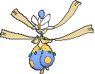
Masquerain looks majestic as all hell. I like them.


Looks so autumnal you can smell the autumn on them. Shiny Breloom in particular is spectacular.


Purple Slakoth is a m'eh. Vigoroth and Slaking look barely different.


They all look super-sepia, and kinda disappointing.


Whismur's neon earmuffs are neat. Loudred and Exploud are disappointing.


Makuhita's m'eh. Hariyama is spectacularly colourful.

Nice and neon green.

Nice and golden! I like this, actually.


Both very unchanging and disappointing.


M'eh. Looks a lot better in mega form, though, where the big ruby turns into a big emerald.


Ehh. Looks fancier, again, as a mega, with a more prominent and pleasant colour of pink for the chompers.


The red eyes are scary on Aron, but barely noticeable on Lairon and Aggron. Mega Aggron's a lot more noticeable and green, but honestly looks pretty bad.


Medicham looks very nice, actually, for a design I dislike. Mega Medicham looks gorgeous. Meditite's... okay.


Electrike is muted, but black-yellow Manectric looks BADASS.


Bad. Plusle doesn't even change, does he?


Pretty nice and colourful! Illumise's gold and neon blue in particular is amazing.

Roselia's purple and black roses are very nice!


They're neat.


Pink Sharpedo doesn't look as good as other pink shinies, but the cornucopia of colours that is Carvanha is amazing.


Fat pinkums. I like them.


Black Camerupt with those yellow rings works so amazingly well, as does that Mega Camerupt. Numel's blah.

Golden Torkoal is... okay? Kinda wish it's the shell that's gold, though.


They're okay. Golden Grumpig's especially neat.

Puke green ew.


Vibrava is particularly eye-catching for me. Flygon is a wee bit too neon for me. Trapinch is ew.


The desert-camouflage versions of Cacnea and Cacturne! I like them.


Gold and majestic!


Zangoose looks good in blue, actually. Seviper looks like a crayon accident, but I actually like it.


Lunatone's eye change is neat. Sorlock looks basically the same.


Silver-gold Barboach looks great. Whiscash is pretty bland.


Very muted and boring.


Baltoy's neon green is great, but Claydol is disappointing! I think he actually has that same muted colour scheme in his older sprites.


Did these two just exchange colours? That's fucking hilarious. I like these.


Muted and ugly.


Shiny Milotic is as gorgeous as normal Milotic. Lookit that blue! That gold tail! Feebas is okay.

Better than the original but not by much. None of the weather forms actually change.

Why are you not purple? Just changing the stripe is super-dumb, to be honest.


M'eh.


Ehh.

Also m'eh.

Barely different.


M'eeeh.

Pink and cute.


Oh god what the fuck Glalie. That looks metal. Both Glalie and Mega Glalie just swap out their eyes, but looks so different. Snorunt's light-blue-and-gold deal also looks very pleasing.


Purple, and honestly kinda boring.


Clamperl and Gorebyss are majestic, with Clamperl's purple-neon-blue-yellow deal being great, and Gorebyss's gold paint looking majestic. Huntail's neat, but not as good as the other two.

They gave him a more proper green coelacanth paint job. That's neat.

Golden heart! Luvdisc's okay.


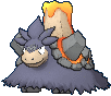
All disappointingly puke green. Mega Salamence has a slightly darker and more pleasing shade of green, but still eh.


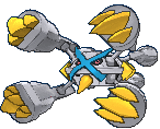
The best shiny pokemon ever. Fight me. They just look so badass with the metal silver body and golden claws and crosses. Mega Metagross adds an extra bright blue and looks pretty fucking dope.


Regirock looks like dark chocolate, and that's hilarious. Might be my favourite shiny legendary, honestly. The other two look barely different and kinda shit.


The regular forms are actually very nice neon shinies, with gold and neon green both working amazingly well. The megas continue to be piss-poor decisions and look like absolute shit. Go away, Mega Latis. Your regular Shiny versions just look so much better.


Pink Kyogre's okay, but for the primal/mega forms of the weather trio, they just simply said "fuck it" and turned them all black with neon lines... which is amazing. Shiny Kyogre probably looks the most spectacular out of the weather titans because of his rainbow coloured neon lines.

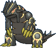
Regular Groudon is another one that looks like piss, doesin't he? But Primal Groudon is just jet-black with glowing red magma and holy shit man that looks so cool. Sadly he retains the piss-yellow colours on his claws.

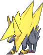
Black Rayquaza is a strong contender for Metagross as "best Shiny of Hoenn", and black Rayquaza actually highlights the yellow runes that kind of get washed out with normal Rayquaza. The mega form adds some random pink highlights I find uninteresting.

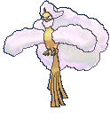
The red wish-strips actually somehow look more sinister. It's actually a subtle change that I find pretty neat.


Not that great, but not horrible.


A wee bit too neon for my liking.


All pretty disappointing, honestly.


You can barely tell these are shinies or if there's just a malfunction on your computer's brightness setting, honsetly.


All very disappointing. Staraptor's found some blue hair dye, though. That's neat.


Lotst of minimal-effort oranges here, huh? Disappointing.


More minimal-effort oranges. Delelelewhooop is disappointed.


Actually fixes a lot of the problems I have with the designs of this line, with the bright almost-orange yellow being far more striking and blending in with the ring-markings well. It does make him generically electric = yellow, but such a superior colour scheme compared to normal Shinx's line.


Like Roselia, Roserade is very stylishly done, with the purples and blacks all being great. Shiny Budew's... okay.


Pinkums! Actually doesn't look that bad.


Barely different.


Shiny Mothim is majestic, with that bright yellow and bright blue working amazingly well. The Burmies and Wormadams don't even look different and look pretty disappointing.


M'eh.

Pretty cute, actually.

They're kinda disappointing, but they are the shinies I own, so I really like them.


Sleepy Cherrim is cute. Cherubi's boring. Sunny-mode Cherrim isn't noticeably different, I feel.


They ALL look barely different.

Kinda ugly.


Gloriously neon and colourful. I love these two. Bright yellow and baby blue works so well.


Cute and pink. Very appropriate.

Puke green and ugly.

Pink and majestic.


Kinda suck.

Not different at all.


Looks red, but not particularly good.


Puke-green. Not a fan.


Bonsly's nice. The other two are bland.

Neon shiny Chatot is honestly prettier than the real thing.

Man, Shiny Spiritomb is pretty. They just swapped the colours and put it through a bit of a bright filter and it works so well.


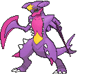
Gible and Gabite are decent. I actually had to double-check if I copied the shiny Garchomp sprite, and... yeah, that's pretty fucking unchanged. Mega Garchomp is gloriously pink and I love it.

Barely different.

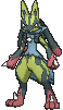
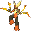
Yellow-black Riolu looks great! The addition of baby blue on Lucario is... it's very disappointing, to be honest. It's not the worst, but it's so hideously neon. The yellow's a bit more muted in Mega Lucario and it looks so much better, just as everything is about mega Lucario.


Barely different.


Skorupi is especially nice and pleasant. Drapion's a bit too close to his original purple for my liking.


Craogunk is okay, but Toxicroak's bright blue and pink is so awesome.

Pleasantly autumnal.


Not a bad pair, actually, for what is otherwise a pretty boring pair of fishies.

M'eh.


Nyeeeeh not bad, I suppose.

Pink, golden and majestic as hell.

Behold your monochrome overlords! Works well with the design, just like the shiny Magneton and Magnemites before him.

I love how the tongue stays the same, but the rest of the body turns a pleasing shade of yellow.

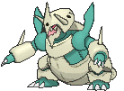
Muted, but actually a bit more pleasing than the original Rhyperior. Still looks ugly, though.

Gloriously neon green.

M'eh.

Bleh.

Yeah, it's even less apparent here that they just switched the reds and blues. Disappointing.

Holy fuck shiny Yanmega is so glorious. Bright blue and pink works so well.


Both pretty disappointing.

Not as good as the normal Gliscor, but not a bad colour scheme.

Disappointing.

Pleasant.


Not as good as the rest of the Ralts line. Should've gone all the way black, honestly. Very disappointed Mega Gallade's cape or blades doesn't change colour.

GLORIOUS! Lookit that golden body and that pink nose!

Disappointingly similar to the original

Also disappointingly similar to the original


All very m'eh.


Eh.


Dialga's okay, but Palkia's barely changed.

Not sure if this one's even changed. Pretty bad.

The purple's a neat colour on Regigigas, actually.


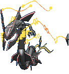
...is this a negative-colour version of the normal Giratina? That's so appropriate, and the resulting gold, silver and bright blue is actually pretty striking.

More majestic than the normal colouring. Pretty neat, actually.


Not much different.

Not much different either.


Very pleasantly bright green. I like Shaymin.

God's gold. Or kinda like piss-yellow. Kinda m'eh. Not a big fan. And... that's it for Sinnoh and Hoenn!
No comments:
Post a Comment