Due to the nature of Shiny Pokemon mostly just being different in colour, this is just going to be a quick, visceral talk about how I feel about the shinies compared to their original versions. Most of these are all going to end up being a 'm'eh' situation due to the fact that the first three (four?) generations apparently worked on a simple "move down the colour filter" code that barely caused any difference, sometimes, leading to some infamous examples of "why doesn't this look any different?" shinies. Really wished that once they made the jump to the sixth generation that they would actually fix this, but they didn't.
Also, to pre-empt not having to just list a bunch of single stagers later on, I'll talk about the mega evolutions and Alolan Forms alongside their normal evolution chain. Since we're talking about superficial appearance it's not going to matter that much, really.
I'll try to be quick for this one. Special thanks to the website Pkparaiso, where I source the 3D sprites out of. Due to the understandable length and huge amount of images that kind of screw up some mobile web browsers, I'm going to use a 'page break'. This is going to be a fast-paced, quick-paced opinion machinegun. No ratings, no real attempt to compare stuff, sometimes it's just going to be a single word. This is just my pure, undiluted reactions to them as I look at a lot of them -- and I look at a lot of them for honestly the first time.
Anyway, click to see me talk about them shinies!


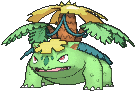
Bulbasaur's quite boring, but while they're sort of muted, Ivysaur and the two Venusaurs do give the impression of Autumn, which I kinda like, but they're ultimately some of the more bland and funkier-looking shinies.


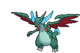
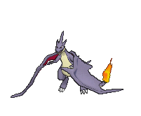
Charmander's boring if not quite unpleasant, Charmeleon's colour fits well into the 'real' evolution line and I really wished it was what they went with. Black-and-red Charizard is the be-all-end-all of cool shinies back in the day, and looks appropriately awesome. Since Mega Charizard X's already black, they decided to turn him... green? Charizard Y keeps the base form's black-and-red scheme, although adds a tiny of purple. It's neat.


It's not readily apparent, but the back of Squirtle's shell actually changes colour. It's pretty m'eh. Wartortle and the Blastoises' purples are neat, I suppose, but not my favourite shinies.


Golden Caterpie's really great looking, although most of the golden shinies end up looking great. Red Metapod's a neat variation, and Butterfree's honestly a disappointment. The green eyes are cool, but the rest of Butterfree ends up just looking like the normal one put through a filter. Mostly I'm sad they didn't pull out the pink Butterfree from the first anime season, really.


Weedle's barely different, Kakuna's okay, and green Beedrill's... okay? I wished they used a more glossy shade of green to actually look like a green hornet, but it's neat.


All very boring and pretty bad, actually. Very washed-out and yellow.


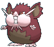
Rattata's got one of those funky, nasty gray-green colours, but Raticate's red is actually somewhat pleasing. The Alolan Raticates, benefitting from more effort put into the 3D model shinies, look a neat shade of maroon. Not the best out of the seventh generation shinies, but pretty okay.


Both pretty bland and washed out.


Ekans is pretty bad, but golden Arbok with those purple eye-hood markings is pretty awesome.


Yeah, both of these are pretty bad. They look barely different from the actual things. Alolan Raichu looks like chocolate, which is very neat, and relatively different than the non-shiny Alolan Raichu.


Oh, wait, I actually met a shiny Sandshrew in Safari Zone in HGSS. That was a shame. Sandshrew's neon green's... eh. Sandslash's claws not being red like his spikes is a huge miss, but otherwise okay. The Alolan ones are honestly pretty low-effort, though, barely different than the regular ones.


They were doing so well! Either by coincidence or design, the female and male Nidos actually swap colours... other than Nidoqueen here, who ends up in the most nasty puke-green and muted-pink combination. Out of the six, I think I prefer both of the youngest Nidos the best.


They only change the tips of their ears to neon green. Could've done more, to be honest.


Vulpix's disappointing, but holy shit silver Ninetales with those blue tail-tips look majestic as fuck. Alolan Vulpix's boring, but Alolan Ninetales is just as majestic as her non-Alolan counterpart with a neat purple shade.


They changed the eyes... it's neat, I suppose, but pretty boring.


Puke-green bats. Ew.


Oddish's a load of green, but both Gloom and Vileplume just look washed out. The original colours are infinitely superior, although I have a special place in my heart for Shiny Oddish, having owned one.


A bit difficult to tell they changed the colours, although it's a neat change.


Venonat is such a pleasing neon combination of purple and light blue! Venomoth's uniform blue colour is also neat.


Pretty bland for all of them, although the blue noses are somewhat funny. Kinda wished they did something with Alolan Dugtrio's hair, though


Persian isn't even different! Meowth just looks sunburnt. The Alolan versions also look sunburnt.


Golduck also looks sunburnt. Psyduck actually looks pretty neat.


Pretty blah.


Growlithe's not that different, but Arcanine looks like a Raikou with these colourings. I like it.


Poliwag and Poliwhirl barely look different (gonna see lots of these, really) but Poliwrath becomes green like a real frog and that's awesome. Politoed down below actually turns blue, and I actually like that a lot, intentional or not.


Abra and Kadabra don't look different, but Alakazam? Hoo boy, those pink armour plates makes him look fancy as heck.


All pretty disappointing.


Bellsprout and Weepinbell are disppointing, but Victreebel looks like a negative-colour version with that blue lips and that awesome shade for his leaves. Victreebel's neat.


They changed the orbs and gave the main body a more purple tint. They're fine.


Geodude's gold, and it's a very cool colour scheme. On both regular and Alolan variant. Golem is m'eh, Graveler literally looks like shit. That statement applies for both Alolan and regular variants.


Ponyta's blue flames are great, but it doesn't hold a candle to the awesomeness of Rapidash's silver flames.


Slowpoke's barely different. The Slowbros' purple is okay.


Shiny Magnemite and Magneton just paint the entire thing chrome silver, and they're actually neat.

Not different.


Ew.


Not different at all, really.


Okay, turning these two into goopy puke green actually makes sense. In a very neat homage, the Alolan Grimer and Muk just swaps out the green for purple, turning the two into regular Grimer and Muk. Very much a shame that Alolan Muk didn't just swap out the pinks and yellows as well to make a different rainbow slushee, though -- missed opportunity on that one, I feel.


Shiny Shellder is gold and he's awesome! Cloyster is a bit less awesome, but that combination of blues is very interesting.


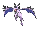
Gastly's purple head and bright blue smoke is very striking. Haunter and Gengar are straight-up bad, though. Mega Gengar's white and pink is acctually one of the most striking alterations as shinies go, and while white ghosts aren't revolutionary, I don't think we actually have one in pokemon! So yeah, good on you, shiny Mega Gengar.

Pretty ew.


Pink Hypno looks neat, but Drowzee just looks so silly and washed out.


Haha, they look like Great Balls now! I like these.


Not the best, but they look decent.


Puke green, ew. Alolan Marowak becomes purple, which is actually neat! Shame they didn't swap out the flame colours either, but no big loss.


Also ew. Hitmonchan's gloves becoming blue is a nice touch.

Not bad. Yellow's not a bad colour on Lickitung, and retaining the tongue's colour is neat. Probably not a good choice for default colours, but neat for a variant.


Big fan of the combination of muted green and purple smoke. Very much appreciated that they actually change the colour of the smoke, actually.


Rhyhorn's pretty pleasant looking, like some sort of rust monster. Rhydon's boring.

Ew.

That's actually a very pleasing shade of bright neon green.

Barely noticeable. Pink baby Kangaskhan's more prominent in the mega form, but they're both eh.


Horsea's m'eh, but Seadra's decently striking.


Nyeh. Could've been so much cooler.


Staryu looks majestic, with that white body and bright blue jewel. Starmie's okay.

Ew.

Only the joints become red and that's boring.

Not different either.

Barely different.

Noticeably different, but not strictly better.

Purple body and gold spikes aren't the best colours on Pinsir, but it's neat.

Ew, lime.


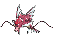
Everyone's favourite shiny! Both golden Magikarp and red Gyarados look amazingly awesome. No wonder Gamefreak wants everyone to have a red Gyarados. Mega Gyarados looks more like a giant lobster due to the red colours, and I love it.

Pleasant-looking.

Also pleasant-looking.


Jolteon and Flareon are disappointing choices, but silver Eevee and purple Vaporeon are neat.

Eh.


They're okay.


They look so painfully lime, but I kind of like both. Kabuto, especially. Bright green with those pink eyes and golden claws remaining the same is neat.

Okay, I guess? Not ideal, but not horrible.

Barely different.


Zapdos looks barely different. Moltres looks kinda sunburnt. I think Articuno being just slightly more white and silver-like end up making shiny Articuno pretty striking.


Dratini and Dragonair look great with a pink body and golden orbs. Dragonite is kinda like puke.


All three Mewtwos are m'eh, but at least the change is noticeable. Mew is cute.


Actually very pleasantly autumnal.


Very pale and honestly kinda bland. Disappointments. You can't see it the 3D animations, but not even their flames change colour.


They all look washed out. Feraligatr looks pretty cool, though.


Sentret's disappointing. Pink Furret's cute.


Golden Hoothoot's very cute. Noctowl... the anime does it better with a far more yellow paint scheme, actually.


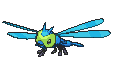
Not different enough for my liking. They would look great with a proper golden-ladybug look.


Spinarak's blue is very pleasant. Ariados looks barely different.

...not gonna lie, I actually think pink Crobat's pretty as hell.


Eh.


None of these look different.


They swap the red and blue markings and it doesn't look prominent.


Washed-out and barely different.


Everyone becomes Flaaffy! Which is actually something I can get behind. Pink Ampharos especially looks pretty, which looks even more awesome as a mega.

Could've actually changed the hula dress, but nope. Pretty bland.


Probably my favourite generation 2 shinies. Neon-green Marill is very pleasant looking, but golden Azumarill's just great.

It's okay.

Hee hee, blue frog. Not a big fan of the lack of contrast of the blue and purple, though.


Green Hoppip and Pink Skiploom are great. Jumpluff needs more contrast.

Bad. Just bad.


Nyeh. They look anemic.
Very neon. Not bad, though I prefer original Yanma.


PINK WOOPER AAAAAAAAAAAAA These two are pretty gerat.


Neon-green Espeon is either utterly disgusting or delightfully bright, depending on my mood. Umbreon looks amazingly great, though, and the simple act of changing the gold rings into neon blue is just so cool.

Not bad.

Pretty m'eh, actually.

Likewise, also m'eh.

M'eh. Can't tell if it's different if you didn't tell me.

Very pink! I don't mind it.

Don't like this one a lot, to be honest -- barely changed.


Very sepia. Looks good on Pineco, not so much on Forretress, who looks kind of like a turd.

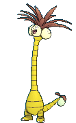
Yellow and pink are neat colours on Dunsparce.

One-tone Gligar actually looks pretty okay, if not super-special.

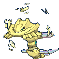
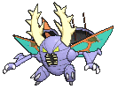
This is actually pretty great! Compare it with the Onix up above, and you can see how much better the gold looks on Steelix. Particularly satisfying on the Mega Evolution, and actually the gold blends in a bit better with the rainbow crystal spikes.


They both look pretty different, but also pretty bad.

Bleh.

Ew on both counts.

Blue shell Shuckle's actually very nice. Looks tasty somewhat.

Pink Heracross is neat. Not my favourite, but pretty neat.

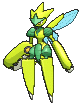
Oh man, the pink and gold plays so well with each other! Shiny Sneasel looks pretty majestic.


Ew so bright.


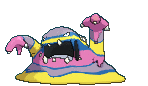
Shiny silver Slugma is cool as balls! Pink-goop Magcargo, not so much.


Swinub looks like a mossy pig. Piloswine's gold but it's not that good on him, I feel.

Very tropical and pleasant-looking. I like it.


Neither one of these are especially good.

M'eh.

Barely different.

The monochrome sadly doesn't look as striking on Skarmory as it does on the magnets. M'eh.


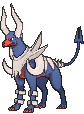
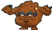
Oh man, they really missed an opportunity for a red-based hellhound shiny, huh. Thankfully rectified with the mega evolution, with a blood-red snout, claws and belly.

Quite nice, actually


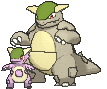
Phanpy's barely different. Donphan looks saturated and ugly.

Very pleasant-looking.

EW FUCK NO

Smeargle's paint changes from blue to red. I find it hilarious.


Both are m'eh.


None of these change significantly, and are all pretty banal.

She looks diseased, to be honest.

Barely different.


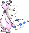
Straight-up superior to their original colourations, due to using less colours and having ones that actually work very well with each other. Raikou and Entei in particular look far more majestic, and the two properly look as part of a set. Really wished they changed Suicune's crystal or mane into silver to match the other two.


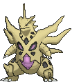
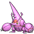
Ehhhh. Pupitar's cool, but the others are boring.


Not a big fan of pink Lugia. Gold-and-silver Ho-Oh is like missing the whole point of being a rainbow pokemon, but it's pretty cool looking and matches the theme of the generation.

Pink Celebi's cute!
Holy shit, that was quick and painless. I can do these pretty quickly, really.
No comments:
Post a Comment